OverviewPermalink to: Overview
A space-saving section of content that can be hidden or shown to the user.
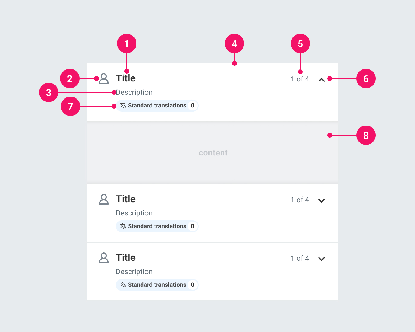
AnatomyPermalink to: Anatomy
-
Heading: A label for an Accordion Item.
-
Icon (optional) An icon to help illustrate the Accordion's purpose.
-
Description (optional): Used to provide more detailed information about the Accordion's purpose.
-
Container: Houses the contents of the Accordion heading. It always has a white background. The entire container is clickable to open the Accordion.
-
Summary (optional): Used to provide a summary of the state within an Accordion Item's contents.
-
Expand/Collapse Icon: Denotes whether an Accordion Item is expanded or collapsed.
-
Tag (optional): An optional Tag that can be used for categorising the contents of an Accordion Item.
-
Contents: A transparent container for an Accordion Item's contents. It has padding by default, but it is possible to opt into no padding.
UsagePermalink to: Usage
When to usePermalink to: When to use
- To provide an overview of related content.
- To break content into digestible sections while optimising for space. For example, they can be useful in Slide Ins where you may have to handle multiple steps within a small area.
When not to usePermalink to: When not to use
- When there is only one Item to show - use the Disclosure component (coming soon).
AccessibilityPermalink to: Accessibility
No interactive elementsPermalink to: No interactive elements
For usability, a <button> covers the entire header. It should be the only interactive element in the header; include anything meant to control content in the panel within the panel itself. For example, if you wanted to use an Accordion to contain a number of checkboxes with a 'Check all' option, add this as the first option within the panel (see With summary section).
Use the correct semantic headingPermalink to: Use the correct semantic heading
The heading is a required prop to ensure a meaningful title. Visually, this heading style is fixed, but the semantic level of the heading is determined by what is passed to headingsLevel. This is also required, so be mindful of where the Accordion(s) will render in relation to other headings. Each Accordion Item will have the same heading level as they sit at the same level in the page hierarchy.
ExamplesPermalink to: Examples
Controlled vs UncontrolledPermalink to: Controlled vs Uncontrolled
By default, Accordion Items are uncontrolled and handle their own expanded/collapsed state. If you wish to control this, you can pass expanded (as the value for being expanded/collapsed) and onExpandChange (as the function to handle the expand/collapse behaviour). For maximum flexibility, each Accordion Item handles its own behaviour.
An example of needing a controlled Accordion is if you have multiple Accordion Items and only want one to be open at a time, or want to expand/collapse them all at once:
Open
import { useState } from "react";
import { Accordion } from "@peakon/bedrock/react/accordion";

function Snippet() {
  const [openIndex, setOpenIndex] = useState(null);

  function handleClick(index) {
    setOpenIndex(openIndex === index ? null : index);
  }

  const items = [
    { title: "Heading 1", content: "Content for 1" },
    { title: "Heading 2", content: "Content for 2" },
    { title: "Heading 3", content: "Content for 3" },
  ];

  return (
    <Accordion headingsLevel={2}>
      {items.map((item, index) => (
        <Accordion.Item
          key={index}
          onExpandedChange={() =>
            setOpenIndex(openIndex === index ? null : index)
          }
          expanded={openIndex === index}
          heading={item.title}
        >
          {item.content}
        </Accordion.Item>
      ))}
    </Accordion>
  );
}
With Tag componentPermalink to: With Tag component
Accordions are sometimes related to categorisation. In such instances you may want to indicate this as part of the description. You can do so by passing a Tag component.
For example, you may have an Accordion Item which handles translations. You can indicate this in the header:
Open
import { Accordion } from "@peakon/bedrock/react/accordion";
import { Tag } from "@peakon/bedrock/react/tag";
import { SystemIcon } from "@peakon/bedrock/react/assets/SystemIcon";

function Snippet() {
  return (
    <Accordion headingsLevel={2}>
      <Accordion.Item
        heading="Heading"
        tagComponent={
          <Tag
            variant="info"
            label="Translations"
            icon={<SystemIcon name="question-setup-customized-translation" />}
            count={2}
          />
        }
      >
        Content
      </Accordion.Item>
      <Accordion.Item heading="Some other setting">Content</Accordion.Item>
    </Accordion>
  );
}SummaryPermalink to: Summary
As well as a more verbose description, you may want an at-a-glance overview of the Accordion Item's current state. The most common example would be a counter to indicate how many options are selected from a list concealed within the Accordion content panel.
Open
import { useState } from "react";
import { Accordion } from "@peakon/bedrock/react/accordion";
import { Checkbox } from "@peakon/bedrock/react/form";

function Snippet() {
  const [checkedItems, setCheckedItems] = useState([
    { name: "suit", checked: false },
    { name: "socks", checked: false },
    { name: "shoes", checked: false },
  ]);

  function handleChecked(newItem) {
    const updatedItems = checkedItems.map((item) =>
      item.name === newItem ? { ...item, checked: !item.checked } : item
    );
    setCheckedItems(updatedItems);
  }

  function isChecked(currentItem) {
    const item = checkedItems.find((item) => item.name === currentItem);
    return item ? item.checked : false;
  }

  function setAllItemsChecked() {
    if (checkedItems.every((item) => item.checked)) {
      const updatedItems = checkedItems.map((item) => ({
        ...item,
        checked: false,
      }));
      setCheckedItems(updatedItems);
    } else {
      const updatedItems = checkedItems.map((item) => ({
        ...item,
        checked: true,
      }));
      setCheckedItems(updatedItems);
    }
  }

  function checkedItemsCount() {
    const checkedItemsCount = checkedItems.filter((item) => item.checked);
    return checkedItemsCount.length;
  }

  return (
    <>
      <Accordion headingsLevel={2}>
        <Accordion.Item
          heading="Items of clothing owned"
          summary={`${checkedItemsCount()} of 3`}
        >
          <div>
            <Checkbox
              label="All clothing"
              checked={checkedItems.every((item) => item.checked)}
              indeterminate={
                checkedItems.some((item) => item.checked) &&
                !checkedItems.every((item) => item.checked)
              }
              onChange={() => {
                setAllItemsChecked();
              }}
            />
            <Checkbox
              label="Suit"
              checked={isChecked("suit")}
              onChange={() => {
                handleChecked("suit");
              }}
            />
            <Checkbox
              label="Socks"
              checked={isChecked("socks")}
              onChange={() => {
                handleChecked("socks");
              }}
            />
            <Checkbox
              label="Shoes"
              checked={isChecked("shoes")}
              onChange={() => {
                handleChecked("shoes");
              }}
            />
          </div>
        </Accordion.Item>
      </Accordion>
    </>
  );
}
Prop TablePermalink to: Prop Table
AccordionPermalink to: Accordion
Props extend from HTML Div Element(external link), with the omission of className and style
| Name | Type | Description | Default | Required |
|---|---|---|---|---|
headingsLevel | 1 | 2 | 3 | 4 | 5 | 6 | The semantic heading level for all the contained Accordion.Items; determines which heading element their headings will render as. | — | Yes |
children | React.ReactNode | The contents of the Accordion. Should be one or more Accordion.Items. | — | Yes |
Accordion.ItemPermalink to: Accordion.Item
Props extend from HTML Div Element(external link), with the omission of className and style
| Name | Type | Description | Default | Required |
|---|---|---|---|---|
heading | string | The heading for the Accordion.Item. | — | Yes |
icon | React.ReactNode | An optional icon for the Accordion.Item. | — | No |
description | string | An optional description for the Accordion.Item. | — | No |
summary | string | An optional summary of content in the Accordion.Item. | — | No |
tagComponent | React.ReactElement | An optional Tag component, if you need to categorise the content of the Accordion.Item. | — | No |
noPadding | boolean | Removes padding from the content of the panel. | — | No |
disabled | boolean | Disables the Accordion.Item. As well as visually disabling the header, it is also applied to the | — | No |
expanded | boolean | Used for controlled Accordion.Items. Determines whether the Accordion.Item is expanded or collapsed. | — | No |
onExpandedChange | function | Used for controlled Accordion.Items. Callback function that is triggered when the expanded state changes. Accepts a boolean parameter indicating whether the Accordion.Item is expanded or collapsed. | — | No |