A Toggle Group is a selection of mutually exclusive options that offers a wider range of design options than a group of Radio Buttons.
AnatomyPermalink to: Anatomy
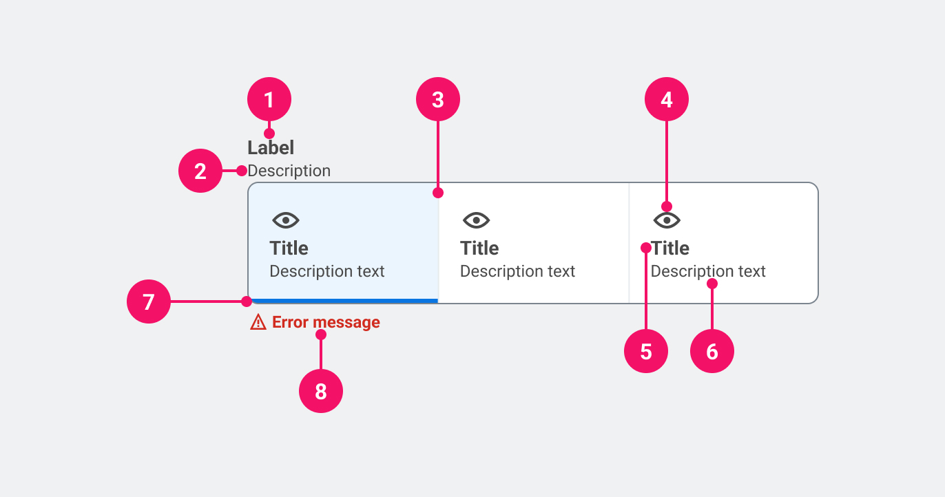
- Group title: Describes the purpose of the Toggle Group.
- Group description (optional): Adds further context to the purpose of the Toggle Group.
- Group Container: A visual containment for the options.
- Item icon (optional): Adds visual affordance to the item.
- Item label: Describes the purpose of the toggle item.
- Item description (optional): Adds further content to the purpose of the toggle item.
- Selected indicator: Indicates which item is chosen.
UsagePermalink to: Usage
When using a Toggle Group it is recommended that one option is pre-selected by default(external link) — that should be either the option that the user has previously selected or the first one in the list. However, if the Toggle Group is used for a poll or something similar, all options should be left unchecked as to not introduce bias.
Unlike a group of Radio Buttons, the Toggle Group can be used in interfaces where the expectation is that the selection has an immediate effect, eg. inside forms without a dedicated submit button.
When to usePermalink to: When to use
- Use where there are between two and four options available, but only one can be selected.
When not to usePermalink to: When not to use
- If there are more than four options, consider Select. An exception to this rule could be range selector, ie. from one to ten.
AccessibilityPermalink to: Accessibility
A Toggle Group always needs a group name to define the options, ie. if the options are “1 Month”, “3 Months” and “6 Months”, the group name could be “Subscription Length”.
It is recommended that the group name is always shown, but can in some rare cases be hidden visually if the context is self explanatory or if another interface element describes the context visually.
ExamplesPermalink to: Examples
DirectionPermalink to: Direction
A Toggle Group can present its' options either horizontally (default) or vertically.
HorizontallyPermalink to: Horizontally
Open
import { ToggleGroup } from "@peakon/bedrock/react/form";

function Snippet() {
  return (
    <ToggleGroup groupLabel="Sharing settings">
      <ToggleGroup.Item
        name="example-01"
        label="Shared with all"
        value="public"
        defaultChecked
      />
      <ToggleGroup.Item
        name="example-01"
        label="Shared with friends"
        value="hidden"
      />
      <ToggleGroup.Item
        name="example-01"
        label="Not shared at all"
        value="secret"
      />
    </ToggleGroup>
  );
}VerticallyPermalink to: Vertically
Open
import { ToggleGroup } from "@peakon/bedrock/react/form";

function Snippet() {
  return (
    <ToggleGroup groupLabel="Sharing settings" direction="vertical">
      <ToggleGroup.Item
        name="example-02"
        label="Shared with all"
        value="public"
        defaultChecked
      />
      <ToggleGroup.Item
        name="example-02"
        label="Shared with friends"
        value="hidden"
      />
      <ToggleGroup.Item
        name="example-02"
        label="Not shared at all"
        value="secret"
      />
    </ToggleGroup>
  );
}
With Group DescriptionPermalink to: With Group Description
Open
import { ToggleGroup } from "@peakon/bedrock/react/form";

function Snippet() {
  return (
    <ToggleGroup
      groupLabel="Sharing settings"
      description="Choose who you want to share the spoils with."
    >
      <ToggleGroup.Item
        name="example-03"
        label="Shared with all"
        value="public"
        defaultChecked
      />
      <ToggleGroup.Item
        name="example-03"
        label="Shared with friends"
        value="hidden"
      />
      <ToggleGroup.Item
        name="example-03"
        label="Not shared at all"
        value="secret"
      />
    </ToggleGroup>
  );
}
With Item DescriptionPermalink to: With Item Description
Open
import { ToggleGroup } from "@peakon/bedrock/react/form";

function Snippet() {
  return (
    <ToggleGroup groupLabel="Sharing settings">
      <ToggleGroup.Item
        label="Shared with all"
        name="example-04"
        value="public"
        description="Everyone with access to the internet can see this."
        defaultChecked
      />
      <ToggleGroup.Item
        label="Shared with friends"
        name="example-04"
        value="hidden"
        description="Only your friends who are logged in can see this."
      />
      <ToggleGroup.Item
        label="Not shared at all"
        name="example-04"
        value="secret"
        description="No one but you can see this. It's your own little secret."
      />
    </ToggleGroup>
  );
}
With IconsPermalink to: With Icons
Open
import { ToggleGroup } from "@peakon/bedrock/react/form";
import { SystemIcon } from "@peakon/bedrock/react/assets/SystemIcon";

function Snippet() {
  return (
    <ToggleGroup groupLabel="Sharing settings">
      <ToggleGroup.Item
        label="Shared with all"
        name="example-05"
        value="public"
        icon={<SystemIcon name="access-visibility-on" />}
        defaultChecked
      />
      <ToggleGroup.Item
        label="Shared with friends"
        name="example-05"
        value="hidden"
        icon={<SystemIcon name="access-visibility-restricted" />}
      />
      <ToggleGroup.Item
        label="Not shared at all"
        name="example-05"
        value="secret"
        icon={<SystemIcon name="access-visibility-off" />}
      />
    </ToggleGroup>
  );
}
Hide Group LabelPermalink to: Hide Group Label
Please read the accessibility section before using this pattern.
In this example a heading element is used instead of the groupLabel for styling purposes. It's important that the heading element and the groupLabel prop have the same content ("Sharing settings").
Open
import { ToggleGroup } from "@peakon/bedrock/react/form";

function Snippet() {
  return (
    <>
      <h2>Sharing settings</h2>
      <ToggleGroup groupLabel="Sharing settings" hideGroupLabel>
        <ToggleGroup.Item
          label="Shared with all"
          name="example-06"
          value="public"
          defaultChecked
        />
        <ToggleGroup.Item
          name="example-06"
          label="Shared with friends"
          value="hidden"
        />
        <ToggleGroup.Item
          name="example-06"
          label="Not shared at all"
          value="secret"
        />
      </ToggleGroup>
    </>
  );
}DisabledPermalink to: Disabled
It is possible to disable the entire group or individual items — when doing this, make sure to provide an explanation as to why the user is prevented from using the control.
Disabled GroupPermalink to: Disabled Group
Open
import { ToggleGroup } from "@peakon/bedrock/react/form";

function Snippet() {
  return (
    <ToggleGroup
      groupLabel="Sharing settings"
      disabled
      description="You do not have sufficient rights to edit sharing settings."
    >
      <ToggleGroup.Item
        label="Shared with all"
        name="value-07"
        value="public"
        defaultChecked
      />
      <ToggleGroup.Item
        name="value-07"
        label="Shared with friends"
        value="hidden"
      />
      <ToggleGroup.Item
        label="Not shared at all"
        name="value-07"
        value="secret"
      />
    </ToggleGroup>
  );
}
Disabled ItemPermalink to: Disabled Item
Open
import { ToggleGroup } from "@peakon/bedrock/react/form";

function Snippet() {
  return (
    <ToggleGroup
      groupLabel="Sharing settings"
      description="Only premium members can share stuff with their friends."
    >
      <ToggleGroup.Item
        name="example-08"
        label="Shared with all"
        value="public"
        defaultChecked
      />
      <ToggleGroup.Item
        name="example-08"
        label="Shared with friends"
        value="hidden"
        disabled
      />
      <ToggleGroup.Item
        name="example-08"
        label="Not shared at all"
        value="secret"
      />
    </ToggleGroup>
  );
}RequiredPermalink to: Required
If a choice is required, the Toggle Group should be marked as such. In most cases this will have no actual effect on the usage, as it is recommended that there is a default selection.
Making a Toggle Group required only takes adding the native HTML attribute, required to one of it's items.
Open
import { useState } from "react";
import { ToggleGroup } from "@peakon/bedrock/react/form";

function Snippet() {
  const [value, setValue] = useState(undefined);

  return (
    <>
      <ToggleGroup
        groupLabel="Sharing settings"
        description="You do not have sufficient rights to edit sharing settings."
        status={value === undefined ? "error" : undefined}
        feedbackMessage={
          value === undefined ? "You have to pick one" : undefined
        }
      >
        <ToggleGroup.Item
          label="Shared with all"
          name="required-toggle-group"
          value="public"
          checked={value === "public"}
          onChange={() => setValue("public")}
          required
        />
        <ToggleGroup.Item
          name="required-toggle-group"
          label="Shared with friends"
          value="hidden"
          checked={value === "hidden"}
          onChange={() => setValue("hidden")}
          required
        />
        <ToggleGroup.Item
          label="Not shared at all"
          name="required-toggle-group"
          value="secret"
          checked={value === "secret"}
          onChange={() => setValue("secret")}
          required
        />
      </ToggleGroup>
      <button type="button" onClick={() => setValue(undefined)}>
        Reset
      </button>
    </>
  );
}
Controlled Toggle GroupPermalink to: Controlled Toggle Group
Open
import { useState } from "react";
import { ToggleGroup } from "@peakon/bedrock/react/form";

function Snippet() {
  const [value, setValue] = useState("public");

  return (
    <ToggleGroup groupLabel="Sharing settings">
      <ToggleGroup.Item
        name="sharing_settings_1"
        label="Shared with all"
        value="public"
        checked={value === "public"}
        onChange={(event) => setValue(event.target.value)}
      />
      <ToggleGroup.Item
        name="sharing_settings_1"
        label="Shared with friends"
        value="hidden"
        checked={value === "hidden"}
        onChange={(event) => setValue(event.target.value)}
      />
      <ToggleGroup.Item
        name="sharing_settings_1"
        label="Not shared at all"
        value="secret"
        checked={value === "secret"}
        onChange={(event) => setValue(event.target.value)}
      />
    </ToggleGroup>
  );
}
Custom Toggle GroupsPermalink to: Custom Toggle Groups
The ToggleGroup can be customised in a myriad of ways — before doing this, ask yourself whether this is really necessary and if one of the provided options can be used instead.
Open
import { ToggleGroup } from "@peakon/bedrock/react/form";

function Snippet() {
  return (
    <ToggleGroup groupLabel="Simple sharing settings">
      <ToggleGroup.BespokeItem
        name="custom-01"
        value="public"
        accessibleName="Public"
        defaultChecked
      >
        <span
          style={{
            display: "flex",
            alignItems: "center",
            justifyContent: "center",
            padding: "3rem 1.625rem",
            flex: 1,
            textAlign: "center",
            fontWeight: "bold",
          }}
        >
          Public
        </span>
      </ToggleGroup.BespokeItem>
      <ToggleGroup.BespokeItem
        name="custom-01"
        value="hidden"
        accessibleName="Hidden"
      >
        <span
          style={{
            display: "flex",
            alignItems: "center",
            justifyContent: "center",
            padding: "3rem 1.625rem",
            flex: 1,
            textAlign: "center",
            fontWeight: "bold",
          }}
        >
          Hidden
        </span>
      </ToggleGroup.BespokeItem>
      <ToggleGroup.BespokeItem
        name="custom-01"
        value="secret"
        accessibleName="Top secret"
      >
        <span
          style={{
            display: "flex",
            alignItems: "center",
            justifyContent: "center",
            padding: "3rem 1.625rem",
            flex: 1,
            textAlign: "center",
            fontWeight: "bold",
          }}
        >
          Top
          <br />
          Secret
        </span>
      </ToggleGroup.BespokeItem>
    </ToggleGroup>
  );
}
Open
import { ToggleGroup } from "@peakon/bedrock/react/form";

function Snippet() {
  return (
    <ToggleGroup groupLabel="Number row">
      <ToggleGroup.BespokeItem
        name="custom-02"
        value="number_off"
        accessibleName="Off"
        defaultChecked
      >
        <span
          style={{ paddingBlock: "1rem", width: "3rem", textAlign: "center" }}
        >
          Off
        </span>
      </ToggleGroup.BespokeItem>
      <ToggleGroup.BespokeItem
        name="custom-02"
        value="number_4"
        accessibleName="4"
      >
        <span
          style={{ paddingBlock: "1rem", width: "3rem", textAlign: "center" }}
        >
          4
        </span>
      </ToggleGroup.BespokeItem>
      <ToggleGroup.BespokeItem
        name="custom-02"
        value="number_5"
        accessibleName="5"
      >
        <span
          style={{ paddingBlock: "1rem", width: "3rem", textAlign: "center" }}
        >
          5
        </span>
      </ToggleGroup.BespokeItem>
      <ToggleGroup.BespokeItem
        name="custom-02"
        value="number_6"
        accessibleName="6"
        defaultChecked
      >
        <span
          style={{ paddingBlock: "1rem", width: "3rem", textAlign: "center" }}
        >
          6
        </span>
      </ToggleGroup.BespokeItem>
      <ToggleGroup.BespokeItem
        name="custom-02"
        value="number_7"
        accessibleName="7"
      >
        <span
          style={{ paddingBlock: "1rem", width: "3rem", textAlign: "center" }}
        >
          7
        </span>
      </ToggleGroup.BespokeItem>
      <ToggleGroup.BespokeItem
        name="custom-02"
        value="number_8"
        accessibleName="8"
      >
        <span
          style={{ paddingBlock: "1rem", width: "3rem", textAlign: "center" }}
        >
          8
        </span>
      </ToggleGroup.BespokeItem>
      <ToggleGroup.BespokeItem
        name="custom-02"
        value="number_9"
        accessibleName="9"
      >
        <span
          style={{ paddingBlock: "1rem", width: "3rem", textAlign: "center" }}
        >
          9
        </span>
      </ToggleGroup.BespokeItem>
      <ToggleGroup.BespokeItem
        name="custom-02"
        value="number_10"
        accessibleName="10"
      >
        <span
          style={{ paddingBlock: "1rem", width: "3rem", textAlign: "center" }}
        >
          10
        </span>
      </ToggleGroup.BespokeItem>
    </ToggleGroup>
  );
}
Open
import { ToggleGroup } from "@peakon/bedrock/react/form";

function Snippet() {
  return (
    <ToggleGroup groupLabel="WiFi">
      <ToggleGroup.BespokeItem
        name="custom-03"
        value="on"
        accessibleName="On"
        defaultChecked
      >
        <span
          style={{
            fontWeight: "bold",
            paddingInline: "0.75rem",
            paddingBlock: "0.375rem",
          }}
        >
          On
        </span>
      </ToggleGroup.BespokeItem>
      <ToggleGroup.BespokeItem
        name="custom-03"
        value="off"
        accessibleName="Off"
      >
        <span
          style={{
            fontWeight: "bold",
            paddingInline: "0.75rem",
            paddingBlock: "0.375rem",
          }}
        >
          Off
        </span>
      </ToggleGroup.BespokeItem>
    </ToggleGroup>
  );
}
Props TablePermalink to: Props Table
ToggleGroupPermalink to: ToggleGroup
Props extend from HTML Fieldset Element(external link), with the omission of className, style, aria-labelledby and aria-label
| Name | Type | Description | Default | Required |
|---|---|---|---|---|
ref | HTMLFieldSetElement | Forwards a ref to the ToggleGroup. | — | No |
groupLabel | string | Used to render the label that describes the ToggleGroup. | — | Yes |
hideGroupLabel | boolean | Hides the label (visually) — Please read the section on accessibility before utilising this option. | — | No |
description | string | Renders a description below the label to give further information on the ToggleGroup options. | — | No |
direction | horizontal | vertical | Determines whether the options will be presented horizontally or vertically. | horizontal | No |
feedbackMessage | string | Used to provide feedback about the ToggleGroup. | — | No |
status | error | success | Used to indicate the status of the ToggleGroup. Passing error will render the border and feedback message in red. | — | No |
ToggleGroup.ItemPermalink to: ToggleGroup.Item
Props extend from HTML Input Element(external link), with the omission of className, style, aria-labelledby and aria-label
| Name | Type | Description | Default | Required |
|---|---|---|---|---|
ref | HTMLInputElement | Forwards a ref to the ToggleGroup.Item. | — | No |
label | string | Used to render the label that describes the ToggleGroup.Item. | — | Yes |
description | string | Renders a description below the label to give further information on the option. | — | No |
icon | ReactNode | Allows to pass an icon to further illustrate the option. | — | No |
value | string | Sets the value of the ToggleGroup.Item. | — | Yes |
name | string | Groups the ToggleGroup.Item with the others in the group, by providing the same name. | — | Yes |
checked | boolean | Used to set the controlled value of the ToggleGroup.Item. | — | No |
defaultChecked | boolean | Used to set the uncontrolled value of the ToggleGroup.Item. | — | No |
ToggleGroup.BespokeItemPermalink to: ToggleGroup.BespokeItem
Props extend from HTML Input Element(external link), with the omission of className, style, aria-labelledby and aria-label
| Name | Type | Description | Default | Required |
|---|---|---|---|---|
ref | HTMLInputElement | Forwards a ref to the ToggleGroup.BespokeItem. | — | No |
name | string | Groups the ToggleGroup.BespokeItem with the others in the group, by providing the same name. Note that while the name is natively optional by default, on the ToggleGroup.BespokeItem it is required. | — | Yes |
accessibleName | string | Used to provide an accessible name for screen readers, to ensure it is always clear what the item represents, regardless of content. | — | Yes |
value | string | Sets the value of the ToggleGroup.BespokeItem. Note that while the value is natively optional by default, on the ToggleGroup.BespokeItem it is required. | — | Yes |
checked | boolean | Used to set the controlled value of the ToggleGroup.BespokeItem. | — | No |
defaultChecked | boolean | Used to set the uncontrolled value of the ToggleGroup.BespokeItem. | — | No |