Buttons are used to trigger actions. The label of the button expresses clearly to the user what that action is and what will happen when the button is pressed.
AnatomyPermalink to: Anatomy
-
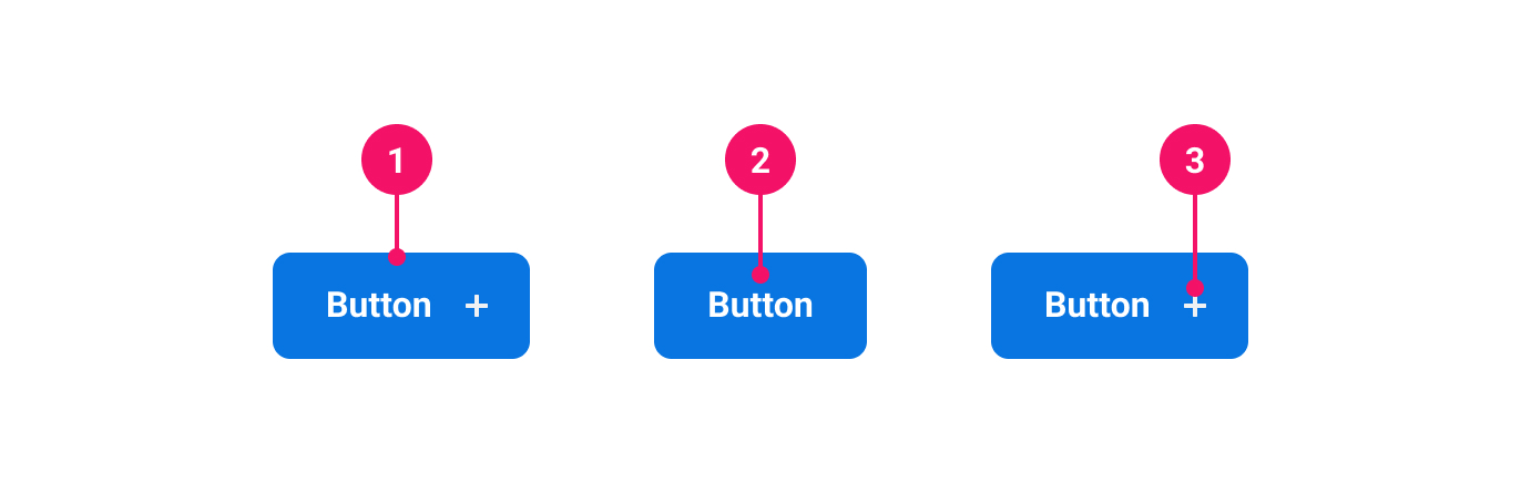
Container: Houses the contents of the Button. Visual appearance differs based on button variant.
-
Label: Specific text describing the action.
-
Icon (optional): Supplementary visual indicator that can be positioned alone or added to the left or right of the label. Used to promote the purpose of the button.
UsagePermalink to: Usage
When to usePermalink to: When to use
Buttons should be used to trigger user interactions such as expanding a section on a page or submitting data from a form.
When not to usePermalink to: When not to use
Buttons are not meant for page navigation. If that is the use case, you should use a Link instead. If you do find a permitted use case for a Button as a link, see the Button as link section.
When creating forms you should avoid using disabled Buttons and instead create meaningful feedback messages. For background, please read Disabled Buttons Suck(external link).
AccessibilityPermalink to: Accessibility
The label of a Button should be clear and succinct.
On some pages there will be a lot of repeating buttons, ie. “Edit”-buttons in a table of elements. In those cases it is important to give the button an improved “accessible name”. This can be done in two ways:
- adding hidden text inside the Button using a Visually Hidden component. Make sure the hidden text makes sense when read with the visible text.
- using the
aria-describedbyattribute and pointing it to another element on the page.
ExamplesPermalink to: Examples
VariantPermalink to: Variant
When deciding which Button to use, consider its level of priority and how much visual emphasis it should have on the page. Refer to the examples below to determine which is right for your use case:
| Variant | Description |
|---|---|
| Primary | Use for the principal, positive call to action. Submitting forms, saving changes, etc. Avoid having multiple primary buttons next to each other or stacked, as they are styled to attract attention, and will clump. Choose a primary action, and use secondary for the remaining options. |
| Secondary | A more discreet Button for secondary actions like ‘Cancel’, ‘Edit’ and other non-primary choices. |
| Tertiary | For use on less important, prominent actions. They can be used in isolation or paired with a primary or secondary Button when there are multiple actions. |
| Warning | Use for negative but non-destructive actions. They work in stacked lists. |
| Danger | Only to be used if doing a very destructive, irreversible action, such as deleting a company. Avoid using in stacked lists, as the red styling is very heavy. |
Open
import { Button } from "@peakon/bedrock/react/button";
import { Inline } from "@peakon/bedrock/react/layout";

function Snippet() {
  return (
    <Inline spacing={8}>
      <Button variant="primary">Primary</Button>
      <Button variant="secondary">Secondary</Button>
      <Button variant="tertiary">Tertiary</Button>
      <Button variant="warning">Warning</Button>
      <Button variant="danger">Danger</Button>
    </Inline>
  );
}SizesPermalink to: Sizes
Button supports four sizes: xsmall, small, medium (default) and large. Which is appropriate will depend on the size of its surrounding elements and visual space.
Open
import { Button } from "@peakon/bedrock/react/button";
import { Inline } from "@peakon/bedrock/react/layout";

function Snippet() {
  return (
    <Inline spacing={8}>
      <Button variant="primary" size="xsmall">
        Xsmall
      </Button>
      <Button variant="primary" size="small">
        Small
      </Button>
      <Button variant="primary" size="medium">
        Medium
      </Button>
      <Button variant="primary" size="large">
        Large
      </Button>
    </Inline>
  );
}IconsPermalink to: Icons
A Button displays an icon its start or end to assist with comprehension. If you wish to only show an icon, consider the Icon Button.
Open
import { Button } from "@peakon/bedrock/react/button";
import { Inline } from "@peakon/bedrock/react/layout";
import { SystemIcon } from "@peakon/bedrock/react/assets/SystemIcon";

function Snippet() {
  return (
    <Inline spacing={8}>
      <Button variant="primary">No icon</Button>
      <Button
        variant="primary"
        icon={<SystemIcon name="navigation-basic-navigation-chevron-right" />}
      >
        Icon left
      </Button>
      <Button
        variant="primary"
        icon={<SystemIcon name="navigation-basic-navigation-chevron-right" />}
        iconPlacement="end"
      >
        Icon right
      </Button>
    </Inline>
  );
}
Full widthPermalink to: Full width
On desktop web, the Button's width is defined by its content, but on mobile web and the native apps, a full width Button can be useful.
A fullWidth Button has a width of 100%. If an icon is used, the icon is always pinned to the side.
Open
import { Button } from "@peakon/bedrock/react/button";
import { SystemIcon } from "@peakon/bedrock/react/assets/SystemIcon";

function Snippet() {
  return (
    <Button
      variant="primary"
      icon={<SystemIcon name="navigation-basic-navigation-chevron-right" />}
      iconPlacement="end"
      fullWidth
    >
      Full width button
    </Button>
  );
}
Button as linkPermalink to: Button as link
Sometimes it may be necessary to use a link that looks like a Button, which is supported for both native <a> elements and framework-specific elements, such as React Router's Link(external link) or Next.js' Link(external link) components. This usage pattern should be the exception rather than the rule.
Open
import { LinkButton } from "@peakon/bedrock/react/button";
import { Inline } from "@peakon/bedrock/react/layout";
import { default as NextLink } from "next/link";

function Snippet() {
  return (
    <Inline spacing={8}>
      <LinkButton variant="primary" href="#">
        Button as regular link
      </LinkButton>
      <LinkButton variant="primary" as={NextLink} href="#">
        Button as Next.js link
      </LinkButton>
    </Inline>
  );
}
Busy statePermalink to: Busy state
The Button can be set to a busy state, which is useful when being used to trigger an action that takes some time to complete. The busy state is indicated by a spinner, and the Button will be announced as busy for assistive technology.
It is up the the consumer to choose when or when not to use the busy state. A good rule of thumb is to use it when you know an action will take a considerable amount of time to complete, eg. generating a file for download. If you are unsure whether or not an action will take a long time to complete, consider adding a small delay before setting the Button to busy - this way it will only show, if the actions takes a considerable amount of time.
The Button's label will be hidden when busy, but the button will retain the original width.
Open
import { Button } from "@peakon/bedrock/react/button";
import { Inline } from "@peakon/bedrock/react/layout";

function Snippet() {
  return (
    <Inline spacing={8}>
      <Button variant="primary" busy>
        Busy button
      </Button>
      <Button variant="secondary" busy>
        Busy button
      </Button>
      <Button variant="tertiary" busy>
        Busy button
      </Button>
      <Button variant="warning" busy>
        Busy button
      </Button>
      <Button variant="danger" busy>
        Busy button
      </Button>
    </Inline>
  );
}
Props TablePermalink to: Props Table
ButtonPermalink to: Button
Props extend from HTML Button Element(external link), with the omission of className and style
| Name | Type | Description | Default | Required |
|---|---|---|---|---|
ref | HTMLButtonElement | Forwards a ref to the Button. | — | No |
size | xsmall | small | medium | large | Defines the size of the Button. | medium | No |
variant | primary | secondary | tertiary | warning | danger | Defines the variant of the Button. | — | Yes |
icon | ReactNode | Defines what icon to render in the Button (Peakon system icon recommended) | — | No |
iconPlacement | start | end | The placement of the icon. It will render either before ( | start | No |
fullWidth | boolean | Sets the Button to take up 100% of available width. | false | No |
busy | boolean | Set the | false | No |
LinkButtonPermalink to: LinkButton
Props extend from HTML anchor element(external link), with the omission of className and style
| Name | Type | Description | Default | Required |
|---|---|---|---|---|
ref | HTMLAnchorElement | Forwards a ref to the Button. | — | No |
as | ElementType | The LinkButton also supports custom link components via the | a | No |
size | xsmall | small | medium | large | Defines the size of the LinkButton. | medium | No |
variant | primary | secondary | tertiary | warning | danger | Defines the variant of the LinkButton. | — | Yes |
icon | ReactNode | Defines what icon to render in the LinkButton (Peakon system icon recommended) | — | No |
iconPlacement | start | end | The placement of the icon. It will render either before ( | start | No |
fullWidth | boolean | Sets the LinkButton to take up 100% of available width. | false | No |
busy | boolean | Set the | false | No |