The Select component is used when the user has to choose exactly one option from a set of predefined list of choices.
AnatomyPermalink to: Anatomy
Select ControlPermalink to: Select Control
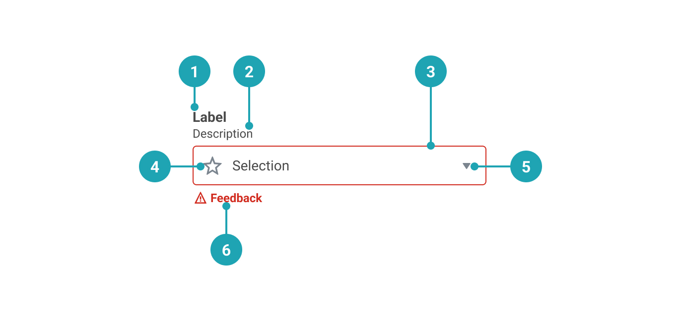
- Label: A textual representation that provides a clear and descriptive title for the Select.
- Description (optional): A more detailed description that extends the Label.
- Control Container
- Icon (optional): Added visual affordance. Use of this is strongly discouraged.
- State indicator: Shows whether the Select is open or closed.
- Feedback message (optional): Display feedback that provides the user with needed information.
DroplistPermalink to: Droplist
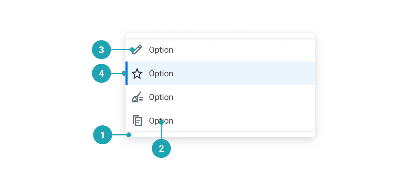
- Lip: If the container has scroll, we display both an upper and a lower lip for visual affordance.
- Option label: A clear and descriptive text label for the option.
- Option icon: Added visual affordance. Use of this is strongly discouraged.
- Selected option indicator: Indicates the selected option.
UsagePermalink to: Usage
The choices (options) should be listed in alphabetical order or in increasing order relative to the context. If the user isn't required to select an option, be sure to insert an empty option at the beginning of the list, otherwise the first option will be selected by default.
When to usePermalink to: When to use
- Use the Select when the list of options is limited and the user shouldn't be able to modify the choice.
When not to usePermalink to: When not to use
- Generally, a Select should not contain more than 12-15 choices. If there are three or fewer options, consider a Radio Group instead.
- Remember that one difference between a Select and a group of Radio Buttons is that a Select requires user interaction to reveal the choices, which also puts a cognitive load on the user in that they have to remember the options once the select is collapsed.
- The Select does not allow for multiple selections. In cases where that is needed, use a group of Checkboxes instead.
AccessibilityPermalink to: Accessibility
The Select requires an accessible name, which is provided by the label.
In some cases, ie. in a large table view, it might be visually preferrable to not show the label and instead rely on the row/column header to act as a visual label. In such cases it is possible to hide the label.
Don't use this solution just to minimise vertical space in the user interface, as that will most likely lead to a violation of the WCAG 2.1 AA accessibility guidelines(external link).
ExamplesPermalink to: Examples
DefaultPermalink to: Default
Open
import { Select } from "@peakon/bedrock/react/form";

function Snippet() {
  return (
    <Select label="What's your favorite animal" name="favorite-animal-default">
      <Select.Option value="option-01">Cat</Select.Option>
      <Select.Option value="option-02">Cat, obviously</Select.Option>
      <Select.Option value="option-03">It's a cat</Select.Option>
      <Select.Option value="option-04">It's always a cat</Select.Option>
      <Select.Option value="option-05">Cats are the best</Select.Option>
    </Select>
  );
}
With descriptionPermalink to: With description
To help the user it's possible to add context to the Select by providing a description.
Open
import { Select } from "@peakon/bedrock/react/form";

function Snippet() {
  return (
    <Select
      label="What's your favorite animal"
      name="favorite-animal-description"
      description="You can pick any animal you want to as long as it's a cat"
    >
      <Select.Option value="option-01">Cat</Select.Option>
      <Select.Option value="option-02">Cat, obviously</Select.Option>
      <Select.Option value="option-03">It's a cat</Select.Option>
      <Select.Option value="option-04">It's always a cat</Select.Option>
      <Select.Option value="option-05">Cats are the best</Select.Option>
    </Select>
  );
}ControlledPermalink to: Controlled
You can make Select controlled by passing the value of the selected option to value and a function to onChange that handles the option selection.
Open
import { useState } from "react";
import { Select } from "@peakon/bedrock/react/form";

function Snippet() {
  const [value, setValue] = useState("option-01");

  return (
    <Select
      label="What's your favorite animal"
      name="favorite-animal-controlled"
      value={value}
      onChange={(event) => setValue(event.target.value)}
    >
      <Select.Option value="option-01">Cat</Select.Option>
      <Select.Option value="option-02">Cat, obviously</Select.Option>
      <Select.Option value="option-03">It's a cat</Select.Option>
      <Select.Option value="option-04">It's always a cat</Select.Option>
      <Select.Option value="option-05">Cats are the best</Select.Option>
    </Select>
  );
}DisabledPermalink to: Disabled
Open
import { Select } from "@peakon/bedrock/react/form";

function Snippet() {
  return (
    <Select
      label="What's your favorite animal"
      name="favorite-animal-disabled"
      disabled
    >
      <Select.Option value="option-01">Cat</Select.Option>
      <Select.Option value="option-02">Cat, obviously</Select.Option>
      <Select.Option value="option-03">It's a cat</Select.Option>
      <Select.Option value="option-04">It's always a cat</Select.Option>
      <Select.Option value="option-05">Cats are the best</Select.Option>
    </Select>
  );
}
With default selected valuePermalink to: With default selected value
If you're displaying a page where the user has previously chosen an option, you should make sure that it displays as selected using the defaultValue prop.
Open
import { Select } from "@peakon/bedrock/react/form";

function Snippet() {
  return (
    <Select
      label="What's your favorite animal"
      name="favorite-animal-default-selected"
      defaultValue="option-03"
    >
      <Select.Option value="option-01">Cat</Select.Option>
      <Select.Option value="option-02">Cat, obviously</Select.Option>
      <Select.Option value="option-03">It's a cat</Select.Option>
      <Select.Option value="option-04">It's always a cat</Select.Option>
      <Select.Option value="option-05">Cats are the best</Select.Option>
    </Select>
  );
}
With empty valuePermalink to: With empty value
If you want to have an required Select you can add the first option with an empty value (""). Alternatively disable the option, so it cannot be selected again. An empty string ("") will be concidered an invalid value. If you need an empty option as a possible outcome, consider the value "empty" or "none".
Open
import { Select } from "@peakon/bedrock/react/form";

function Snippet() {
  return (
    <Select label="What's your favorite animal" name="favorite-animal-empty">
      <Select.Option value="" disabled>
        Please pick a cat
      </Select.Option>
      <Select.Option value="option-01">Cat</Select.Option>
      <Select.Option value="option-02">Cat, obviously</Select.Option>
      <Select.Option value="option-03">It's a cat</Select.Option>
      <Select.Option value="option-04">It's always a cat</Select.Option>
      <Select.Option value="option-05">Cats are the best</Select.Option>
    </Select>
  );
}FeedbackPermalink to: Feedback
When necessary remember to provide feedback to the user. The feedback can be combined with a status to visually indicate whether the feedback is positive (success) or negative (error). You should never add a status without adding some sort of textual feedback as well, as this would be a violation of WCAG 2.1 Success Criteria 1.4.1 (Use of Color)(external link).
Open
import { Select } from "@peakon/bedrock/react/form";
import { Stack } from "@peakon/bedrock/react/layout";

function Snippet() {
  return (
    <Stack spacing={16}>
      <Select
        label="What's your favorite animal (feedback only)"
        name="favorite-animal-feedback"
        feedbackMessage="Cats really are the best!"
      >
        <Select.Option value="option-01">Cat</Select.Option>
        <Select.Option value="option-02">Cat, obviously</Select.Option>
        <Select.Option value="option-03">It's a cat</Select.Option>
        <Select.Option value="option-04">It's always a cat</Select.Option>
        <Select.Option value="option-05">Cats are the best</Select.Option>
      </Select>

      <Select
        label="What's your favorite animal (positive feedback)"
        name="favorite-animal-positive-feedback"
        feedbackMessage="Yes! You chose a cat!"
        status="success"
      >
        <Select.Option value="option-01">Cat</Select.Option>
        <Select.Option value="option-02">Cat, obviously</Select.Option>
        <Select.Option value="option-03">It's a cat</Select.Option>
        <Select.Option value="option-04">It's always a cat</Select.Option>
        <Select.Option value="option-05">Cats are the best</Select.Option>
      </Select>

      <Select
        label="What's your favorite animal (negative feedback)"
        name="favorite-animal-negative-feedback"
        feedbackMessage="There are not enough cats to choose from."
        status="error"
      >
        <Select.Option value="option-01">Cat</Select.Option>
        <Select.Option value="option-02">Cat, obviously</Select.Option>
        <Select.Option value="option-03">It's a cat</Select.Option>
        <Select.Option value="option-04">It's always a cat</Select.Option>
        <Select.Option value="option-05">Cats are the best</Select.Option>
      </Select>
    </Stack>
  );
}
Input SizePermalink to: Input Size
The inputSize prop controls the size of the select control. Use small for compact layouts.
Open
import { Select } from "@peakon/bedrock/react/form";
import { Stack } from "@peakon/bedrock/react/layout";

function Snippet() {
  return (
    <Stack spacing={16}>
      <Select label="Medium select (default)" name="select-medium">
        <Select.Option value="option-01">Cat</Select.Option>
        <Select.Option value="option-02">Dog</Select.Option>
      </Select>
      <Select label="Small select" name="select-small" inputSize="small">
        <Select.Option value="option-01">Cat</Select.Option>
        <Select.Option value="option-02">Dog</Select.Option>
      </Select>
    </Stack>
  );
}
Hide LabelPermalink to: Hide Label
In this example we rely (visually) on the row headers to identify the purpose of the Select.
Open
import { Select } from "@peakon/bedrock/react/form";

function Snippet() {
  return (
    <TableWrapper>
      <table>
        <thead>
          <tr>
            <th>Question</th>
            <th>Answer</th>
          </tr>
        </thead>
        <tbody>
          <tr>
            <th>What's your favorite animal?</th>
            <td>
              <Select
                label="What's your favorite animal"
                name="favorite-animal-hide-label-01"
                hideLabel
              >
                <Select.Option value="option-01">Cat</Select.Option>
                <Select.Option value="option-02">Cat, obviously</Select.Option>
                <Select.Option value="option-03">It's a cat</Select.Option>
                <Select.Option value="option-04">
                  It's always a cat
                </Select.Option>
                <Select.Option value="option-05">
                  Cats are the best
                </Select.Option>
              </Select>
            </td>
          </tr>
          <tr>
            <th>Cat or Dog?</th>
            <td>
              <Select
                label="Cat or dog?"
                name="favorite-animal-hide-label-02"
                hideLabel
              >
                <Select.Option value="option-01">Cat</Select.Option>
                <Select.Option value="option-02">Cat, obviously</Select.Option>
                <Select.Option value="option-03">It's a cat</Select.Option>
                <Select.Option value="option-04">
                  It's always a cat
                </Select.Option>
                <Select.Option value="option-05">
                  Cats are the best
                </Select.Option>
              </Select>
            </td>
          </tr>
          <tr>
            <th>Best animal ever?</th>
            <td>
              <Select
                label="Best animal ever?"
                name="favorite-animal-hide-label-03"
                hideLabel
              >
                <Select.Option value="option-01">Cat</Select.Option>
                <Select.Option value="option-02">Cat, obviously</Select.Option>
                <Select.Option value="option-03">It's a cat</Select.Option>
                <Select.Option value="option-04">
                  It's always a cat
                </Select.Option>
                <Select.Option value="option-05">
                  Cats are the best
                </Select.Option>
              </Select>
            </td>
          </tr>
        </tbody>
      </table>
    </TableWrapper>
  );
}
With IconsPermalink to: With Icons
Note: It's only due to historical reasons that it is possible to add icons to the options inside the Select, but this usage is strongly discouraged when creating new UI elements.
Open
import { Select } from "@peakon/bedrock/react/form";
import {
  ViewEmployeeIcon as WalkIcon,
  FrequencyQuarterlyIcon as BikeIcon,
  FrequencyMonthlyIcon as ScooterIcon,
  FrequencyBiWeeklyIcon as CarIcon,
  FrequencyEveryWeekIcon as RocketIcon,
} from "@peakon/bedrock/icons/system";
import { SystemIcon } from "@peakon/bedrock/react/assets/SystemIcon";

function Snippet() {
  return (
    <Select
      label="What's your favorite animal (with icons)"
      name="favorite-animal-icons"
    >
      <Select.IconOption
        value="icons-01"
        icon={<SystemIcon name="view-employee" />}
      >
        Walking Cat
      </Select.IconOption>
      <Select.IconOption
        value="icons-02"
        icon={<SystemIcon name="frequency-quarterly" />}
      >
        Biking Cat, obviously
      </Select.IconOption>
      <Select.IconOption
        value="icons-03"
        icon={<SystemIcon name="frequency-monthly" />}
      >
        It's a cat on a scooter
      </Select.IconOption>
      <Select.IconOption
        value="icons-04"
        icon={<SystemIcon name="frequency-bi-weekly" />}
      >
        It's always a cat in a car
      </Select.IconOption>
      <Select.IconOption
        value="icons-05"
        icon={<SystemIcon name="frequency-every-week" />}
      >
        Rocket cats are the best
      </Select.IconOption>
    </Select>
  );
}
Props TablePermalink to: Props Table
SelectPermalink to: Select
Props extend from HTML Select Element(external link), with the omission of className, style, aria-labelledby and aria-label
| Name | Type | Description | Default | Required |
|---|---|---|---|---|
label | string | Adds the label to the Select. | — | Yes |
hideLabel | boolean | Visually hides the label. | false | No |
description | string | Adds further context to the Select. | — | No |
value | string | Used to set the controlled value of the Select. | — | No |
defaultValue | string | Used to set the uncontrolled value of the Select. | — | No |
feedbackMessage | string | Used to provide feedback below the Select. | — | No |
status | error | success | Used to indicate the status of the Select. Passing 'error' will render the input border and feedback message in red. | — | No |
popoverRoot | HTMLElement | Where to render the Droplist. | document.body | No |
inputSize | small | medium | Controls the size of the select control. Use 'small' for compact layouts. | medium | No |
Select.OptionPermalink to: Select.Option
Props extend from HTML Option Element(external link), with the omission of className, style, aria-labelledby and aria-label
| Name | Type | Description | Default | Required |
|---|---|---|---|---|
value | string | The value of the option. | — | No |
children | string | The label of the option. | — | Yes |
Select.IconOptionPermalink to: Select.IconOption
Props extend from HTML Option Element(external link), with the omission of className, style, aria-labelledby and aria-label
| Name | Type | Description | Default | Required |
|---|---|---|---|---|
value | string | The value of the option. | — | No |
children | string | The label of the option. | — | Yes |
icon | React.ReactNode | The icon to render in the Droplist and Control (when selected). | null | No |
hideIconInList | boolean | Whether to hide the icon inside the Droplist - it will still be rendered in the Control (when selected). | false | No |
RelatedPermalink to: Related
ReferencesPermalink to: References
- Article: Dropdowns should be the UI last resort(external link) by Luke Wroblewski