Modals are interactive dialogs that overlay the current content, requiring user engagement before being dismissed. They often present information, gather input, or confirm actions.
AnatomyPermalink to: Anatomy
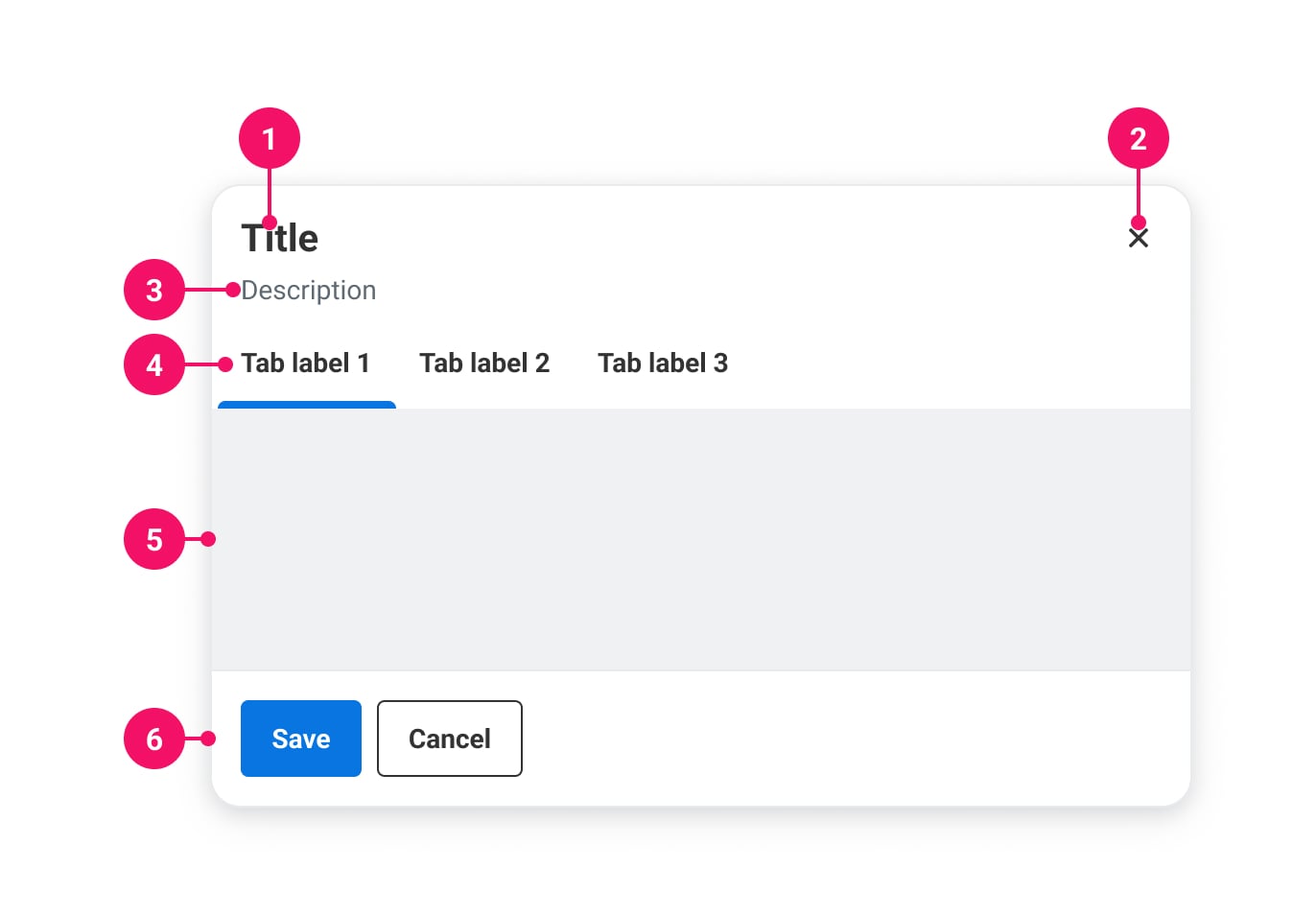
-
Title: Describes the purpose of the Modal
-
Close button: Dismisses the Modal
-
Description (optional): Description that adds more context
-
Tabs (optional): Built in tabs
-
Content: The main content
-
Actions (optional): Action buttons can be placed here
UsagePermalink to: Usage
The Modal is used for displaying content that requires immediate user attention or interaction, without leaving the context of the current page. When a Modal is shown, the rest of the page becomes inert until the Modal has been dismissed.
When to usePermalink to: When to use
- For short forms, brief information or confirmations prompts.
When not to usePermalink to: When not to use
- For longer bodies of text and forms, the Slide In is better suited, as it provides a better scroll experience for the user.
AccessibilityPermalink to: Accessibility
The Modal uses the native HTML dialog element(external link) which will ensure good accessibility in all modern browsers, including: native focus trapping, layering of several dialogs, backdrop and focus restoration.
Headings are requiredPermalink to: Headings are required
To ensure a meaningful title for the Modal, the heading prop is required.
A close label is requiredPermalink to: A close label is required
The Modal has a built-in close button, which ensures that the Modal will always have at least one focusable element, and that the first focused element is a method to dismiss the Modal. The close button needs a label passed with the closeLabel prop.
Focus restorationPermalink to: Focus restoration
For focus restoration to work, it is important that the element that triggers the Modal is still visible on the page when the Modal is dismissed. If that's not possible, focus restoration should be handled manually with the onDismiss callback.
ExamplesPermalink to: Examples
SizesPermalink to: Sizes
The Modal comes in four sizes:
| Name | Max width | Height | Fixed height |
|---|---|---|---|
| small | 512px | Hug content | ~316px |
| medium | 768px | Hug content | ~475px |
| large | 1024px | Hug content | ~712px |
| fullscreen | Fill viewport (minus padding) | Fill viewport (minus padding) | N/A |
The Modal's width will fill out the viewport (minus padding), until the viewport is bigger than the max width, where it will stay at max width and center itself in the viewport.
Fixed height is based on the golden ration relative to the max width (See Fixed height).
Open
import { useState } from "react";
import { Button } from "@peakon/bedrock/react/button";
import { Modal } from "@peakon/bedrock/react/dialog";
import { BodyText } from "@peakon/bedrock/react/typography";

function Snippet() {
  const [isModalOpen, setIsModalOpen] = useState(false);

  return (
    <>
      <Button variant="primary" onClick={() => setIsModalOpen(true)}>
        Open small modal
      </Button>
      <Modal
        open={isModalOpen}
        onDismiss={() => setIsModalOpen(false)}
        heading="Do you want to save this?"
        closeLabel="Close modal"
      >
        <Modal.Content>
          <BodyText>
            Lorem ipsum dolor sit amet, consectetur adipiscing elit. Vivamus id
            tortor tincidunt metus feugiat maximus.
          </BodyText>
        </Modal.Content>
        <Modal.Actions>
          <Button variant="primary" onClick={() => setIsModalOpen(false)}>
            Save
          </Button>
          <Button variant="secondary" onClick={() => setIsModalOpen(false)}>
            Cancel
          </Button>
        </Modal.Actions>
      </Modal>
    </>
  );
}
Open
import { useState } from "react";
import { Button } from "@peakon/bedrock/react/button";
import { Modal } from "@peakon/bedrock/react/dialog";
import { BodyText } from "@peakon/bedrock/react/typography";

function Snippet() {
  const [isModalOpen, setIsModalOpen] = useState(false);

  return (
    <>
      <Button variant="primary" onClick={() => setIsModalOpen(true)}>
        Open medium modal
      </Button>
      <Modal
        open={isModalOpen}
        onDismiss={() => setIsModalOpen(false)}
        heading="Do you want to save this?"
        closeLabel="Close modal"
        size="medium"
      >
        <Modal.Content>
          <BodyText>
            Lorem ipsum dolor sit amet, consectetur adipiscing elit. Vivamus id
            tortor tincidunt metus feugiat maximus.
          </BodyText>
        </Modal.Content>
        <Modal.Actions>
          <Button variant="primary" onClick={() => setIsModalOpen(false)}>
            Save
          </Button>
          <Button variant="secondary" onClick={() => setIsModalOpen(false)}>
            Cancel
          </Button>
        </Modal.Actions>
      </Modal>
    </>
  );
}
Open
import { useState } from "react";
import { Button } from "@peakon/bedrock/react/button";
import { Modal } from "@peakon/bedrock/react/dialog";
import { BodyText } from "@peakon/bedrock/react/typography";

function Snippet() {
  const [isModalOpen, setIsModalOpen] = useState(false);

  return (
    <>
      <Button variant="primary" onClick={() => setIsModalOpen(true)}>
        Open large modal
      </Button>
      <Modal
        open={isModalOpen}
        onDismiss={() => setIsModalOpen(false)}
        heading="Do you want to save this?"
        closeLabel="Close modal"
        size="large"
      >
        <Modal.Content>
          <BodyText>
            Lorem ipsum dolor sit amet, consectetur adipiscing elit. Vivamus id
            tortor tincidunt metus feugiat maximus.
          </BodyText>
        </Modal.Content>
        <Modal.Actions>
          <Button variant="primary" onClick={() => setIsModalOpen(false)}>
            Save
          </Button>
          <Button variant="secondary" onClick={() => setIsModalOpen(false)}>
            Cancel
          </Button>
        </Modal.Actions>
      </Modal>
    </>
  );
}
Open
import { useState } from "react";
import { Button } from "@peakon/bedrock/react/button";
import { Modal } from "@peakon/bedrock/react/dialog";
import { BodyText } from "@peakon/bedrock/react/typography";

function Snippet() {
  const [isModalOpen, setIsModalOpen] = useState(false);

  return (
    <>
      <Button variant="primary" onClick={() => setIsModalOpen(true)}>
        Open fullscreen modal
      </Button>
      <Modal
        open={isModalOpen}
        onDismiss={() => setIsModalOpen(false)}
        heading="Do you want to save this?"
        closeLabel="Close modal"
        size="fullscreen"
      >
        <Modal.Content>
          <BodyText>
            Lorem ipsum dolor sit amet, consectetur adipiscing elit. Vivamus id
            tortor tincidunt metus feugiat maximus.
          </BodyText>
        </Modal.Content>
        <Modal.Actions>
          <Button variant="primary" onClick={() => setIsModalOpen(false)}>
            Save
          </Button>
          <Button variant="secondary" onClick={() => setIsModalOpen(false)}>
            Cancel
          </Button>
        </Modal.Actions>
      </Modal>
    </>
  );
}
With descriptionPermalink to: With description
The Modal has an optional description situated between the header and Content.
Open
import { useState } from "react";
import { Button } from "@peakon/bedrock/react/button";
import { Modal } from "@peakon/bedrock/react/dialog";
import { BodyText } from "@peakon/bedrock/react/typography";

function Snippet() {
  const [isModalOpen, setIsModalOpen] = useState(false);

  return (
    <>
      <Button variant="primary" onClick={() => setIsModalOpen(true)}>
        Open modal
      </Button>
      <Modal
        open={isModalOpen}
        onDismiss={() => setIsModalOpen(false)}
        heading="Do you want to save this?"
        closeLabel="Close modal"
        description="Lorem ipsum dolor sit amet, consectetur adipiscing elit."
      >
        <Modal.Content>
          <BodyText>
            Lorem ipsum dolor sit amet, consectetur adipiscing elit. Vivamus id
            tortor tincidunt metus feugiat maximus.
          </BodyText>
        </Modal.Content>
        <Modal.Actions>
          <Button variant="primary" onClick={() => setIsModalOpen(false)}>
            Save
          </Button>
          <Button variant="secondary" onClick={() => setIsModalOpen(false)}>
            Cancel
          </Button>
        </Modal.Actions>
      </Modal>
    </>
  );
}
Interactive contentPermalink to: Interactive content
To make interactive content - such as form elements - stand out, you can add a grey background to the Modal content.
Open
import { useState } from "react";
import { Button } from "@peakon/bedrock/react/button";
import { Modal } from "@peakon/bedrock/react/dialog";
import { InputField } from "@peakon/bedrock/react/form";

function Snippet() {
  const [isModalOpen, setIsModalOpen] = useState(false);

  return (
    <>
      <Button variant="primary" onClick={() => setIsModalOpen(true)}>
        Open modal
      </Button>
      <Modal
        open={isModalOpen}
        onDismiss={() => setIsModalOpen(false)}
        heading="Personal information"
        closeLabel="Close modal"
      >
        <Modal.Content isInteractive>
          <InputField label="First name" />
        </Modal.Content>
        <Modal.Actions>
          <Button variant="primary" onClick={() => setIsModalOpen(false)}>
            Save
          </Button>
          <Button variant="secondary" onClick={() => setIsModalOpen(false)}>
            Close
          </Button>
        </Modal.Actions>
      </Modal>
    </>
  );
}
Fixed heightPermalink to: Fixed height
The default behavior for the Modal is to grow in height based on the content. For some Modals, eg. if content is expected to grow substantially, it works better if the height of the Modal is fixed. fixedHeight will set a fixed height, based on the size (See Sizes) of the Modal, as long as the viewport height allows it.
Open
import { useState } from "react";
import { Button } from "@peakon/bedrock/react/button";
import { Modal } from "@peakon/bedrock/react/dialog";
import { BodyText } from "@peakon/bedrock/react/typography";

function Snippet() {
  const [isModalOpen, setIsModalOpen] = useState(false);

  return (
    <>
      <Button variant="primary" onClick={() => setIsModalOpen(true)}>
        Open small modal
      </Button>
      <Modal
        open={isModalOpen}
        onDismiss={() => setIsModalOpen(false)}
        heading="Do you want to save this?"
        closeLabel="Close modal"
        fixedHeight
      >
        <Modal.Content>
          <BodyText>
            Lorem ipsum dolor sit amet, consectetur adipiscing elit. Vivamus id
            tortor tincidunt metus feugiat maximus.
          </BodyText>
        </Modal.Content>
        <Modal.Actions>
          <Button variant="primary" onClick={() => setIsModalOpen(false)}>
            Save
          </Button>
          <Button variant="secondary" onClick={() => setIsModalOpen(false)}>
            Cancel
          </Button>
        </Modal.Actions>
      </Modal>
    </>
  );
}
Open
import { useState } from "react";
import { Button } from "@peakon/bedrock/react/button";
import { Modal } from "@peakon/bedrock/react/dialog";
import { BodyText } from "@peakon/bedrock/react/typography";

function Snippet() {
  const [isModalOpen, setIsModalOpen] = useState(false);

  return (
    <>
      <Button variant="primary" onClick={() => setIsModalOpen(true)}>
        Open medium modal
      </Button>
      <Modal
        open={isModalOpen}
        onDismiss={() => setIsModalOpen(false)}
        heading="Do you want to save this?"
        closeLabel="Close modal"
        size="medium"
        fixedHeight
      >
        <Modal.Content>
          <BodyText>
            Lorem ipsum dolor sit amet, consectetur adipiscing elit. Vivamus id
            tortor tincidunt metus feugiat maximus.
          </BodyText>
        </Modal.Content>
        <Modal.Actions>
          <Button variant="primary" onClick={() => setIsModalOpen(false)}>
            Save
          </Button>
          <Button variant="secondary" onClick={() => setIsModalOpen(false)}>
            Cancel
          </Button>
        </Modal.Actions>
      </Modal>
    </>
  );
}
Open
import { useState } from "react";
import { Button } from "@peakon/bedrock/react/button";
import { Modal } from "@peakon/bedrock/react/dialog";
import { BodyText } from "@peakon/bedrock/react/typography";

function Snippet() {
  const [isModalOpen, setIsModalOpen] = useState(false);

  return (
    <>
      <Button variant="primary" onClick={() => setIsModalOpen(true)}>
        Open large modal
      </Button>
      <Modal
        open={isModalOpen}
        onDismiss={() => setIsModalOpen(false)}
        heading="Do you want to save this?"
        closeLabel="Close modal"
        size="large"
        fixedHeight
      >
        <Modal.Content>
          <BodyText>
            Lorem ipsum dolor sit amet, consectetur adipiscing elit. Vivamus id
            tortor tincidunt metus feugiat maximus.
          </BodyText>
        </Modal.Content>
        <Modal.Actions>
          <Button variant="primary" onClick={() => setIsModalOpen(false)}>
            Save
          </Button>
          <Button variant="secondary" onClick={() => setIsModalOpen(false)}>
            Cancel
          </Button>
        </Modal.Actions>
      </Modal>
    </>
  );
}
With TabsPermalink to: With Tabs
The Modal has built-in Tabs if you need to add several views.
Open
import { useState } from "react";
import { Button } from "@peakon/bedrock/react/button";
import { Modal } from "@peakon/bedrock/react/dialog";
import { BodyText } from "@peakon/bedrock/react/typography";

function Snippet() {
  const [isModalOpen, setIsModalOpen] = useState(false);

  return (
    <>
      <Button variant="primary" onClick={() => setIsModalOpen(true)}>
        Open modal with tabs
      </Button>
      <Modal
        open={isModalOpen}
        onDismiss={() => setIsModalOpen(false)}
        heading="Information"
        closeLabel="Close modal"
      >
        <Modal.TabList>
          <Modal.Tab name="tab1">Tab 1</Modal.Tab>
          <Modal.Tab name="tab2">Tab 2</Modal.Tab>
        </Modal.TabList>

        <Modal.Content>
          <Modal.TabPanel controlledBy="tab1">
            <BodyText>This is the first tab.</BodyText>
          </Modal.TabPanel>
          <Modal.TabPanel controlledBy="tab2">
            <BodyText>This is the second tab.</BodyText>
          </Modal.TabPanel>
        </Modal.Content>

        <Modal.Actions>
          <Button variant="secondary" onClick={() => setIsModalOpen(false)}>
            Close
          </Button>
        </Modal.Actions>
      </Modal>
    </>
  );
}CompositionPermalink to: Composition
The composite nature of the Modal will let you extend the design by adding elements anywhere inside the container, eg. between the header and the content.
Open
import { useState } from "react";
import { Button } from "@peakon/bedrock/react/button";
import { Modal } from "@peakon/bedrock/react/dialog";
import { BodyText } from "@peakon/bedrock/react/typography";
import { Tag } from "@peakon/bedrock/react/tag";

function Snippet() {
  const [isModalOpen, setIsModalOpen] = useState(false);

  return (
    <>
      <Button variant="primary" onClick={() => setIsModalOpen(true)}>
        Open modal
      </Button>
      <Modal
        open={isModalOpen}
        onDismiss={() => setIsModalOpen(false)}
        heading="Do you want to save this?"
        closeLabel="Close modal"
      >
        <div style={{ paddingInline: "16px", paddingBlockEnd: "12px" }}>
          <Tag label="Custom composition" variant="custom" />
        </div>
        <Modal.Content>
          <BodyText>
            Lorem ipsum dolor sit amet, consectetur adipiscing elit. Vivamus id
            tortor tincidunt metus feugiat maximus.
          </BodyText>
        </Modal.Content>
        <Modal.Actions>
          <Button variant="primary" onClick={() => setIsModalOpen(false)}>
            Save
          </Button>
          <Button variant="secondary" onClick={() => setIsModalOpen(false)}>
            Cancel
          </Button>
        </Modal.Actions>
      </Modal>
    </>
  );
}
Props TablePermalink to: Props Table
ModalPermalink to: Modal
Props extend from HTML Dialog Element(external link), with the omission of className and style
| Name | Type | Description | Default | Required |
|---|---|---|---|---|
ref | HTMLDialogElement | Forwards a ref to the Modal. | — | No |
heading | string | The heading for the Modal. | — | Yes |
closeLabel | string | The label for the close button of the Modal (for assistive technology). | — | Yes |
description | string | An optional description for the Modal, underneath the header. | — | No |
open | boolean | Controls whether the Modal is open or not. | — | No |
onDismiss | () => void | Callback function for when the Modal is dismissed internally, e.g. with the escape key. Make sure to set it explicitly e.g. | — | No |
onMountedChange | (isMounted: boolean) => void | Callback function for when the Modal is mounted and unmounted. | — | No |
size | small | medium | large | fullscreen | Defines the size of the Modal. | small | No |
fixedHeight | boolean | Defines whether the Modal has a fixed height. | false | No |
defaultTab | string | For defining what Tab should be active by default when using uncontrolled Tabs. | — | No |
activeTab | string | Defines the current active Tab. Used alongside | — | Yes, when controlled |
onTabChange | function | For controlling the changing of Tabs and any side effects. Used alongside | — | Yes, when controlled |
Modal.ContentPermalink to: Modal.Content
Props extend from HTML Div Element(external link), with the omission of className and style
| Name | Type | Description | Default | Required |
|---|---|---|---|---|
isInteractive | string | Will give the content a grey background when | — | Yes |
noPadding | boolean | The label for the close button of the Modal (for assistive technology). | — | Yes |
Modal.ActionsPermalink to: Modal.Actions
Props extend from HTML Div Element(external link), with the omission of className and style
Modal.TabListPermalink to: Modal.TabList
Props extend from HTML Div Element(external link), with the omission of className, style, role, aria-labelledby and aria-label
Modal.TabPermalink to: Modal.Tab
Props extend from HTML Div Element(external link), with the omission of className, style, aria-controls, tabIndex and role
| Name | Type | Description | Default | Required |
|---|---|---|---|---|
name | string | A reference for the Tab. Internally, a unique ID is built using this name that will be used to link to a corresponding TabPanel. | — | Yes |
Modal.TabPanelPermalink to: Modal.TabPanel
Props extend from HTML Div Element(external link), with the omission of className and style
| Name | Type | Description | Default | Required |
|---|---|---|---|---|
controlledBy | string | Defines which Tab the TabPanel is controlled by, ie. which Tab will reveal the TabPanel contents when active. It must correspond to the | — | Yes |