The Text Area is used when user input can span multiple lines.
AnatomyPermalink to: Anatomy
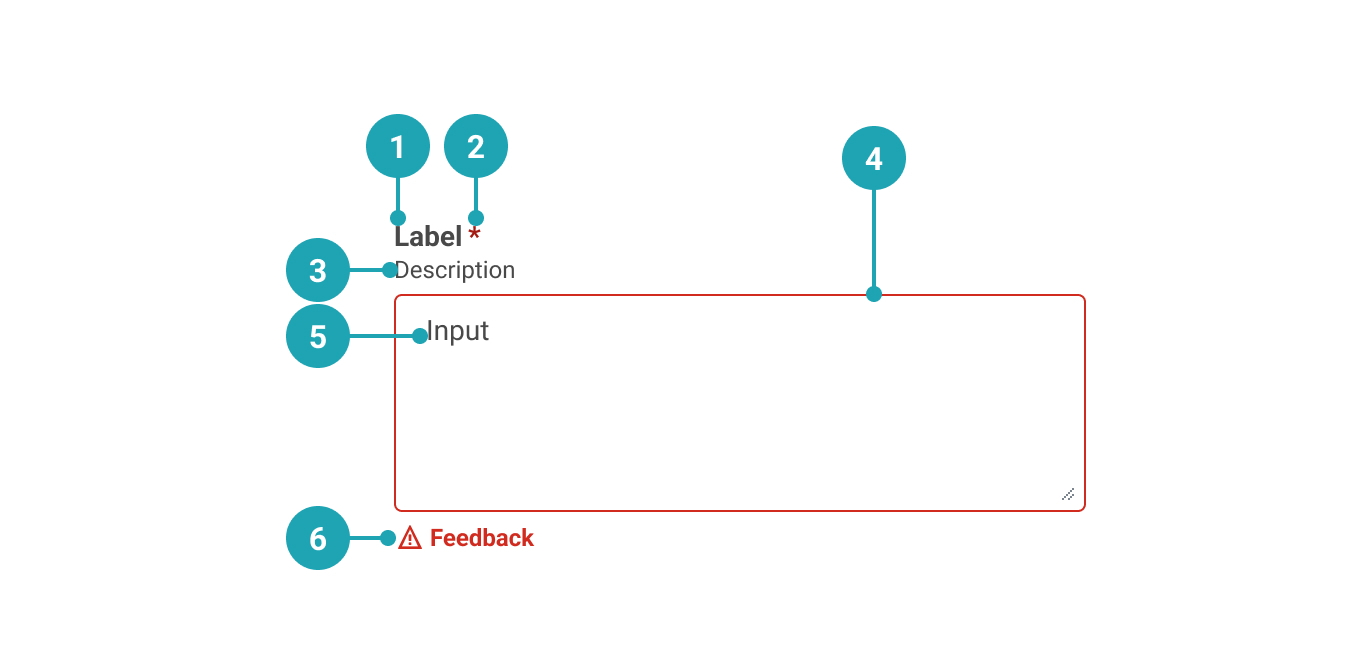
- Label: Text that accurately describes the purpose of the Text Area.
- Required (optional): Used to indicate whether the Text Area needs to be filled out.
- Description (optional): Used to add further context for the purpose of the Text Area.
- Container: Text Area container.
- Value: The value that the user has entered.
- Feedback (optional): Used for feedback messages.
UsagePermalink to: Usage
The Text Area is used when the user's input is longer and potentially spanning multiple lines. Note that the input of a Text Area can not be validated in any other way than whether there is content or not.
When to usePermalink to: When to use
- For longer, multi-line entries, eg. when the user needs to leave a comment or other feedback.
When not to usePermalink to: When not to use
- For short/one-line content - use Input Field.
AccessibilityPermalink to: Accessibility
Placeholder textPermalink to: Placeholder text
It is discouraged to use the placeholder attribute on Text Areas as users can have a hard time distinguishing the placeholder text from pre-filled content.
Hiding the labelPermalink to: Hiding the label
The Text Area requires an accessible name, which is provided by the label.
In some rare cases, ie. in a large table view, it might be visually preferrable to not show the label and instead rely on the row/column header to act as a visual label. In such cases it is possible to hide the label.
Don't use this solution just to minimise vertical space in the user interface, as that will most likely lead to a violation of the WCAG 2.1 AA accessibility guidelines(external link).
ExamplesPermalink to: Examples
DefaultPermalink to: Default
Open
import { TextArea } from "@peakon/bedrock/react/form";

function Snippet() {
  return <TextArea label="Insert comment" />;
}DisabledPermalink to: Disabled
A Text Area can be rendered as disabled by adding the disabled attribute.
Open
import { TextArea } from "@peakon/bedrock/react/form";

function Snippet() {
  return <TextArea label="Insert comment (disabled)" disabled />;
}
Read onlyPermalink to: Read only
A Text Area can be rendered as read only by adding the readOnly attribute.
Open
import { TextArea } from "@peakon/bedrock/react/form";

function Snippet() {
  return (
    <TextArea label="Input name" readOnly defaultValue="You can't touch me!" />
  );
}RequiredPermalink to: Required
It is possible to force the user to enter content by using required attribute.
Open
import { TextArea } from "@peakon/bedrock/react/form";

function Snippet() {
  return <TextArea label="Insert comment (required)" required />;
}
With DescriptionPermalink to: With Description
To provide the user with more context it is possible to add descriptive text.
Open
import { TextArea } from "@peakon/bedrock/react/form";

function Snippet() {
  return (
    <TextArea
      label="Insert comment"
      description="A description to add context"
    />
  );
}
With FeedbackPermalink to: With Feedback
You can provide neutral or informative feedback on input with feedbackMessage
Open
import { TextArea } from "@peakon/bedrock/react/form";

function Snippet() {
  return <TextArea label="Insert comment" feedbackMessage="Feedback message" />;
}StatusPermalink to: Status
If you want to provide specifically succcess or error feedback, add status to the Text Area. When using the status prop, remember to provide a feedbackMessage as well.
Open
import { TextArea } from "@peakon/bedrock/react/form";
import { Stack } from "@peakon/bedrock/react/layout";

function Snippet() {
  return (
    <Stack spacing={16}>
      <TextArea
        label="Insert comment"
        status="success"
        feedbackMessage="Successful Feedback message"
      />
      <TextArea
        label="Insert comment"
        status="error"
        feedbackMessage="Error Feedback message"
      />
    </Stack>
  );
}
Input SizePermalink to: Input Size
The inputSize prop controls the size of the text area. Use small for compact layouts.
Open
import { TextArea } from "@peakon/bedrock/react/form";
import { Stack } from "@peakon/bedrock/react/layout";

function Snippet() {
  return (
    <Stack spacing={16}>
      <TextArea label="Medium text area (default)" />
      <TextArea label="Small text area" inputSize="small" />
    </Stack>
  );
}
Hide LabelPermalink to: Hide Label
Open
import { TextArea } from "@peakon/bedrock/react/form";

function Snippet() {
  return <TextArea label="Insert comment" hideLabel />;
}
Custom HeightPermalink to: Custom Height
The Text Area can be set to contain a specific amount of lines of text (default is two) by using the native HTML attribute rows.
Open
import { TextArea } from "@peakon/bedrock/react/form";

function Snippet() {
  return <TextArea label="Insert comment" rows={8} />;
}
No ResizePermalink to: No Resize
TextAreas can be resized vertically by default, but it is possible to prevent this behaviour by adding the noResize prop. Please use this with caution as it can lead to a inferior user experience.
Open
import { TextArea } from "@peakon/bedrock/react/form";

function Snippet() {
  return <TextArea label="Insert comment" noResize />;
}ControlledPermalink to: Controlled
You can make an Text Area controlled with the value and onChange props. Pass a function to onChange that handles the change behaviour.
Open
import { useState } from "react";
import { TextArea } from "@peakon/bedrock/react/form";

function Snippet() {
  const [value, setValue] = useState("This value is controlled!");

  return (
    <TextArea
      label="Insert comment"
      value={value}
      onChange={(event) => setValue(event.target.value)}
    />
  );
}
Props TablePermalink to: Props Table
Props extend from HTML Textarea Element(external link), with the omission of className, style, aria-labelledby and aria-label
| Name | Type | Description | Default | Required |
|---|---|---|---|---|
ref | HTMLTextAreaElement | Forwards a ref to the TextArea. | — | No |
label | string | Used to render the label that describes the purpose of the TextArea. | — | Yes |
hideLabel | boolean | Hides the label (visually) — Please read the section on accessibility before utilising this option. | — | No |
readOnly | boolean | Determines whether the user can interact with the TextArea — a readonly TextArea will still be available for keyboard users and assistive technologies. | — | No |
description | string | Renders a description below the label to give further information on how to fill out the TextArea. | — | No |
defaultValue | string | Used to set the uncontrolled value of the TextArea. | — | No |
value | string | Used to set the controlled value of the TextArea. | — | No |
feedbackMessage | string | Used to provide feedback below the TextArea. | — | No |
status | error | success | Used to indicate the status of the TextArea. Passing 'error' will render the input border and feedback message in red. | — | No |
noResize | boolean | Setting this prop will prevent the TextArea from being resizable. | — | No |
inputSize | small | medium | Controls the size of the text area. Use 'small' for compact layouts. | medium | No |