A Toggle Switch is used to switch between two states, most commonly “on”/“off”.
AnatomyPermalink to: Anatomy
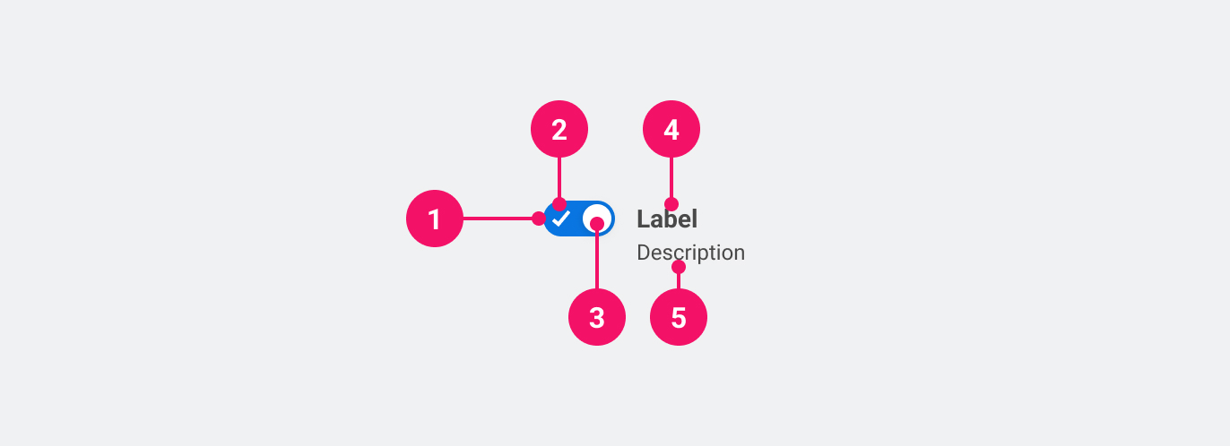
- Toggle Switch Container: The container of the control.
- On indicator: Indicator that shows the Toggle Switch is in the "on" position.
- Thumb: Togglable element to indicate the change. Can also indicate a locked Toggle Switch.
- Label: Text that describes very clearly what is being turned on or off.
UsagePermalink to: Usage
Only use the Toggle Switch when the state is automatically saved upon switching.
When to usePermalink to: When to use
- Use inside large data tables, where the user can turn on a setting.
When not to usePermalink to: When not to use
- For forms where the user has to submit by activating a button (ie. “Save” or “Submit”) you should use either a group of Radio Buttons or a Checkbox.
AccessibilityPermalink to: Accessibility
Always make sure that the label for the Toggle Switch is visible.
If the Toggle Switch is placed inside a table or another similar pattern, it is possible to rely on other UI elements, ie. a table header or a heading element, to convey the purpose of the switch. In such cases it is still required to pass the label prop but it should then be combined with the hideLabel prop.
If further context is needed the aria-describedby attribute could be used in the same manner.
ExamplesPermalink to: Examples
DefaultPermalink to: Default
Open
import { ToggleSwitch } from "@peakon/bedrock/react/form";

function Snippet() {
  return <ToggleSwitch label="Settings" />;
}DisabledPermalink to: Disabled
The disabled state on the Toggle Switch is used when an option is unavailable, either due to system setting, admin choice or a previous choice made by the user themselves. When using a disabled Toggle Switch be sure to inform the user why it's disabled.
Open
import { ToggleSwitch } from "@peakon/bedrock/react/form";

function Snippet() {
  return <ToggleSwitch label="Setting" disabled />;
}LockedPermalink to: Locked
A locked Toggle Switch can appear if the user doesn't have the correct rights or the system settings is preventing them from toggling the switch. When using a locked Toggle Switch be sure to inform the user why it's disabled.
Open
import { ToggleSwitch } from "@peakon/bedrock/react/form";

function Snippet() {
  return <ToggleSwitch label="Setting" locked />;
}
Hide LabelPermalink to: Hide Label
Open
import { ToggleSwitch } from "@peakon/bedrock/react/form";
import { Stack } from "@peakon/bedrock/react/layout";

function Snippet() {
  return (
    <Stack spacing={8}>
      <h1 id="heading">Notifications</h1>

      <table>
        <tbody>
          <tr>
            <td width="100%" style={{ verticalAlign: "middle" }}>
              Comments
            </td>
            <td>
              <ToggleSwitch label="Comments" hideLabel />
            </td>
          </tr>
          <tr>
            <td style={{ verticalAlign: "middle" }}>Direct messages</td>
            <td>
              <ToggleSwitch label="Direct messages" hideLabel />
            </td>
          </tr>
          <tr>
            <td style={{ verticalAlign: "middle" }}>Event updates</td>
            <td>
              <ToggleSwitch label="Event updates" hideLabel />
            </td>
          </tr>
          <tr>
            <td style={{ verticalAlign: "middle" }}>Shares</td>
            <td>
              <ToggleSwitch label="Shares" hideLabel />
            </td>
          </tr>
        </tbody>
      </table>
    </Stack>
  );
}
With descriptionPermalink to: With description
To provide the user with more context it is possible to add descriptive text.
Open
import { ToggleSwitch } from "@peakon/bedrock/react/form";

function Snippet() {
  return <ToggleSwitch label="Setting" description="This is a description." />;
}ControlledPermalink to: Controlled
You can a Toggle Switch controlled with the checked and onChange props.
Open
import { useState } from "react";
import { ToggleSwitch } from "@peakon/bedrock/react/form";

function Snippet() {
  const [isToggled, setIsToggled] = useState<boolean>(false);

  return (
    <ToggleSwitch
      label="Settings"
      checked={isToggled}
      onChange={(event) => setIsToggled(event.target.checked)}
    />
  );
}
Props tablePermalink to: Props table
Props extend from HTML Input Element(external link), with the omission of className, style, type, aria-labelledby and aria-label
| Name | Type | Description | Default | Required |
|---|---|---|---|---|
ref | HTMLInputElement | Forwards a ref to the ToggleSwitch. | — | No |
label | string | The descriptive name of the Toggle Switch. | — | Yes |
hideLabel | boolean | Hides the label (visually) — Please read the section on accessibility before utilising this option. | — | No |
description | string | Renders a description below the label to give further information on how to fill out the ToggleSwitch. | — | No |
checked | boolean | Used to set the controlled value of the ToggleSwitch. | — | No |
defaultChecked | boolean | Used to set the uncontrolled value of the ToggleSwitch. | — | No |
locked | boolean | Renders the ToggleSwitch as disabled, with the addition of a locked icon and the 'not-allowed' cursor. | — | No |