TL;DR Only use purpose color variables for UI design - never brand colors,Permalink to: TL;DR Only use purpose color variables for UI design - never brand colors,
never hexcodes.
OverviewPermalink to: Overview
Purpose colors are color tokens - color variables available to designers and engineers when designing and developing features. But purpose colors are different from normal color tokens; they have specific purposes, and are not allowed to have a name that refers to any color, hue or tone.
Instead of using color tokens named brand-green and blueberry400 directly on UI components, we use reusable abstractions like --color-controls-border, --color-text-inverted and --color-status-negative.
The purpose colors then map to brand color tokens, like –color-status-positive: var(--wdc-color-kiwi-600);
Why would we want to do this? This makes it easy for the design system team to maintain, and maybe more importantly: change globally. For example, this gives us the ability to deploy other color themes, like dark mode or something entirely different, without having to maintain multiple themes across every single component.
This is why it is important to use the correct purpose colors when designing. If the provided purpose colors don't cover a new use case, we can create a new purpose color.
UsagePermalink to: Usage
When to usePermalink to: When to use
- UI elements
- UI Modules
- Feature designs
- System Icons must use
currentColor, and will in turn inherit the color applied to the parent element.
When not to usePermalink to: When not to use
- Graphic Icons
- Driver Icons
- UI Illustrations
- Brand design
All can use the Canvas brand palette freely.
StatusPermalink to: Status
The current purpose color system was developed in 2021, when we were tasked with changing the UI colors to match Workday’s Canvas design system(external link).
This meant we had to set up the color system to fit the old Peakon color usage, and retrofit the Canvas colors.
This has resulted in some unfortunate naming, confusing structure, and duplicate purposes.
Naming will be fixed, structure will be redone and duplicates will be deprecated.
Text colorsPermalink to: Text colors
Only use these on text and label elements. Do not apply directly to icons/illustrations/borders/etc. System icons can inherit these if applied to a parent component, eg. an Alert.
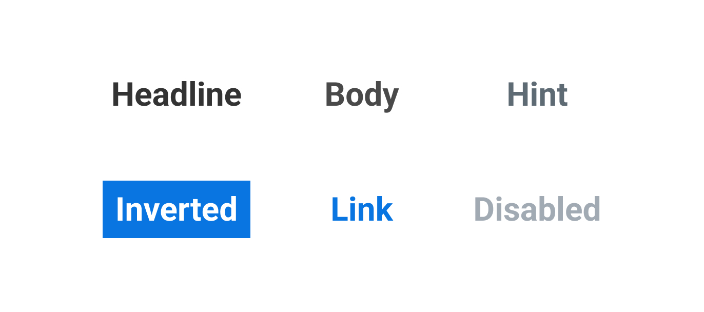
HeadlinePermalink to: Headline
Most commonly used text color. Always used on headlines. Always used in controls.
BodyPermalink to: Body
Used on paragraphs. Never used on headlines.
HintPermalink to: Hint
Used on paragraphs that is used for tips/hints about an action you can take on the page.
Text InvertedPermalink to: Text Inverted
Used on ANY text placed on an inverted, dark enough background. Double check whether you are within the WCAG 2.1 AA contrast range.
Text LinkPermalink to: Text Link
Used in paragraphs to highlight a link with blue - remember that a discreet link with just an underline in a paragraph in also okay.
Text DisabledPermalink to: Text Disabled
Used on labels for disabled controls.
BackgroundsPermalink to: Backgrounds
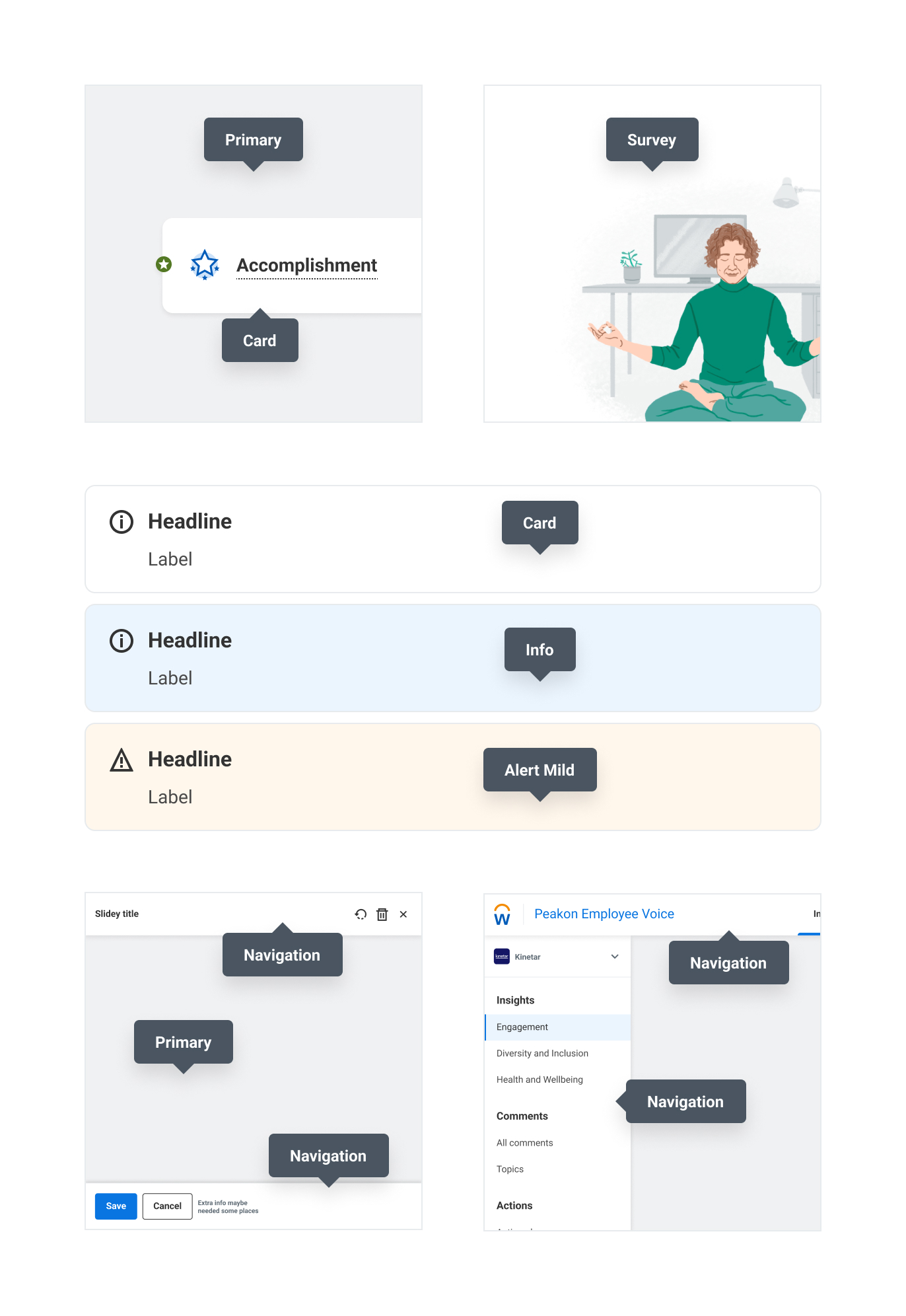
PrimaryPermalink to: Primary
NavigationPermalink to: Navigation
Used on all navigation UI elements. Navbar, slidey panel header, savebar, etc.
CardPermalink to: Card
Used on cards and sticks. Do not apply to navigation components.
SurveyPermalink to: Survey
The survey is much less visually complicated than the dashboard, so we don’t need a tinted color to have contrast to cards and sticks. We did make a special purpose color to be able to support a dark mode that doesn’t necessarily share the same tone as the backgrounds defined above.
OverlayPermalink to: Overlay
Used whenever the user triggers a modal, a lightbox or a slidey-panel.
Status backgroundsPermalink to: Status backgrounds
BorderPermalink to: Border
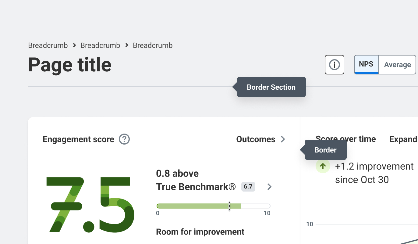
Our cards used to have a border, due to the lack of drop shadows. Now that we have the drop shadows from Canvas, we’ve removed the outer strokes from cards, but still use the same purpose-color to divide large cards. Also used in drop lists, and to separate sections on white background.
Used to separate sections on bg-primary
Button ColorsPermalink to: Button Colors
The button purpose colors are a great example of where the old Peakon brand to Workday transition led to way too many purpose colors. This will be cleaned up.
Read more about how to choose the correct button here
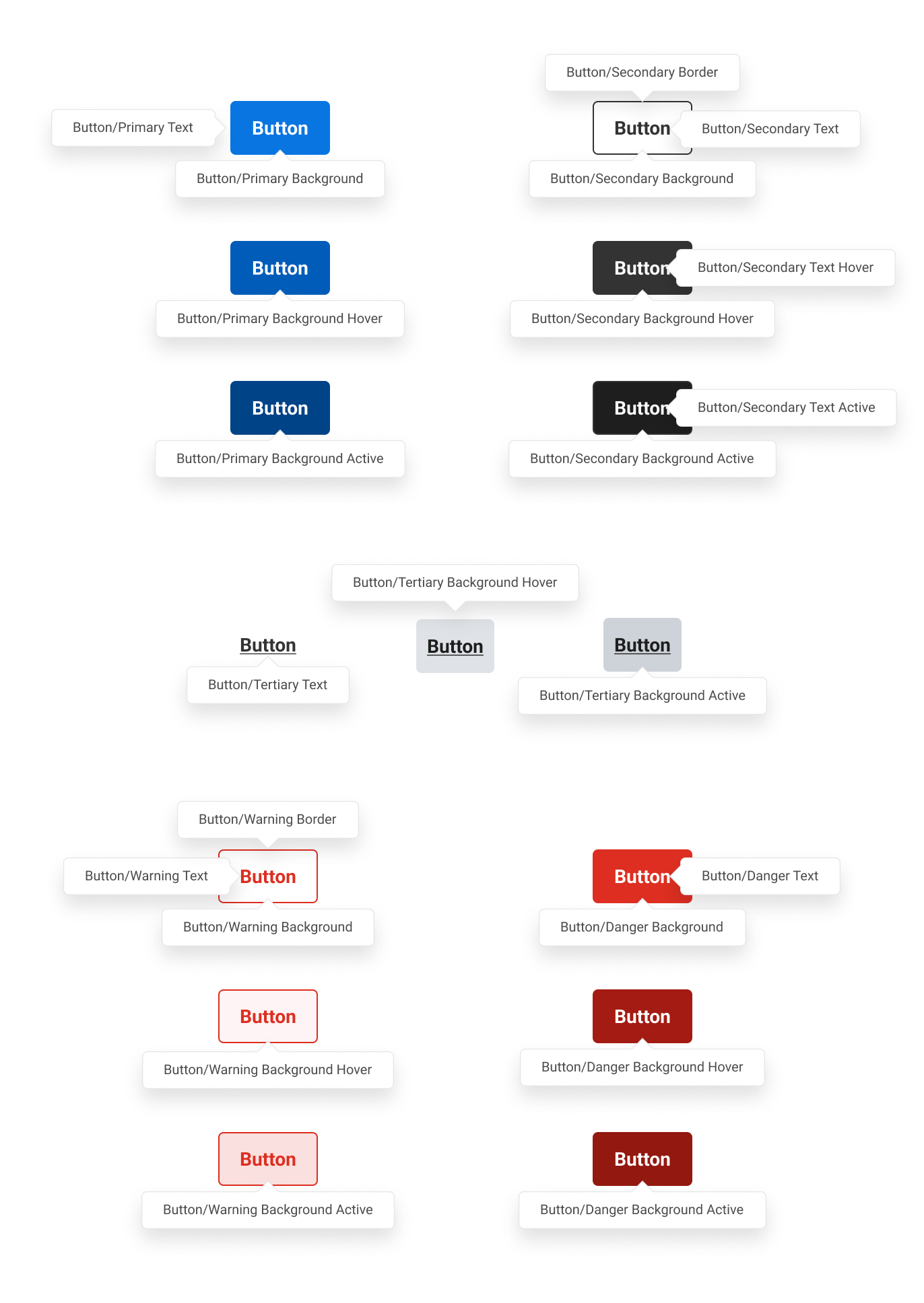
PrimaryPermalink to: Primary
SecondaryPermalink to: Secondary
TertiaryPermalink to: Tertiary
WarningPermalink to: Warning
DangerPermalink to: Danger
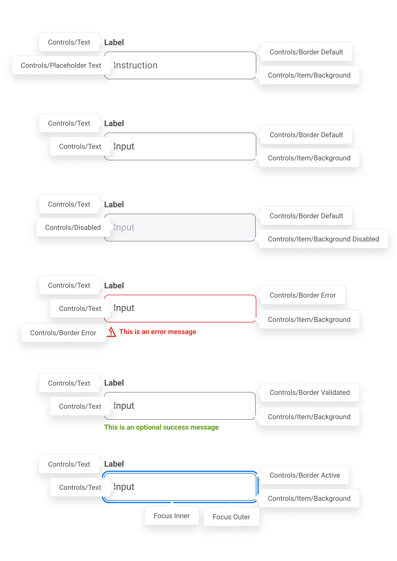
ControlsPermalink to: Controls
Our form controls share these purpose colors. For example, the inputs, selects, checkboxes, radio buttons, etc. all have the same border, the same background color, the same selected-marker.
Focus colorPermalink to: Focus color
These control the focus state. There are 4 different versions of focus indication:
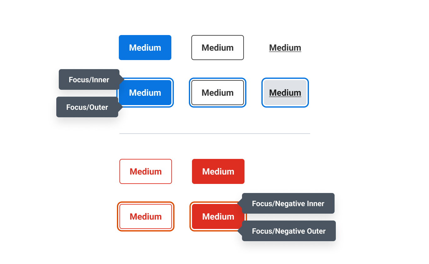
| Variant | Description |
|---|---|
| Blue/White/Outer | Around normal controls |
| White/Blue/Inner | When focusing inside a list/toggle group |
| Red/White/Outer | Around negative controls like a Delete button |
| White/Red/Inner | When focusing inside a list/toggle group on negative options |
Status ColorsPermalink to: Status Colors
Used to indicate statuses. Like On/Off for an attribute, Positive/Alert/Negative for privacy settings on sensitive attributes.
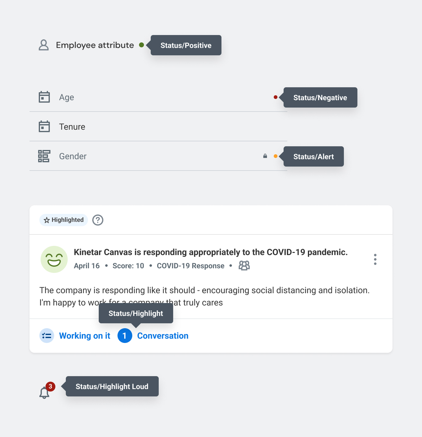
Note: Only relying on color to indicate a status is not enough. For accessibility, we need to be more verbose - not only for color blind users who often can’t tell the difference between red and green, but also blind users with screen readers.
Conversation ColorsPermalink to: Conversation Colors
The conversation colors are used to tell the difference between a reply, the user's own messages, and notes - an internal discussion feature between managers.
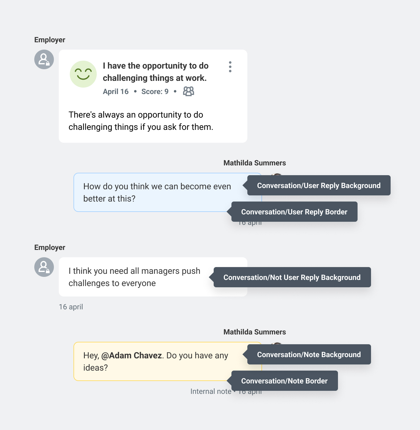
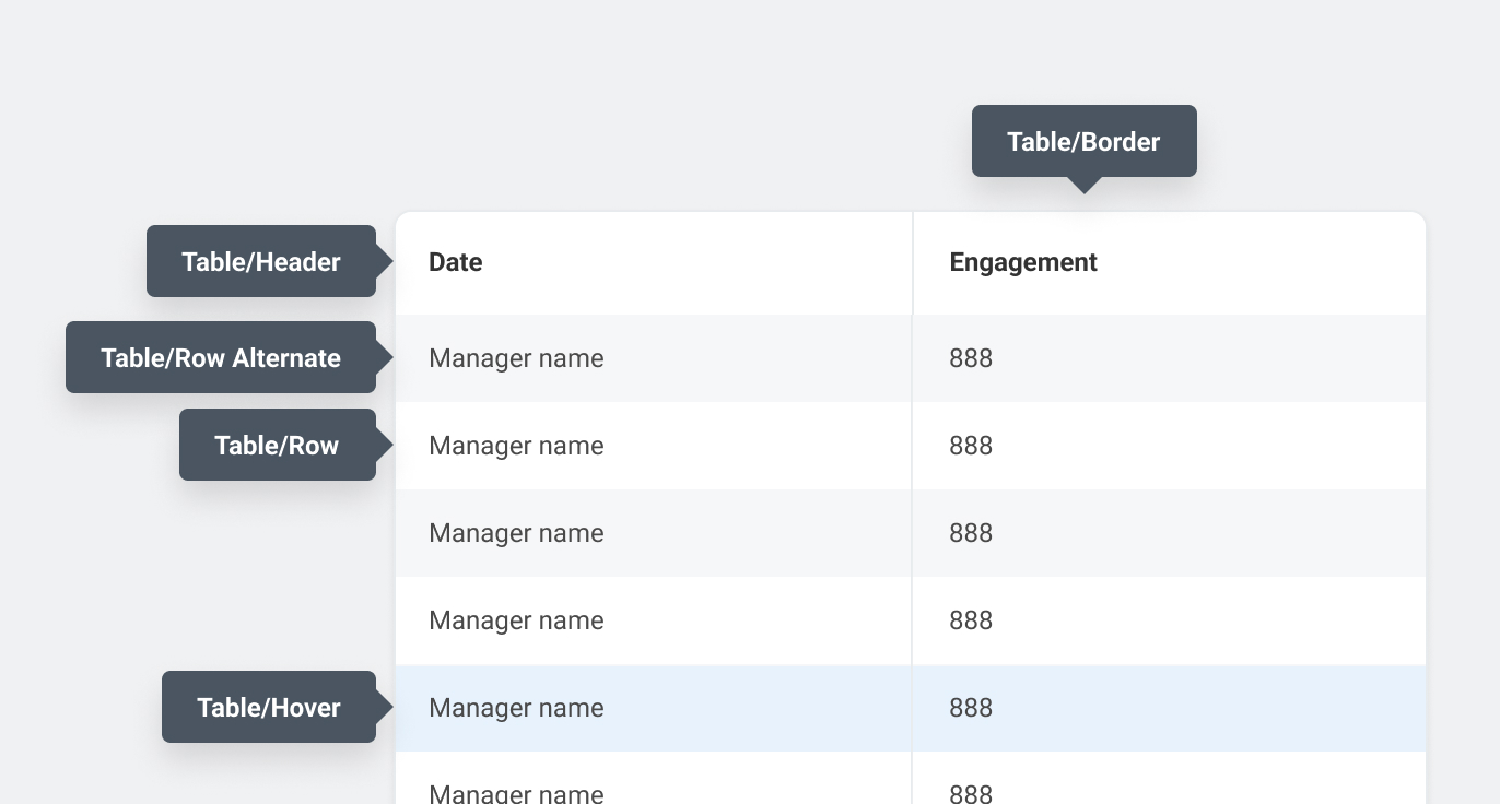
Table ColorsPermalink to: Table Colors
Central colors for our tables.
Not all tables need table-row-alt. That’s up to the designer whether it is necessary. Only wide tables are required to have “zebra striping” to help with following rows.
Placeholder ColorsPermalink to: Placeholder Colors
Used for the placeholder avatars shown when the user hasn’t uploaded a profile picture. The 5 color combinations are picked “randomly”, based on a seed taken from the first character in the first name, and the first character in the last name.
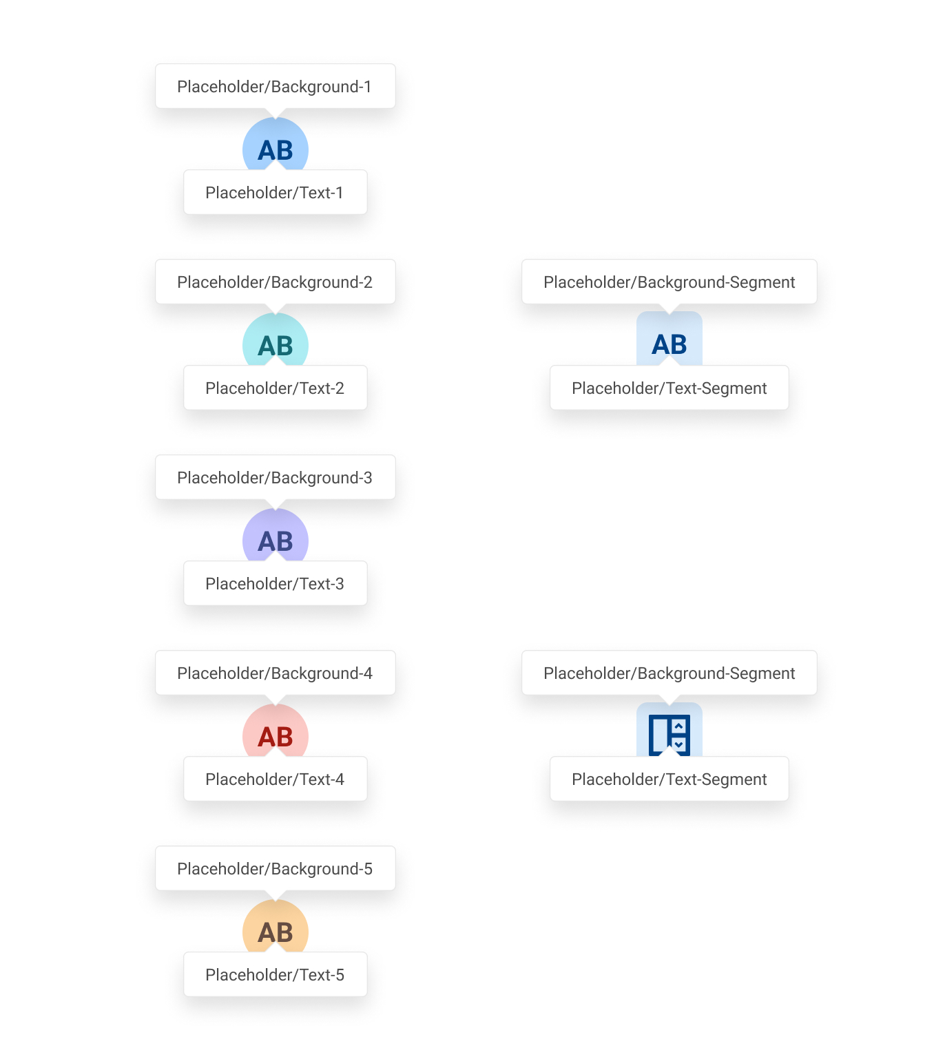
Was also used for randomizing segment icon colors, before the rebrand to Workday. Now all segments are the same color.
Score ColorsPermalink to: Score Colors
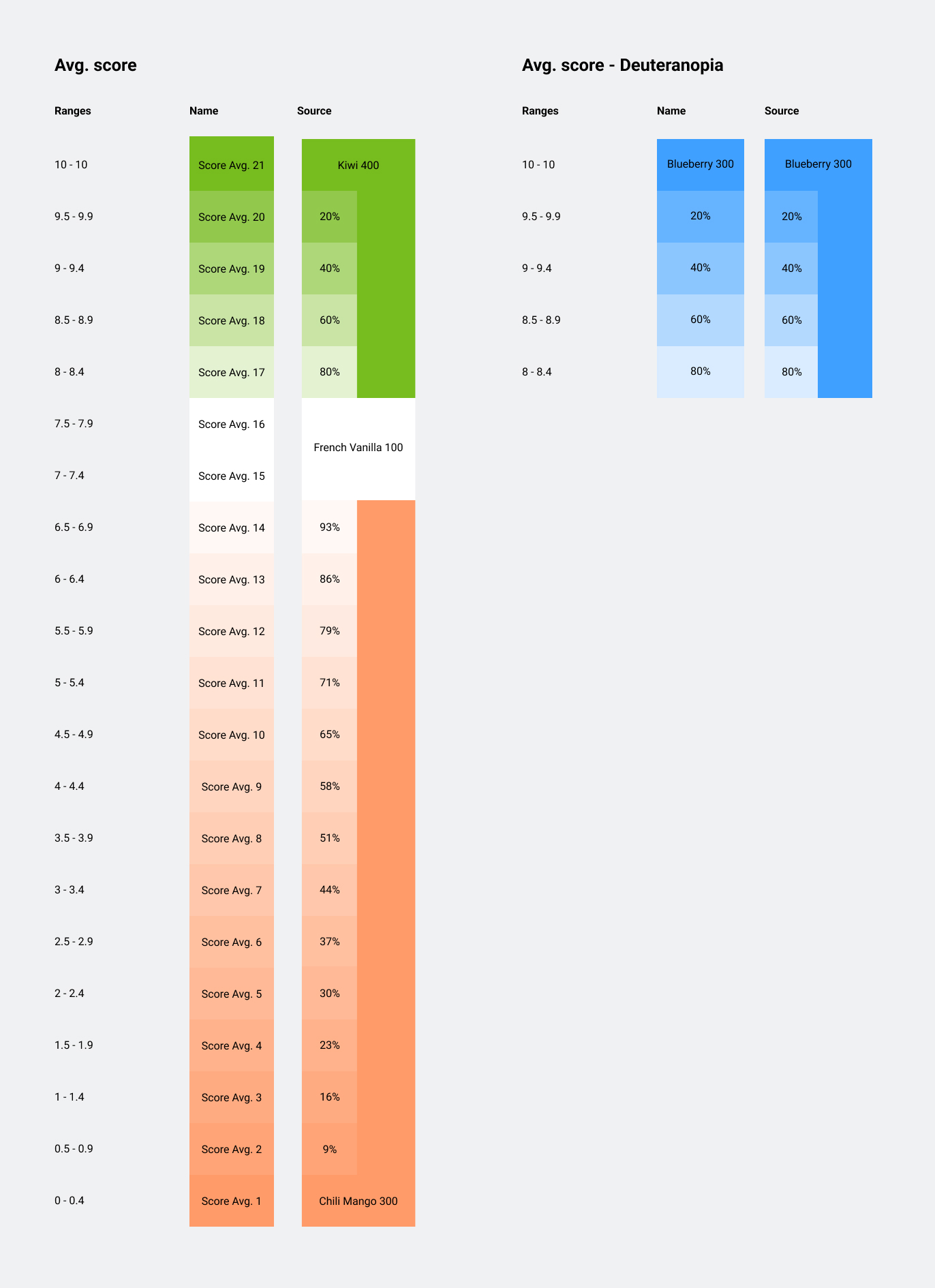
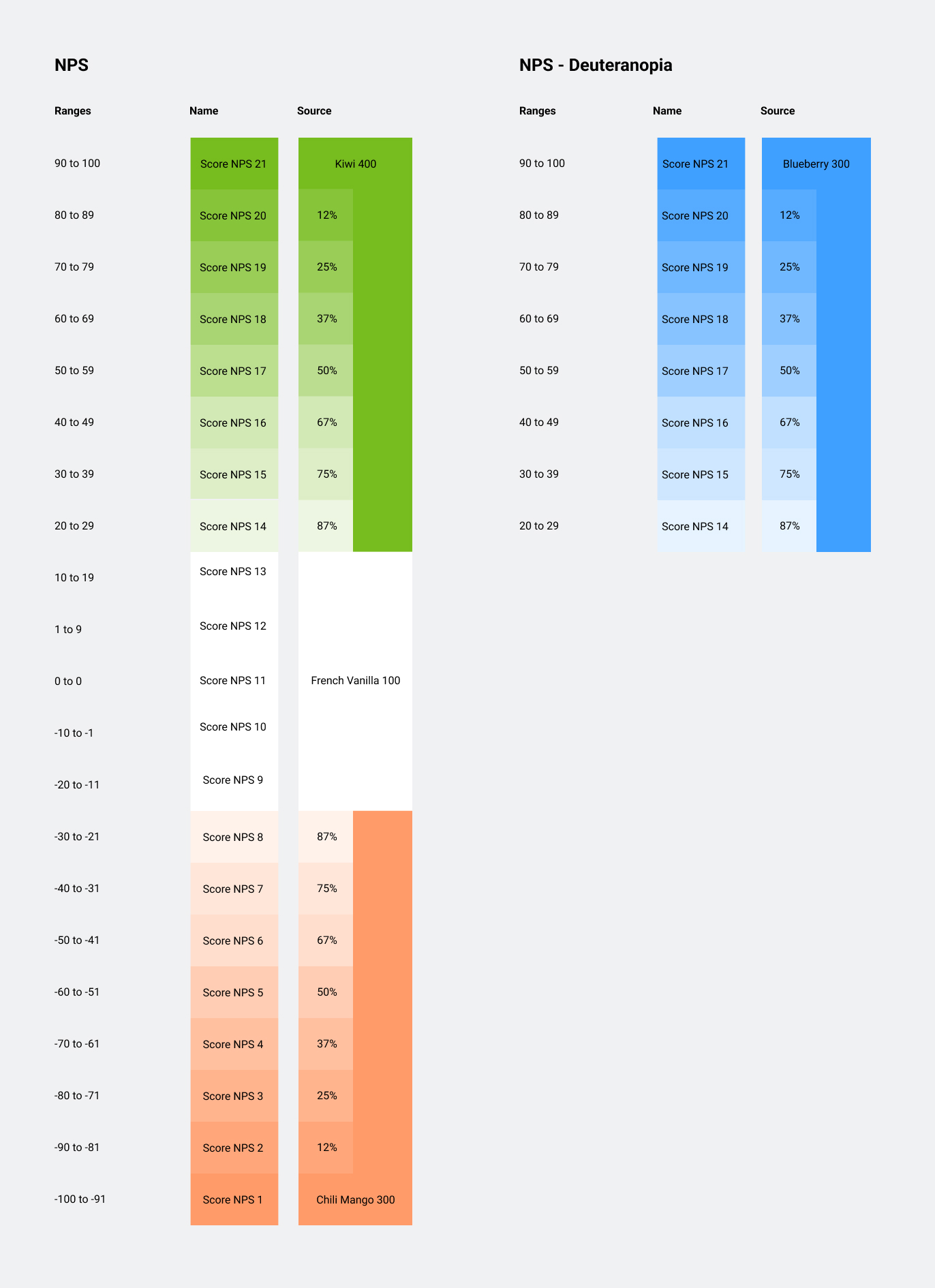
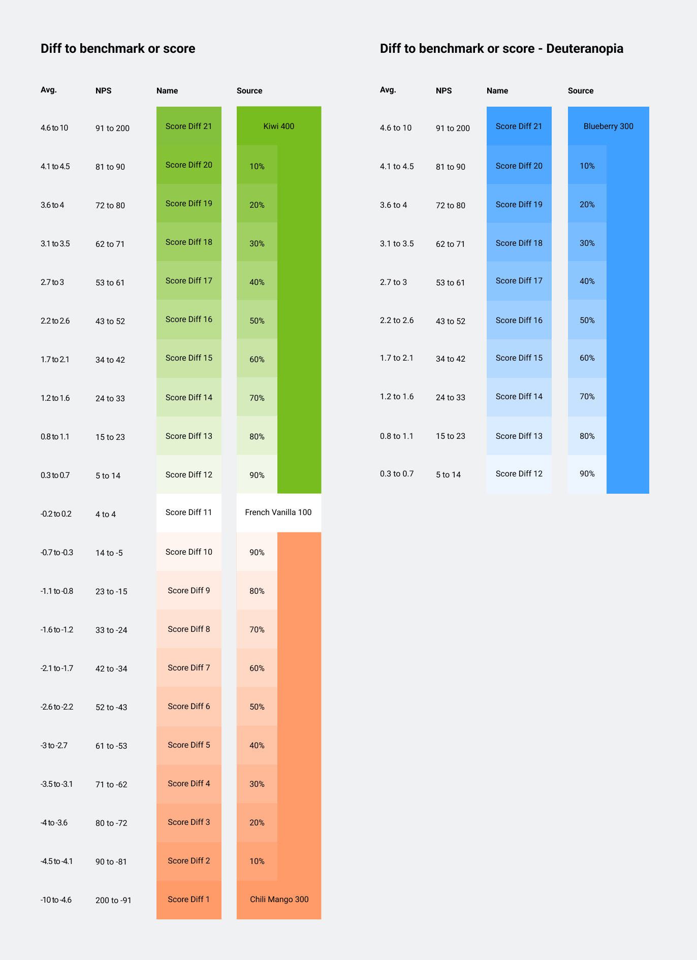
All green score colors have a blue backup for users with red-green color blindness. See Deuteranopia
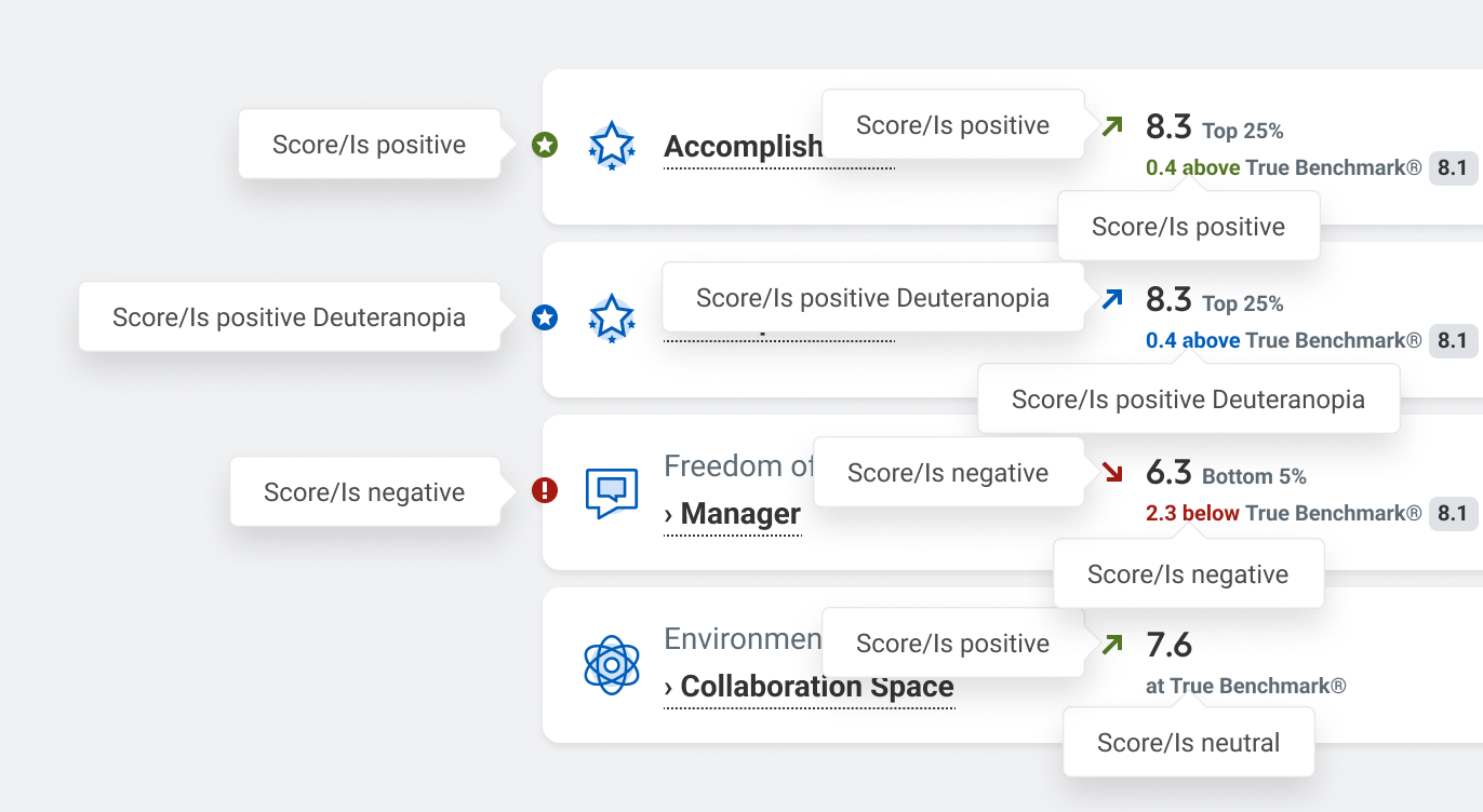
BenchmarkPermalink to: Benchmark
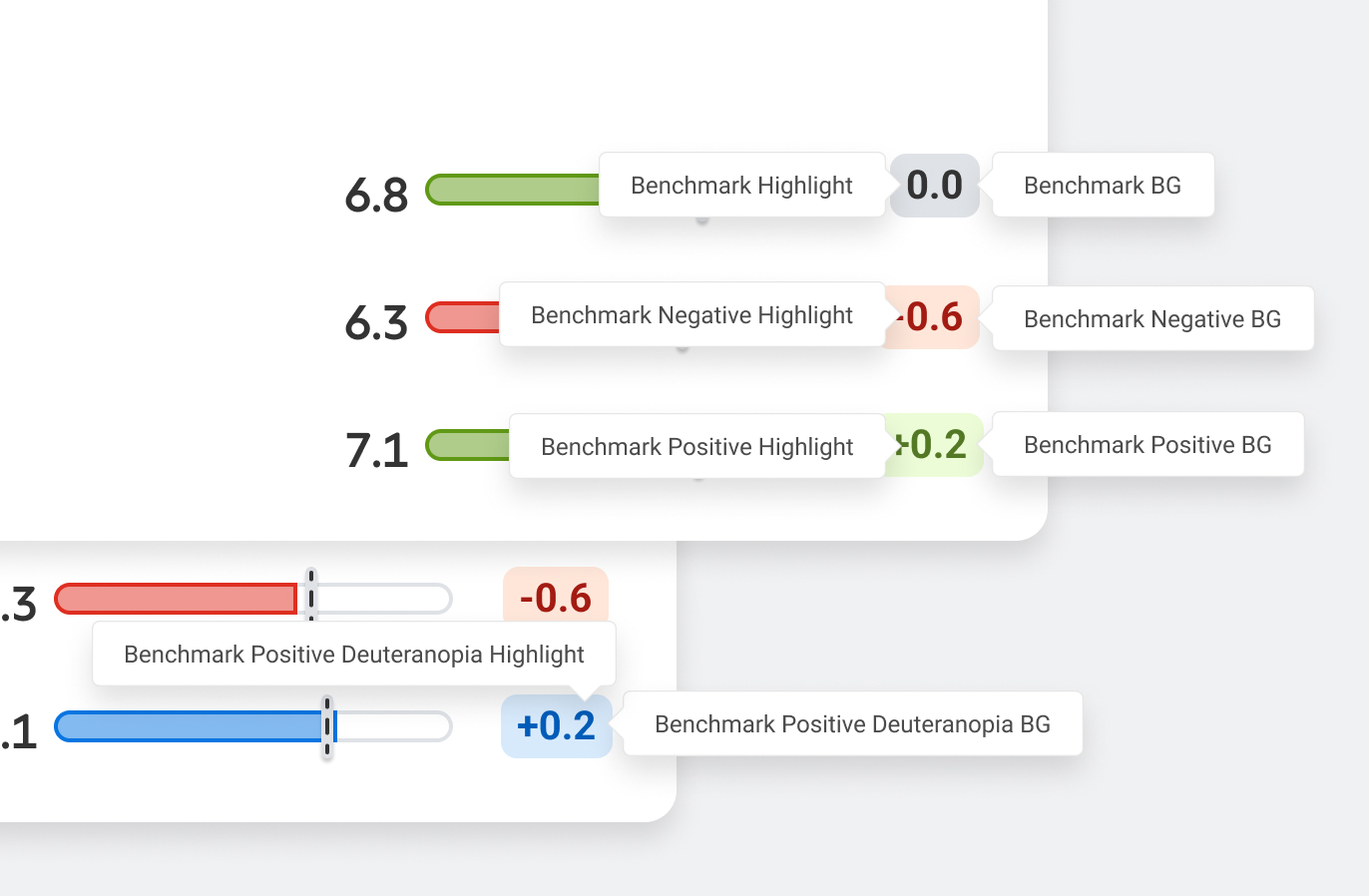
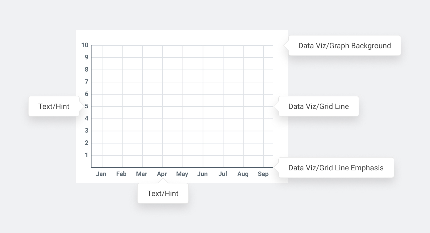
Graphs / Data visualizationPermalink to: Graphs / Data visualization
Used to build the grids behind our charts. Grid Line is for the lighter strokes, and Grid Line Emphasis is for the Axis lines or the zero-line.
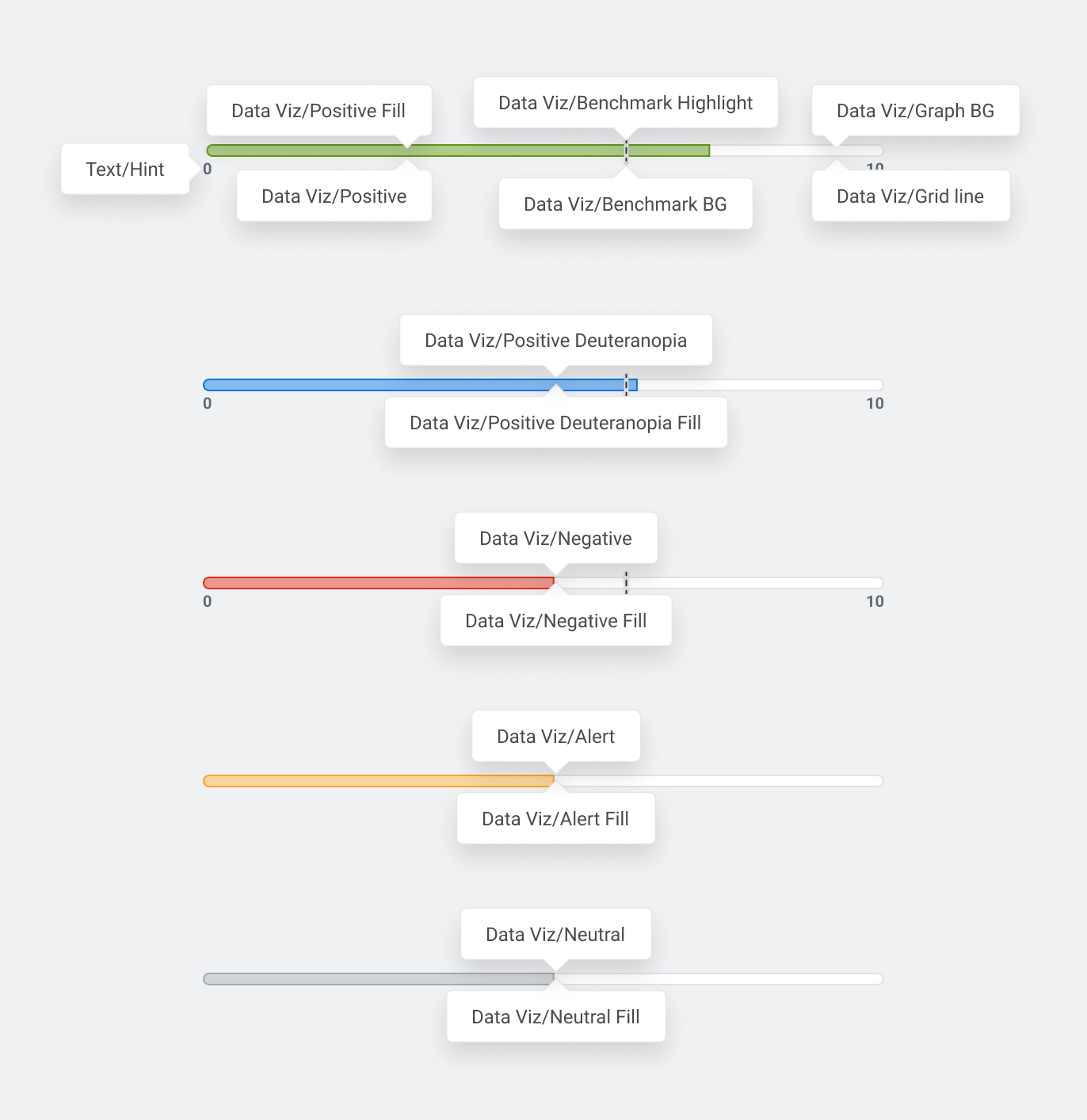
The colors below are reserved for score and difference to benchmark related charts.
For line charts, color-viz-positive can be used, but for bar charts, color-viz-positive is used for the stroke, and color-viz-positive-fill is used to fill the shape.
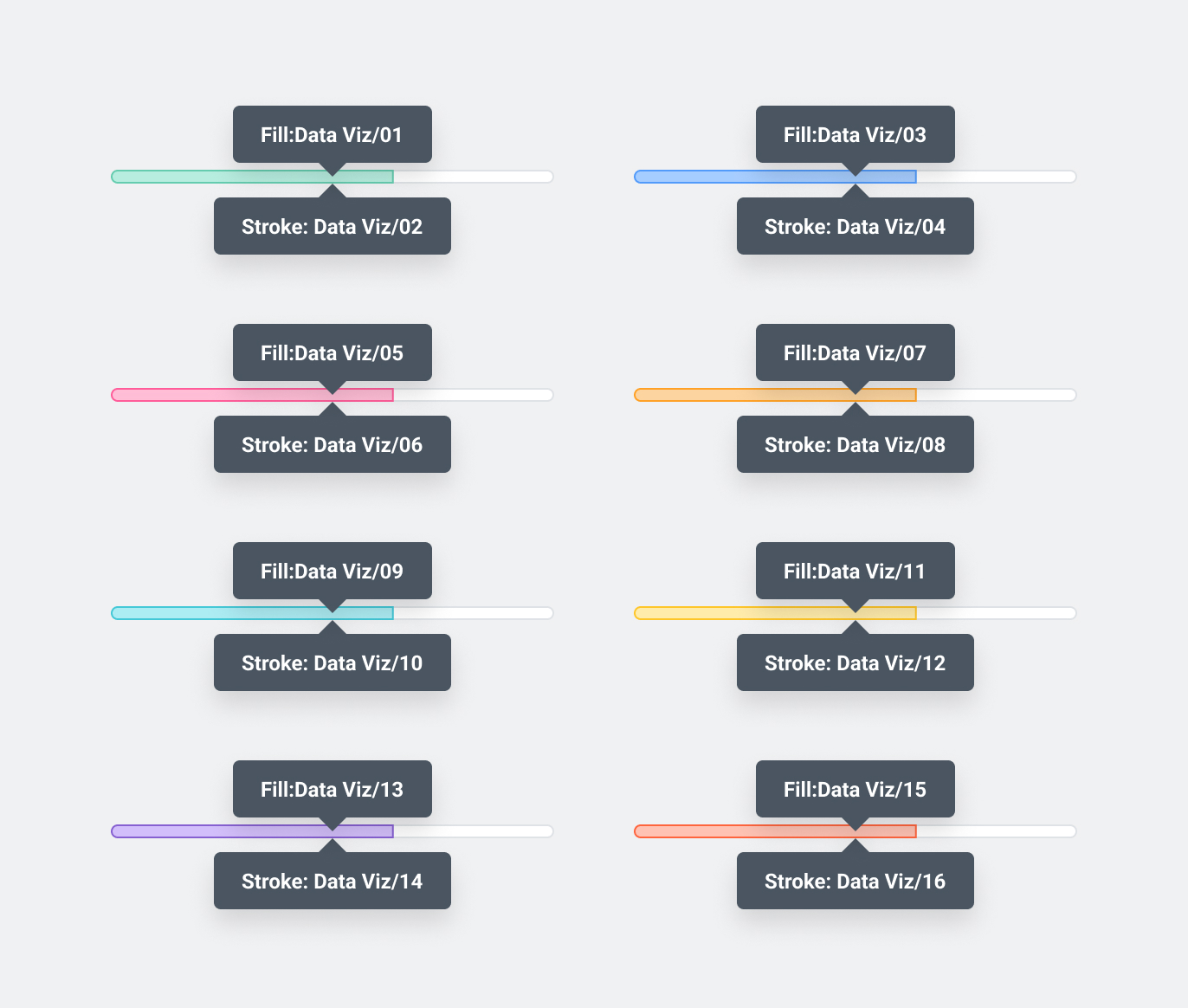
Random color visualization colorsPermalink to: Random color visualization colors
These colors are taken directly from Canvas. They are free to be used on any graph that doesn’t have anything to do with driver scores, or if two scores must be compared.
Use in pairs, eg. Use color-viz-05 for the fill on the bar chart bar, and color-viz-06 as the stroke.
Employee dashboard & GrowPermalink to: Employee dashboard & Grow
Score Number ColorsPermalink to: Score Number Colors
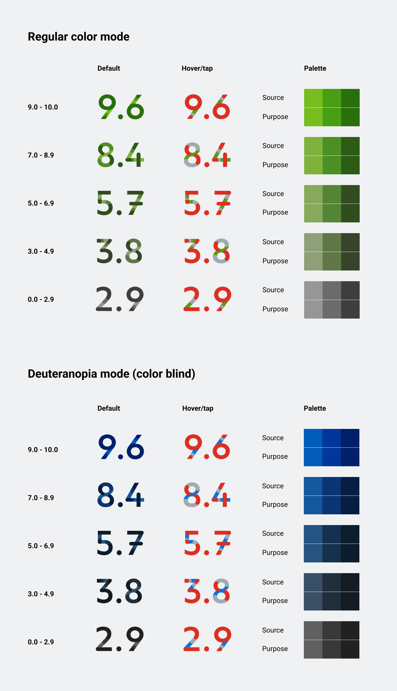
Score rangesPermalink to: Score ranges
The 21 steps in the score ranges are calculated automatically, and prebaked as hexcodes.
We use math to calculate the final colors by mixing white with the negative and positive color.
AveragePermalink to: Average
Currently used on the Heatmap when the score-toggle is set to Average. This range is offset as any score below 7.0 is considered negative and any score above 8.0 is considered positive. 21 steps, 15th and 16th (7.0-8.0) is neutral/white.
NPSPermalink to: NPS
Currently used on the Heatmap when the score-toggle is set to NPS 21 steps, 9th-13th (5 middle steps) is neutral/white.
Difference to XPermalink to: Difference to X
Currently used on the Heatmap when viewing in “Difference to Benchmark” or “Difference to round”. 21 steps, 11th (middle step) is neutral/white.
Brand ColorsPermalink to: Brand Colors
Currently we have one set of brand colors: Workday Canvas All Colors(external link)
There are way more than we actually use in the Peakon UI. To save some complexity, we will remove the unused color variables from the Bedrock package, and from Figma, so we only use a subset of the Workday colors.
DecorationPermalink to: Decoration
Icon colorsPermalink to: Icon colors
Used when the only purpose of the system icon is to be decorative - most system icons inherit the text color from the component.
GradientsPermalink to: Gradients
We currently only use one gradient, which is based of the Workday Canvas color 'Blueberry'.
--color-bg-theme-gradient
AccessibilityPermalink to: Accessibility
The purpose colors have been selected carefully to be WCAG 2.1 AA Contrast compliant(external link) when combined in the intended way. If you create a new purpose color, make sure that it will have adequate contrast to the background(s).
DeuteranopiaPermalink to: Deuteranopia
The most common form of color blindness is red-green blindness. This means that users find it hard to distinguish between red and green. Since this these are the colors we use to distinguish between positive and negative, an alternative color is necessary.
For this reason, we have a set of overrides that change all our relevant green colours to blue. These overrides are applied when data-theme*="deuteranopia" is set on the document HTML tag.
ContributingPermalink to: Contributing
As a designer, creating a new purpose color is not hard, but it requires some steps to roll out correctly.
Getting it into the Bedrock package is simple, but has many steps, and can be blocked by other Bedrock updates, so start this process as early as possible.
- Check if the purpose already is covered.
- If it is, but you don’t like how it looks or if you’re improving a UI pattern, talk to the Design Systems team about changing it globally, or splitting the purpose. Given that many purpose colors are shared across components, expect exhaustive questions.
- If it is not covered, talk to the Design Systems team. Expect questions about scalability, and reusability.
- Once it’s determined that a new purpose color is required, rolling it out in Figma is instant.
- Next step is for the engineers on the Design Systems team to include the new color in the Bedrock Package.
- Enjoy.
It is highly encouraged to not create a purpose color that uses a hex code/RGB value directly. It should map to a brand palette color.