The Value Button is used to open a dialog element (ie. a modal) where the user can make selections, which are then reflected in the value string of the button.
AnatomyPermalink to: Anatomy
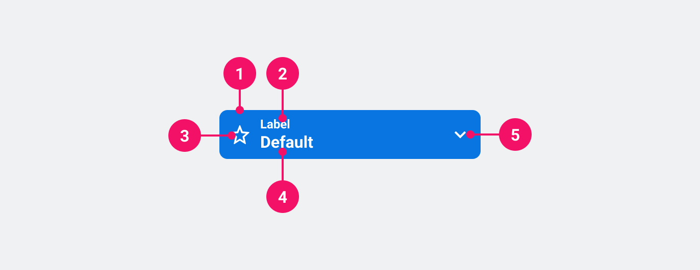
- Container: Container signals importance, ie. primary, secondary or muted. See Variants.
- Label: Specifies what value the button can set.
- Icon (optional): Icon that adds visual weight and affordance.
- Value: The currently chosen value(s).
- Chevron: Indicates that the button opens a popover element. Points up when open, and down when closed.
UsagePermalink to: Usage
Use the Value Button when applying one or more values to a given context, while signalling to the user that the context has changed.
When to usePermalink to: When to use
- Use only when the context is considered more advanced than regular usage, eg. multiple filter/settings or when it's used in combination with other filters or settings. The Value Button should always open a different "window" context, eg. a modal or menu.
When not to usePermalink to: When not to use
- As substitute for the Select.
AccessibilityPermalink to: Accessibility
The Value Button is, from an accessibility perspective, a regular <button> element which means that there should not be any need for aria attributes in most, if not all cases.
ExamplesPermalink to: Examples
VariantsPermalink to: Variants
Open
import { ValueButton } from "@peakon/bedrock/react/button";
import { Stack } from "@peakon/bedrock/react/layout";

function Snippet() {
  return (
    <Stack spacing={8}>
      <ValueButton variant="primary" label="Label">
        Value
      </ValueButton>
      <ValueButton variant="secondary" label="Label">
        Value
      </ValueButton>
      <ValueButton variant="muted" label="Label">
        Value
      </ValueButton>
    </Stack>
  );
}SizesPermalink to: Sizes
ValueButton supports two sizes: medium and large (default). Which is appropriate will depend on the size of its surrounding elements and visual space.
Open
import { ValueButton } from "@peakon/bedrock/react/button";
import { Stack } from "@peakon/bedrock/react/layout";
import { SystemIcon } from "@peakon/bedrock/react/assets/SystemIcon";

function Snippet() {
  return (
    <Stack spacing={8}>
      <ValueButton
        variant="primary"
        label="Label"
        size="medium"
        icon={<SystemIcon name="utility-segment-list" />}
      >
        Value (Medium)
      </ValueButton>
      <ValueButton
        variant="primary"
        label="Label"
        icon={<SystemIcon name="utility-segment-list" />}
      >
        Value (Large)
      </ValueButton>
    </Stack>
  );
}
With IconPermalink to: With Icon
Open
import { ValueButton } from "@peakon/bedrock/react/button";
import { Stack } from "@peakon/bedrock/react/layout";
import { SystemIcon } from "@peakon/bedrock/react/assets/SystemIcon";

function Snippet() {
  return (
    <Stack spacing={8}>
      <ValueButton
        variant="primary"
        label="Label"
        icon={<SystemIcon name="utility-segment-list" />}
      >
        Value
      </ValueButton>
      <ValueButton
        variant="secondary"
        label="Label"
        icon={<SystemIcon name="utility-segment-list" />}
      >
        Value
      </ValueButton>
      <ValueButton
        variant="muted"
        label="Label"
        icon={<SystemIcon name="utility-segment-list" />}
      >
        Value
      </ValueButton>
    </Stack>
  );
}
Full widthPermalink to: Full width
The Value Button's width is defined by its content, but sometimes it can be useful with a full width Value Button.
A fullWidth Value Button has a width of 100%.
Open
import { ValueButton } from "@peakon/bedrock/react/button";

function Snippet() {
  return (
    <ValueButton variant="primary" label="Label" fullWidth>
      Value
    </ValueButton>
  );
}DisabledPermalink to: Disabled
Open
import { ValueButton } from "@peakon/bedrock/react/button";
import { Stack } from "@peakon/bedrock/react/layout";

function Snippet() {
  return (
    <Stack spacing={8}>
      <ValueButton disabled variant="primary" label="Label">
        Value
      </ValueButton>
      <ValueButton disabled variant="secondary" label="Label">
        Value
      </ValueButton>
      <ValueButton disabled variant="muted" label="Label">
        Value
      </ValueButton>
    </Stack>
  );
}
With chevronPermalink to: With chevron
Use aria-expanded="false" or aria-expanded="true" to render the chevron icon.
The aria-expanded attribute is used to signal to screen readers that the button opens a popover element, and whether the popover is currently open or closed.
Open
import { ValueButton } from "@peakon/bedrock/react/button";
import { Stack } from "@peakon/bedrock/react/layout";

function Snippet() {
  return (
    <Stack spacing={8}>
      <ValueButton variant="primary" label="Label" aria-expanded="false">
        Value (closed)
      </ValueButton>
      <ValueButton variant="primary" label="Label" aria-expanded="true">
        Value (open)
      </ValueButton>
    </Stack>
  );
}
Props TablePermalink to: Props Table
Props extend from HTML button element(external link), with the omission of className and style
| Name | Type | Description | Default | Required |
|---|---|---|---|---|
ref | HTMLButtonElement | Forwards a ref to the ValueButton. | — | No |
size | medium | large | Defines the size of the ValueButton. | large | No |
variant | primary | secondary | muted | Defines the variant of the ValueButton. | — | Yes |
label | string | The smaller, persisting label. This label should describe the menu that is triggered by the ValueButton. | — | Yes |
icon | ReactNode | Defines what icon to render in the ValueButton (Peakon system icon recommended) | — | No |
fullWidth | boolean | Sets the ValueButton to take up 100% of available width. | false | No |
children | ReactNode | The contents of the ValueButton. This should show the currently selected option(s) from the associated menu. | — | Yes |