OverviewPermalink to: Overview
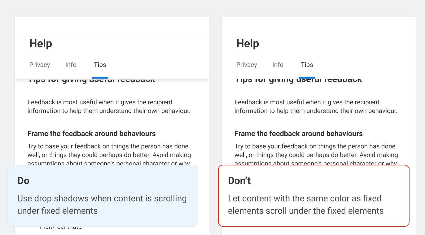
Light and shadows are utilized to indicate a sense of depth. This establishes hierarchy and provides predictability within the user interface.
The depth values are lifted directly from Canvas(external link).
StatusPermalink to: Status
The depth tokens are currently not fully deployed in the UI. Regardless, use them when developing new features. Since the depth tokens were added to Bedrock, Canvas has adjusted the values, and the use cases after the fact.
Follow these use cases when developing new features and components.
UsagePermalink to: Usage
Recommended usagePermalink to: Recommended usage
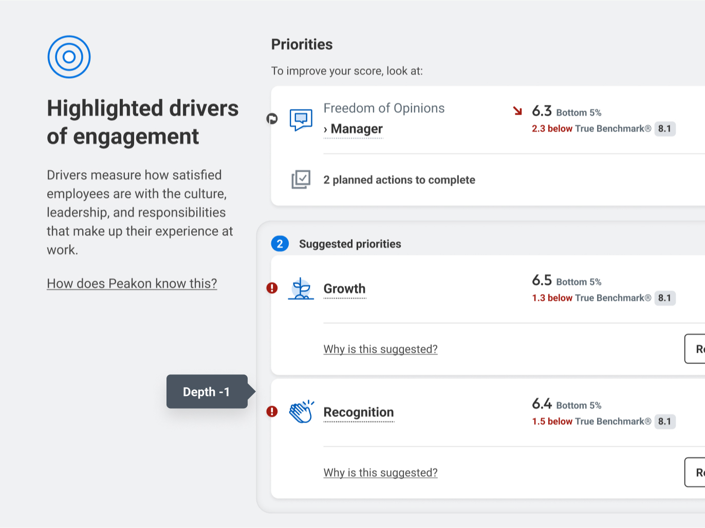
Depth -1Permalink to: Depth -1
Inset wrapper around multiple cards/sticks
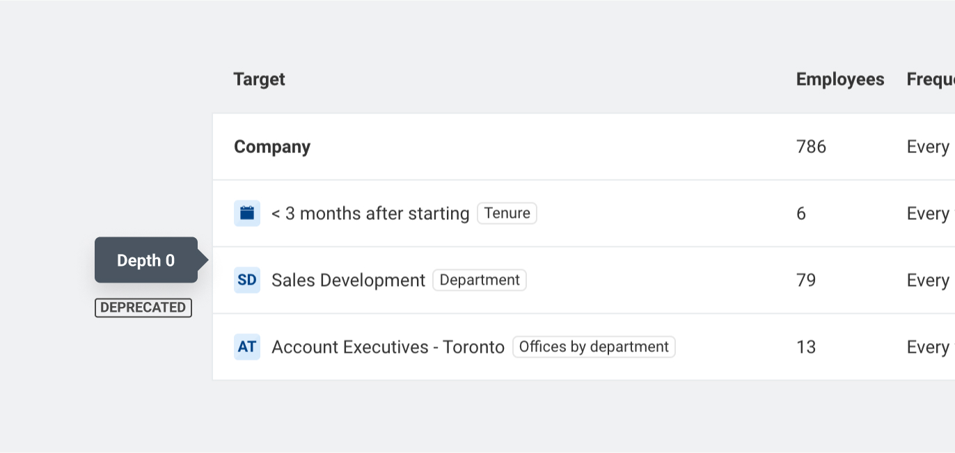
Depth 0 - DeprecatedPermalink to: Depth 0 - Deprecated
Was used for cards before the rebranding to Workday style. Still applied many places in the Administration section due to those cards being neglected.
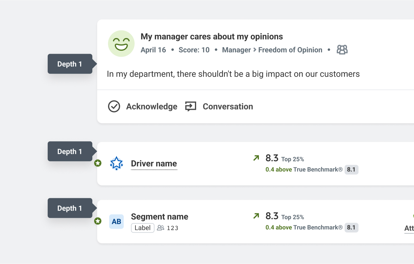
Depth 1Permalink to: Depth 1
Used for Card components and 'Sticks'.
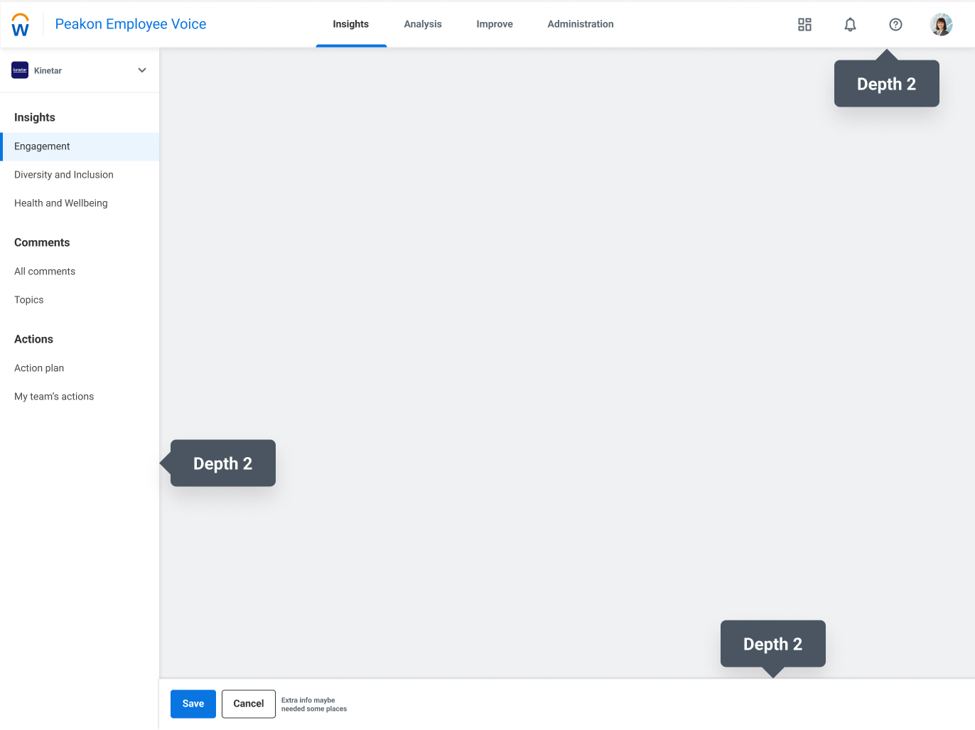
Depth 2Permalink to: Depth 2
Used for the navigation panels.
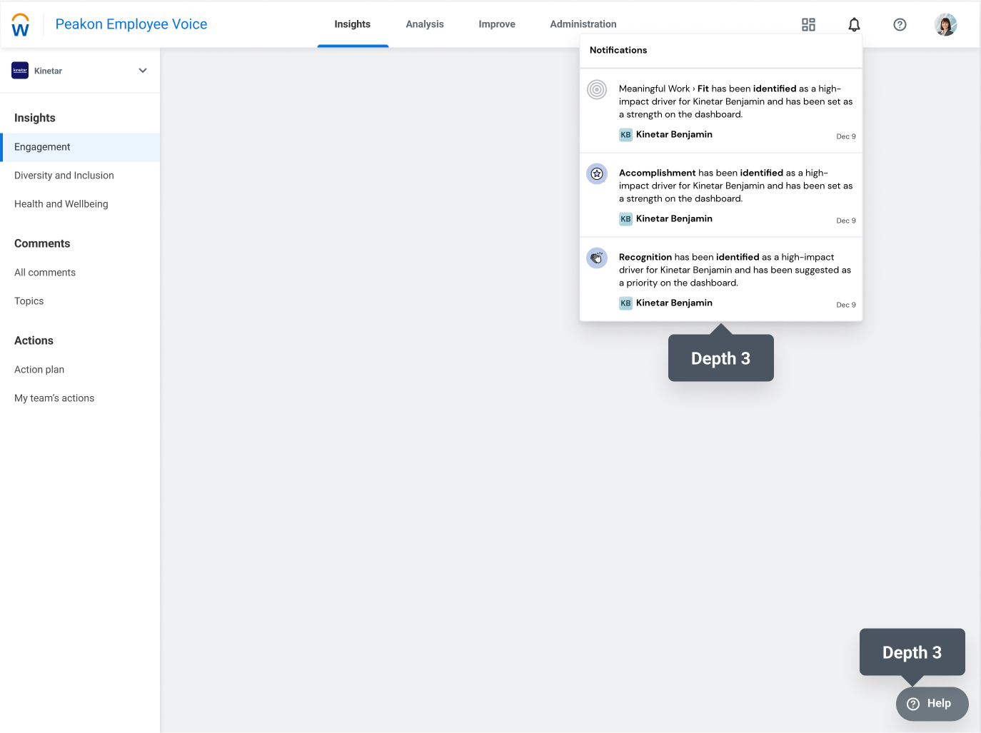
Depth 3Permalink to: Depth 3
Used for Floating Action Button and menus.
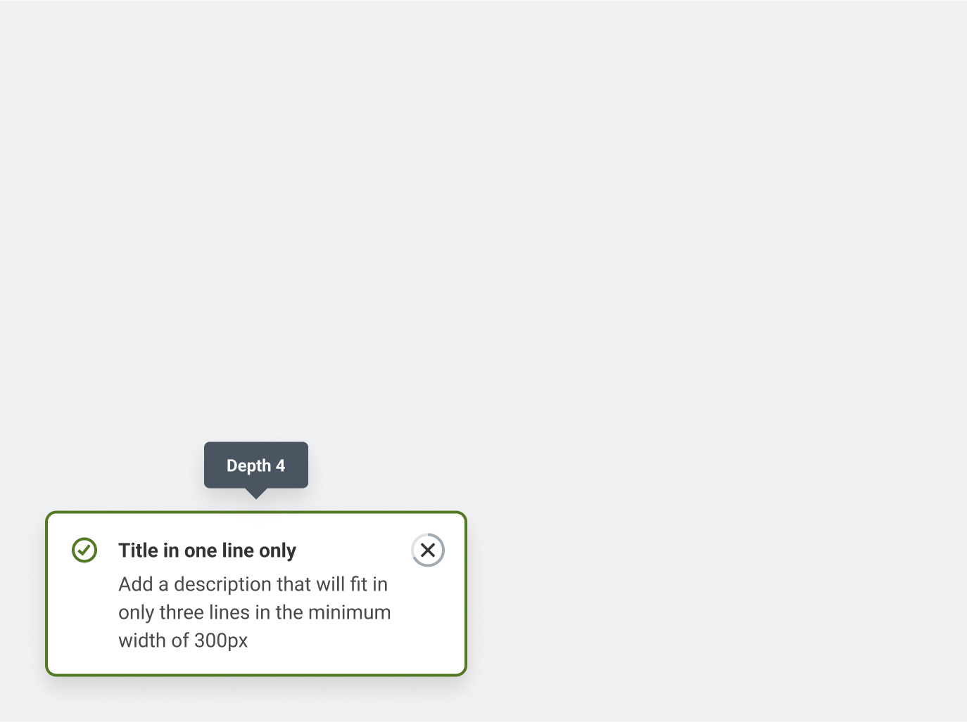
Depth 4Permalink to: Depth 4
Bottom sheets
ValuesPermalink to: Values
The Canvas depth styles utilize two different shadows to create a harder shadow and a softer shadow with more depth. The harder shadow is indicative of a sharper, more realistic direct light. While the softer shadow could be from a softer, farther away, or reflected light.
We havent updated the depth token in Bedrock yet, So here is how they map:
| Depth Token | Bedrock style | Canvas Shadow 1 | Canvas Shadow 2 |
|---|---|---|---|
| Depth -1 | box-shadow: rgba(82, 97, 115, 0.09) 0px 0px 8px 0px inset; | Doesn’t exist | Doesn’t exist |
| Depth 0 | Stroke: Purpose/Border | Doesn’t exist | Doesn’t exist |
| Depth 1 | box-shadow: rgba(0, 0, 0, 0.08) 0px 2px 4px 0px; | x:0 y:1 Blur:4 Color:#000 Alpha 20 | x:0 y:1 Blur:8 Color:#000 Alpha 16 |
| Depth 2 | box-shadow: rgba(0, 0, 0, 0.1) 0px 4px 8px 0px; | x:0 y:2 Blur:8 Color:#000 Alpha 20 | x:0 y:4 Blur:16 Color:#000 Alpha 16 |
| Depth 3 | box-shadow: rgba(0, 0, 0, 0.12) 0px 8px 16px 0px; | x:0 y:3 Blur:12 Color:#000 Alpha 20 | x:0 y:6 Blur:24 Color:#000 Alpha 16 |
| Depth 4 | border: 1px solid purpose-border; box-shadow: rgba(0, 0, 0, 0.12) 0px 8px 16px 0px; | x:0 y:4 Blur:16 Color:#000 Alpha 20 | x:0 y:8 Blur:32 Color:#000 Alpha 16 |
| Depth 5 | Doesn’t exist | x:0 y:5 Blur:20 Color:#000 Alpha 20 | x:0 y:10 Blur:40 Color:#000 Alpha 16 |
| Depth 6 | Doesn’t exist | x:0 y:6 Blur:24 Color:#000 Alpha 20 | x:0 y:12 Blur:48 Color:#000 Alpha 16 |
AccessibilityPermalink to: Accessibility
Make sure tooltips, overlays, and modals are visually distinct from other content through supporting icons, color usage, appropriate depth usage, and other visual elements Make sure borders of tooltips, overlays, and modals meet 3:1 contrast with their backgrounds