The Checkbox is used when there are either one or more binary choices that are not mutually exclusive. They each work independently and checking one does not affect other selections - except if there are nested choices that can set a parent checkbox into an indeterminate state.
AnatomyPermalink to: Anatomy
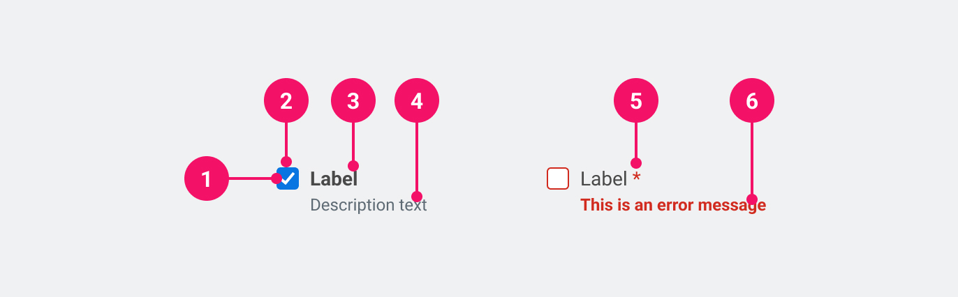
- Checkmark: Indicates the state of the checkbox as unchecked, checked or indeterminate.
- Control Container
- Label: Information about what to select or unselect.
- Description (optional): Used to add further context for the purpose of the Checkbox.
- Required (optional): Used to indicate whether the checkbox needs to be checked.
- Feedback (optional): Used for feedback messages.
UsagePermalink to: Usage
Always distribute Checkboxes vertically as it makes it easier for the user to scan the labels and visually connect them to the associated Checkbox.
When to usePermalink to: When to use
- Inside forms, where the user saves/submits their inputs and selections at the end of the form.
When not to usePermalink to: When not to use
- When the choice needs to be exclusive, use the Radio Button instead.
- If the desired outcome is auto-save, use the Toggle Switch instead.
AccessibilityPermalink to: Accessibility
If you show a list of Checkboxes, consider using a Fieldset to group them together. This will give the group a name and make it easier for users to understand the relationship between the Checkboxes.
ExamplesPermalink to: Examples
DefaultPermalink to: Default
Open
import { Checkbox } from "@peakon/bedrock/react/form";

function Snippet() {
  return <Checkbox label="Checkbox" />;
}DisabledPermalink to: Disabled
The disabled checkbox is used when an option is not available due to other choices made in the application, either by the user themself or by their admin — in any case it should be explained to the user why the option is disabled.
Open
import { Checkbox } from "@peakon/bedrock/react/form";

function Snippet() {
  return <Checkbox label="Disabled checkbox" disabled />;
}IndeterminatePermalink to: Indeterminate
If the checkbox has nested options, it can have an indeterminate state. A lot of users won’t recognize this as it’s rarely used, so be cautious when using it and make sure that it’s the right decision.
Open
import { Checkbox } from "@peakon/bedrock/react/form";

function Snippet() {
  return <Checkbox label="Indeterminate checkbox" indeterminate />;
}DescriptionPermalink to: Description
To provide the user with more context it is possible to add descriptive text.
Open
import { Checkbox } from "@peakon/bedrock/react/form";

function Snippet() {
  return (
    <Checkbox
      label="Checkbox with description"
      description="A description of the checkbox"
    />
  );
}FeedbackPermalink to: Feedback
It's possible to add a feedback message for the user. This should — as the name states — only be used for feedback and not for descriptive text.
Open
import { Checkbox } from "@peakon/bedrock/react/form";

function Snippet() {
  return (
    <Stack spacing={8}>
      <Checkbox label="Neutral" feedbackMessage="This is neutral feedback" />
      <Checkbox
        label="Positive"
        feedbackMessage="This is positive feedback"
        status="success"
      />
      <Checkbox
        label="Negative"
        feedbackMessage="This is negative feedback"
        status="error"
      />
    </Stack>
  );
}ControlledPermalink to: Controlled
You can make Checkbox controlled with the checked and onChange props. Pass a function to onChange that handles the change behaviour.
Open
import { useState } from "react";
import { Checkbox } from "@peakon/bedrock/react/form";

function Snippet() {
  const [isChecked, setIsChecked] = useState(false);

  return (
    <Checkbox
      label="Controlled checkbox"
      checked={isChecked}
      onChange={() => setIsChecked(!isChecked)}
    />
  );
}
Hide LabelPermalink to: Hide Label
All Checkboxes need an accessible name, which is provided by the label prop. In some cases, eg. in a large table view, it might be visually preferable to not show the label and instead rely on the row/column header to act as a visual label. In such cases it is still required to pass a label, which can then be hidden using the hideLabel prop. It's important that the the label in the header and the hidden label have the same text content, to ensure parity between sighted users and assistive technology. This approach should only be taken when there is another obvious text snippet that conveys the purpose of the Checkbox.
Open
import { Checkbox } from "@peakon/bedrock/react/form";

function Snippet() {
  return (
    <TableWrapper>
      <table>
        <thead>
          <tr>
            <th>User</th>
            <th>Include</th>
          </tr>
        </thead>
        <tbody>
          <tr>
            <th>John Smith</th>
            <td>
              <Checkbox label="john-smith" hideLabel />
            </td>
          </tr>
          <tr>
            <th>Lisa Appleseed</th>
            <td>
              <Checkbox label="lisa-appleseed" hideLabel />
            </td>
          </tr>
          <tr>
            <th>Mo Karim</th>
            <td>
              <Checkbox label="mo-karim" hideLabel />
            </td>
          </tr>
        </tbody>
      </table>
    </TableWrapper>
  );
}
Props tablePermalink to: Props table
Props extend from HTML Input Element(external link), with the omission of className, style, type, aria-labelledby and aria-label
Specifically, the Checkbox is an input element of type="checkbox"(external link). Please follow the link for more details on additional native attributes.
| Name | Type | Description | Default | Required |
|---|---|---|---|---|
ref | HTMLButtonElement | Forwards a ref to the Checkbox. | — | No |
checked | boolean | Used to set the controlled state of the Checkbox. | — | No |
defaultChecked | boolean | Used to set the uncontrolled state of the Checkbox. | — | No |
indeterminate | boolean | Used to indicate when the Checkbox is neither 'on' nor 'off'. The most common use case for this is when the Checkbox owns a number of sub-options. If all the sub-options are checked, the Checkbox is checked; if they are all unchecked, it is unchecked, and if only some of the sub-options are checked, it is in an indeterminate state. | — | No |
description | string | Renders a description below the label to give further information on how to fill out the Checkbox. | — | No |
feedbackMessage | string | Used to provide feedback below the Checkbox label. | — | No |
status | error | success | Used to indicate the status of the Checkbox. Passing 'error' will render the input border and feedback message in red. | — | No |
label | string | Used to render the label that describes the purpose of the Checkbox. | — | Yes |
hideLabel | boolean | Hides the label (visually) - please read the section on accessibility before utilising this option. | — | No |