Standard container for grouping content.
AnatomyPermalink to: Anatomy
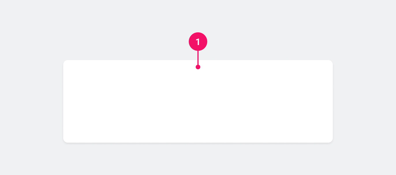
- Container: Houses the contents of the Card.
UsagePermalink to: Usage
When to usePermalink to: When to use
Use the Card component to group related content.
When not to usePermalink to: When not to use
Avoid creating clickable Cards. Instead, rely on actions (buttons/links etc.) inside the Card. This is due to consistency; we want to make sure that it's immediately obvious for the user what parts of the UI are clickable and what are not and since there is no way we can ensure that all Cards are clickable, no Cards should be clickable.
ExamplesPermalink to: Examples
DefaultPermalink to: Default
The Card component does not have any spacing built in, so you will have to add your own container inside the Card eg. with the Box component.
Open
import { Card } from "@peakon/bedrock/react/card";
import { Box } from "@peakon/bedrock/react/layout";
import { BodyText } from "@peakon/bedrock/react/typography";

function Snippet() {
  return (
    <Card>
      <Box padding={16}>
        <BodyText>
          Lorem ipsum dolor sit amet, consectetur adipiscing elit, sed do
          eiusmod tempor incididunt ut labore et dolore magna aliqua. Ut enim ad
          minim veniam, quis nostrud exercitation ullamco laboris nisi ut
          aliquip ex ea commodo consequat. Duis aute irure dolor in
          reprehenderit in voluptate velit esse cillum dolore eu fugiat nulla
          pariatur. Excepteur sint occaecat cupidatat non proident, sunt in
          culpa qui officia deserunt mollit anim id est laborum.
        </BodyText>
      </Box>
    </Card>
  );
}
No DepthPermalink to: No Depth
Per default, the Card component has a shadow to give it depth. For certain scenarios, eg. as a card around form elements in a form, you might want to remove the shadow with the noDepth prop.
Open
import { Card } from "@peakon/bedrock/react/card";
import { Box } from "@peakon/bedrock/react/layout";
import { InputField } from "@peakon/bedrock/react/form";

function Snippet() {
  return (
    <Card noDepth>
      <Box padding={16}>
        <InputField label="Input field" description="The card has no shadow" />
      </Box>
    </Card>
  );
}
With DividersPermalink to: With Dividers
Any Divider inside the Card will inherit the Cards border color as it's color.
Open
import { Card } from "@peakon/bedrock/react/card";
import { Stack, Box } from "@peakon/bedrock/react/layout";
import { BodyText } from "@peakon/bedrock/react/typography";
import { Divider } from "@peakon/bedrock/react/divider";

function Snippet() {
  return (
    <Card>
      <Stack>
        <Box padding={16}>
          <BodyText>
            Lorem ipsum dolor sit amet, consectetur adipiscing elit, sed do
            eiusmod tempor incididunt ut labore et dolore magna aliqua.
          </BodyText>
        </Box>
        <Divider />
        <Box padding={16}>
          <BodyText>
            Duis aute irure dolor in reprehenderit in voluptate velit esse
            cillum dolore eu fugiat nulla pariatur.
          </BodyText>
        </Box>
        <Divider />
        <Box padding={16}>
          <BodyText>
            Ut enim ad minim veniam, quis nostrud exercitation ullamco laboris
            nisi ut aliquip ex ea commodo consequat.
          </BodyText>
        </Box>
      </Stack>
    </Card>
  );
}
Props TablePermalink to: Props Table
Props extend from HTML Div Element(external link), with the omission of className and style
| Name | Type | Description | Default | Required |
|---|---|---|---|---|
noDepth | boolean | Whether the Card has a shadow or not. | false | No |