Tab Navigation is a navigation bar that groups related navigation items.
AnatomyPermalink to: Anatomy
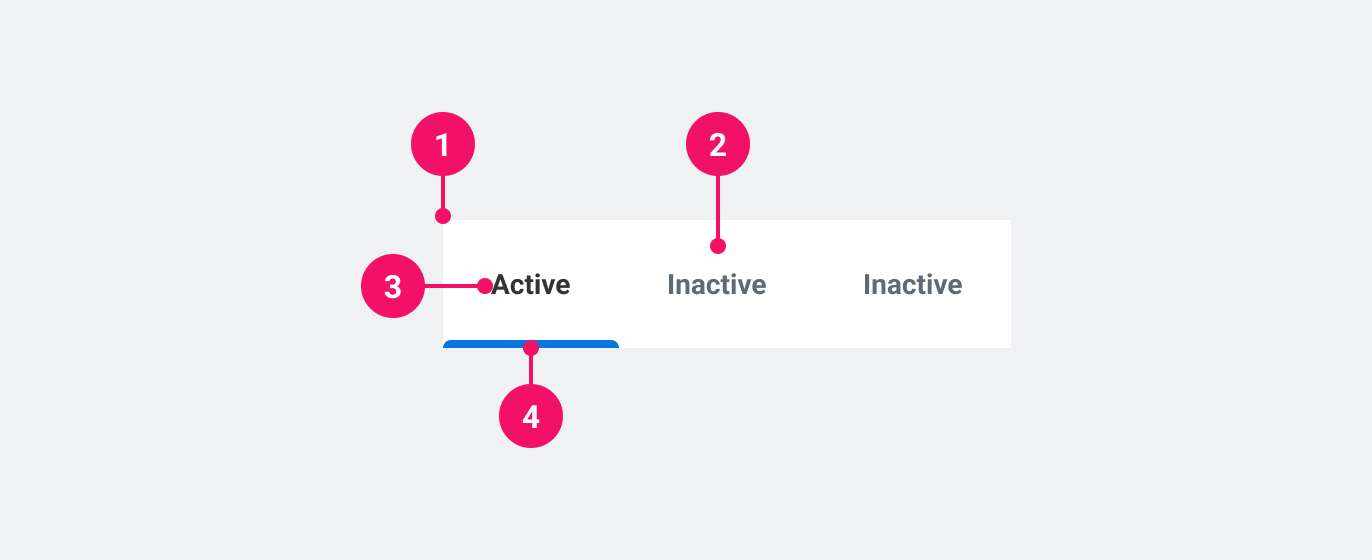
- Navigation bar
- Navigation item
- Current navigation item
- Current navigation item indicator
UsagePermalink to: Usage
When to usePermalink to: When to use
- Use when switching tabs triggers a new URL. This can be an entirely new page or a section of a page.
When not to usePermalink to: When not to use
- When switching tabs does not trigger a new URL and simply updates the content within the page, use Tabs.
AccessibilityPermalink to: Accessibility
Accessible namePermalink to: Accessible name
Because the Tab Navigation outputs a native <nav> element, it is required to add a name to the landmark using either the aria-label attribute or the aria-labelledby attribute (see example). The name should convey the purpose of the navigation and not a description of itself, ie. it should be "Profile options" and not "Profile tab navigation".
Indicating the active navigation itemPermalink to: Indicating the active navigation item
aria-current is used to indicate the "active" navigation item, both visually and for assistive technology.
ExamplesPermalink to: Examples
DefaultPermalink to: Default
Open
import { TabNavigation } from "@peakon/bedrock/react/navigation";

function Snippet() {
  return (
    <TabNavigation aria-label="Tab Navigation">
      <TabNavigation.Link aria-current="page" href="/some-url-1">
        Tab 1
      </TabNavigation.Link>
      <TabNavigation.Link href="/some-url-2">Tab 2</TabNavigation.Link>
      <TabNavigation.Link href="/some-url-3">Tab 3</TabNavigation.Link>
      <TabNavigation.Link href="/some-url-4">Tab 4</TabNavigation.Link>
    </TabNavigation>
  );
}SizesPermalink to: Sizes
It is possible to make each individual tab a little larger using the size prop. The font size does not change, however each tab gets more padding.
Open
import { TabNavigation } from "@peakon/bedrock/react/navigation";
import { Stack } from "@peakon/bedrock/react/layout";

function Snippet() {
  return (
    <Stack spacing={16}>
      <TabNavigation aria-label="Medium Tab Navigation">
        <TabNavigation.Link aria-current="page" href="/some-url-1">
          Medium Tab 1
        </TabNavigation.Link>
        <TabNavigation.Link href="/some-url-2">Medium Tab 2</TabNavigation.Link>
        <TabNavigation.Link href="/some-url-3">Medium Tab 3</TabNavigation.Link>
      </TabNavigation>

      <TabNavigation aria-label="Large Tab Navigation" size="large">
        <TabNavigation.Link aria-current="page" href="/some-url-1">
          Large Tab 1
        </TabNavigation.Link>
        <TabNavigation.Link href="/some-url-2">Large Tab 2</TabNavigation.Link>
        <TabNavigation.Link href="/some-url-3">Large Tab 3</TabNavigation.Link>
      </TabNavigation>
    </Stack>
  );
}
Using other element for accessible namePermalink to: Using other element for accessible name
Open
import { TabNavigation } from "@peakon/bedrock/react/navigation";
import { Stack } from "@peakon/bedrock/react/layout";

function Snippet() {
  return (
    <Stack spacing={8}>
      <p id="tab-navigation-name">Tab Navigation</p>
      <TabNavigation aria-labelledby="tab-navigation-name">
        <TabNavigation.Link aria-current="page" href="/some-url-1">
          Tab 1
        </TabNavigation.Link>
        <TabNavigation.Link href="/some-url-2">Tab 2</TabNavigation.Link>
        <TabNavigation.Link href="/some-url-3">Tab 3</TabNavigation.Link>
        <TabNavigation.Link href="/some-url-4">Tab 4</TabNavigation.Link>
      </TabNavigation>
    </Stack>
  );
}
Using custom LinkPermalink to: Using custom Link
Tab Navigation supports custom or framework-specific link components (eg. Next.js or React Router) via the as prop on <TabNavigation.Link>.
Open
import Link from "next/link";
import { TabNavigation } from "@peakon/bedrock/react/navigation";

function Snippet() {
  return (
    <TabNavigation aria-label="Using custom Link">
      <TabNavigation.Link as={Link} aria-current="page" href="/some-url-1">
        Custom Link 1
      </TabNavigation.Link>
      <TabNavigation.Link as={Link} href="/some-url-2">
        Custom Link 2
      </TabNavigation.Link>
      <TabNavigation.Link as={Link} href="/some-url-3">
        Custom Link 3
      </TabNavigation.Link>
      <TabNavigation.Link as={Link} href="/some-url-4">
        Custom Link 4
      </TabNavigation.Link>
    </TabNavigation>
  );
}
Props TablePermalink to: Props Table
TabNavigationPermalink to: TabNavigation
Props extend from HTML Nav Element(external link), with the omission of className and style
| Name | Type | Description | Default | Required |
|---|---|---|---|---|
size | medium | large | Defines the size of the padding around the tabs. | medium | No |
aria-labelledby | string | Used to link the TabNavigation to an external label that describes it. | — | Yes, if not using aria-label. |
aria-label | string | Used to provide context to screen readers about the TabNavigation. | — | Yes, if not using aria-labelledby. |
children | ReactNode | The contents of the TabNavigation. This should contain the links (see TabNavigation.Link). | — | Yes |
TabNavigation.LinkPermalink to: TabNavigation.Link
Props extend from HTML Anchor Element(external link), with the omission of className and style
| Name | Type | Description | Default | Required |
|---|---|---|---|---|
as | ElementType | TabNavigation.Link also supports custom link components via the as prop, from eg. Next or React Router. | a | No |
children | ReactNode | The contents of the link. This will render as the visible label. | — | Yes |