OverviewPermalink to: Overview
Our design system is called Bedrock. It's an extension of Workday's Canvas design system.
Why not just use Canvas?Permalink to: Why not just use Canvas?
For Peakon to use Canvas, we would need to rewrite the entire frontend, as well as redesigning most pages, as Peakon has an entirely different approach to flows and patterns.
Bedrock started before Workday acquired Peakon and is woven tightly into all Peakon products, so our strategy is to retrofit Canvas’ aesthetic, with few but impactful changes without needing to redesign the entire product. All the colors were changed to Workday’s palette, the font was swapped everywhere, and all the 500+ icons were redesigned to match Canvas' icon style.
How we work in FigmaPermalink to: How we work in Figma
This guide is a little old, but the principles are still valid. If in doubt, ask your buddy to give you a tour of their recent projects.
Peakon Ways of Working in Figma(external link)
Picking the right components in FigmaPermalink to: Picking the right components in Figma
When browsing and searching for components in Figma, it can be confusing if there's multiple Design System libraries activated at the same time. We recommend that you turn off the Canvas libraries.
A quick way to tell the difference is that Components are color coded in the Figma asset preview.
- Canvas components have a green-ish background in the preview.
- Bedrock components has a light blue background
- Peakon Classic components are marked with a red background.
- Deprecated components have a hot pink background. Do not use deprecated components in new features.
Figma structurePermalink to: Figma structure
We have a nested library structure, where each level of library inherits from the more elementary libraries.
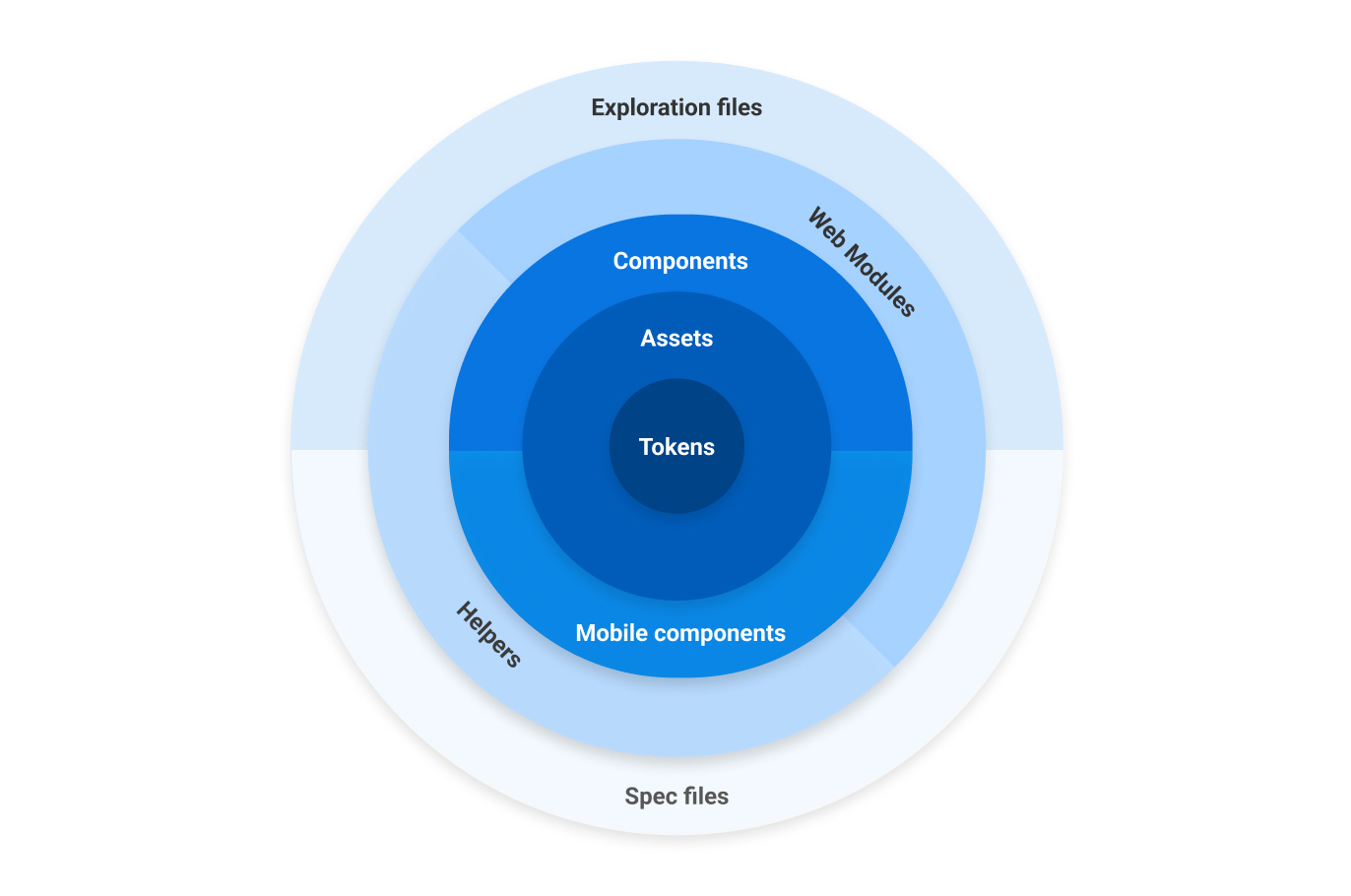
Because we share the Figma installation with Workday, their standard library setting is unfortunate for us. When starting a new exploration file, please make sure the libraries below are turned on, and that the Canvas libraries are turned off.
TokensPermalink to: Tokens
The Tokens library contains all typography styles, all colors, depth styles and spacers. These are used in all other Bedrock Libraries.
AssetsPermalink to: Assets
Contains system icons, graphic icons, driver icons, avatars, segment icons and soon, all product illustration.
The way we use our icon library is special. The Bedrock package that the frontend engineers use, takes the icons straight from this Figma file, and creates React components.
ComponentsPermalink to: Components
Bedrock Components contains base components like buttons, form inputs, tabs, etc.
Peakon Classic Components are a separate library containing older design components, which has not been rewritten as a Bedrock component. It's recommended to try to use the newer Bedrock components when possible, when creating a brand new feature, as it's much faster for the frontend engineers to work with.
The Mobile components are the native mobile components that don't belong in the core component library. The mobile spec files use the regular components when applicable. The native app are being sunsetted as of July 2024.
- Bedrock Components(external link)
- Peakon Classic Components(external link)
- Bedrock Mobile Components(external link)
Web ModulesPermalink to: Web Modules
Contains complex, reusable web-only components, built from base components, such as Comment Cards, Hero header, App frame, etc. Include versions for mobile web, but not native mobile.
Useful Figma plug-insPermalink to: Useful Figma plug-ins
- Design Lint(external link) - Use this to check your artboards for hex codes, wrong border radii, and unlinked text styles
- Contrast(external link) - Simple WCAG color contrast checker
- Bunch text changer(external link) - Excellent for changing strings on multiple texts at the same time.
- Memsource(external link) - Translation plugin inside Figma. Brilliant for checking if your exploration files will break when translated strings are added.
Support LibrariesPermalink to: Support Libraries
- Bedrock Native Mobile UI(external link) - Native UI from iOS and Android - Headers, notches, keyboards, etc.
- Helpers(external link) - Helper components for use in our Spec and Exploration files - Title cards, status indicators, etc.
- Inspiration(external link) - A bunch of component libraries for inspiration. Feel free to add more.
- Wireframing kit(external link) - For making lo-fi versions of product features for using testing/validation.
- Design Critique Template(external link) - Use this when you need input from your colleagues in a design critique.
- Exploration file Template(external link)
- Specification file Template(external link)