Alerts are non-dismissible information boxes, used to guide the user, usually placed close to the UI element that the information is regarding.
AnatomyPermalink to: Anatomy
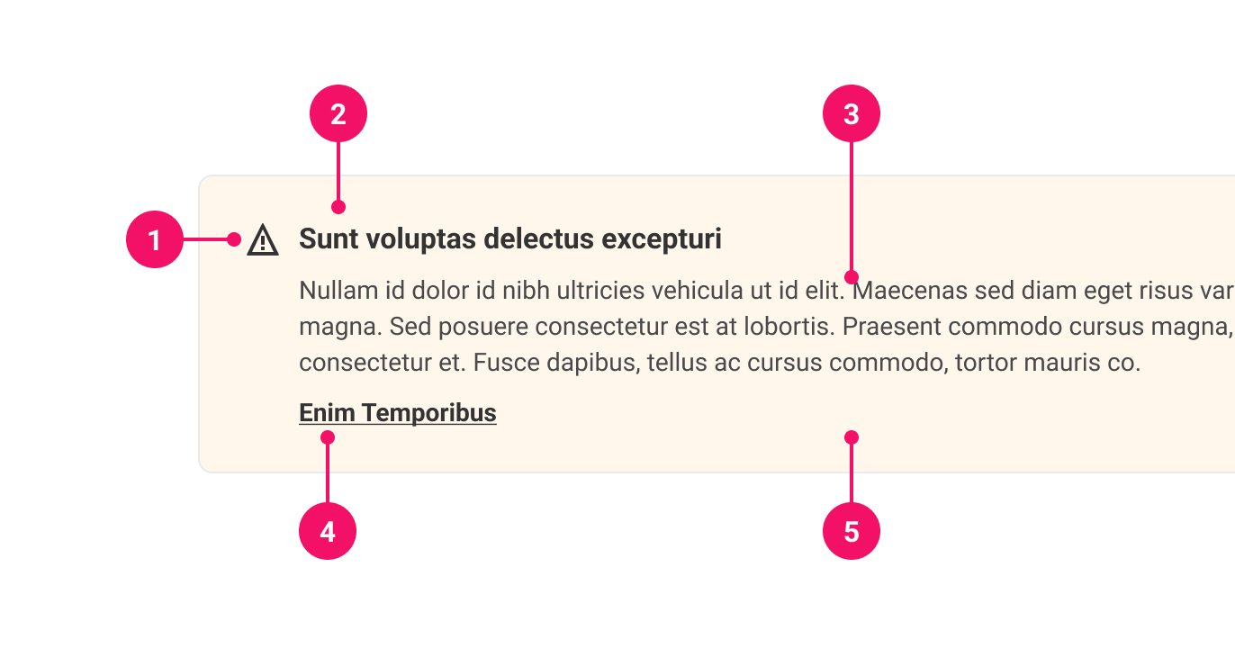
-
Icon (optional): Optional, but useful to provide immediate visual context. The icon is determined by its
variant. -
Headline (optional): Short summary of Alert content.
-
Content: Describes why the user is being alerted.
-
Actions (optional): In the case of the Alert becoming too verbose, an optional link or a button can be added, ie. a link to a Help Desk article or a button that triggers a modal.
-
Card: Container for the Alert. The background color is determined by its
variant.
UsagePermalink to: Usage
When to usePermalink to: When to use
- For any important information that needs more emphasis than a normal paragraph.
- When the user has done something that requires some urgent action.
- For contextual information.
- To inform the user how a feature works. Add a link to guide the user to help/ find out more information.
When not to usePermalink to: When not to use
- As a branding banner.
- As the edge-to-edge site banner informing the user about tech outage, new survey to take, etc.
- For dismissible content — use the Content Banner component instead.
AccessibilityPermalink to: Accessibility
Alert screen readers appropriatelyPermalink to: Alert screen readers appropriately
If the Alert conveys essential information that is required, it is possible to add one of two role attributes:
role="status"(external link) — used for essential information that is not important enough to interrupt the user in their current flow.role="alert"(external link) — should be used if the information requires the user's immediate attention.
ExamplesPermalink to: Examples
VariantPermalink to: Variant
Each variant provides an indicator of what the Alert is communicating. Note this is purely visual, therefore, it is recommended to include an ARIA status role so that information is properly communicated to screen readers.
Open
import { Alert } from "@peakon/bedrock/react/alert";
function Snippet() {
return (
<Stack spacing={8}>
<Alert>
<Alert.Paragraph>
Use 'neutral' on a primary background, or to be very
discreet on a white background.
</Alert.Paragraph>
</Alert>
<Alert variant="info">
<Alert.Paragraph>
Use 'info' for general tips, tricks or guidance.
</Alert.Paragraph>
</Alert>
<Alert variant="success">
<Alert.Paragraph>
Use 'success' for confirmation and validation of a
successful action.
</Alert.Paragraph>
</Alert>
<Alert variant="warning">
<Alert.Paragraph>
Use 'warning' if the consequences of an action aren't
destructive, but could be problematic.
</Alert.Paragraph>
</Alert>
<Alert variant="danger">
<Alert.Paragraph>
Use 'danger' to warn about irreversible, destructive
consequences.
</Alert.Paragraph>
</Alert>
</Stack>
);
}SizePermalink to: Size
The Alert size affects how much padding surrounds the content. All Alert expand to the width of their container.
Open
import { Alert } from "@peakon/bedrock/react/alert";

function Snippet() {
  return (
    <Stack spacing={8}>
      <Alert size="small">
        <Alert.Paragraph>
          Small Alerts can be used in tight spaces - mobile web, slide-ins,
          modals, etc. It does however contribute to a feeling of density in the
          UI.
        </Alert.Paragraph>
      </Alert>
      <Alert size="medium">
        <Alert.Paragraph>
          Medium Alerts give nicer proportions than the small variant. Also
          works well in less busy slide-ins.
        </Alert.Paragraph>
      </Alert>
      <Alert size="large">
        <Alert.Paragraph>
          Use large Alerts directly on feature page backgrounds, where the grid
          has more white space. Avoid using in slide-ins.
        </Alert.Paragraph>
      </Alert>
    </Stack>
  );
}
With headingPermalink to: With heading
A heading can provide a short summary or primer for what the Alert content will be about.
Open
import { Alert } from "@peakon/bedrock/react/alert";

function Snippet() {
  return (
    <Alert heading="Heading title" headingLevel={2}>
      <Alert.Paragraph>First paragraph.</Alert.Paragraph>
      <Alert.Paragraph>Second paragraph.</Alert.Paragraph>
    </Alert>
  );
}
With actionsPermalink to: With actions
If necessary, use Alert.Actions to add additional calls to actions to resolve what triggered the Alert.
Open
import { Alert } from "@peakon/bedrock/react/alert";

function Snippet() {
  return (
    <Stack spacing={8}>
      <Alert>
        <Alert.Paragraph>
          This is an alert with a read more link.
        </Alert.Paragraph>
        <Alert.Actions>
          <a href="#">Read more</a>
        </Alert.Actions>
      </Alert>
      <Alert>
        <Alert.Paragraph>This is an alert with a button.</Alert.Paragraph>
        <Alert.Actions>
          <Button size="small" variant="secondary">
            Create action
          </Button>
        </Alert.Actions>
      </Alert>
    </Stack>
  );
}
Props TablePermalink to: Props Table
AlertPermalink to: Alert
Props extend from HTML div element(external link), with the omission of className and style
| Name | Type | Description | Default | Required |
|---|---|---|---|---|
variant | neutral | success | info | warning | danger | Defines the variant of the Alert. | neutral | No |
size | small | medium | large | Defines the size of the Alert. | medium | No |
withIcon | boolean | Determines whether an icon will render next to the content. Each variant has its own associated icon. | true | No |
heading | string | Renders a heading above the content. | — | Only if headingLevel is provided |
headingLevel | 1 | 2 | 3 | 4 | 5 | 6 | Used to determine the level of the heading element that the heading is rendered within, eg. 1 will render the heading in an <h1>. | — | Only if heading is provided |
role | alert | status | The ARIA role. Alerts are restricted to | — | No |
children | ReactNode | The contents of the Alert. Can consist of one or more Alert.Paragraph or Alert.Actions. | — | No |
Alert.ParagraphPermalink to: Alert.Paragraph
Props extend from HTML paragraph element(external link), with the omission of className and style
| Name | Type | Description | Default | Required |
|---|---|---|---|---|
children | ReactNode | Used to add text content to an Alert. It renders a Typography paragraph without the need to import the component separately. | — | No |
Alert.ActionsPermalink to: Alert.Actions
Props extend from HTML div element(external link), with the omission of className and style
| Name | Type | Description | Default | Required |
|---|---|---|---|---|
children | ReactNode | Intended to be placed below other children of Alert. It is used for calls to action such as buttons or links. They will render in an evenly spaced row. | — | No |