Input Fields allow users to enter words or characters without styling. Predominantly used for form input, but can also be used inline, ie. for filtering purposes.
AnatomyPermalink to: Anatomy
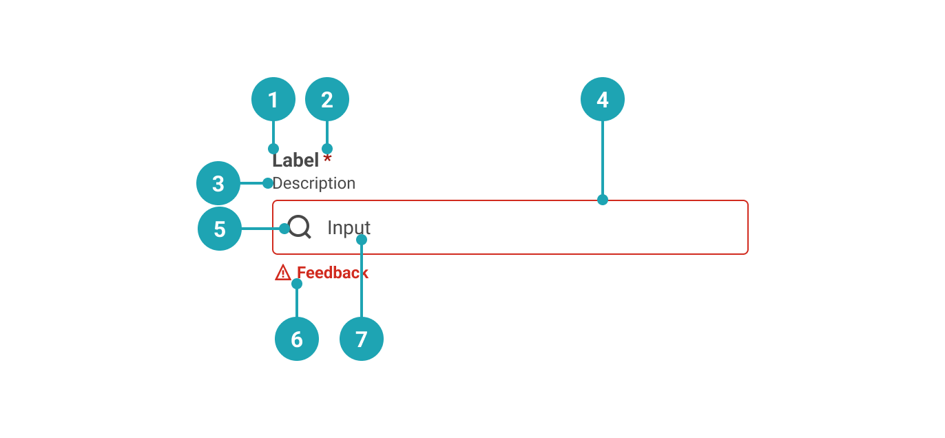
- Label: Text that accurately describes the purpose of the Input Field.
- Required (optional): Used to indicate whether the Input Field needs to be filled out.
- Description (optional): Used to add further context for the purpose of the Input Field.
- Container: Input Field container.
- Icon (optional): Only available on search fields, where it is used to convey purpose in addition to or as replacement of the label. See section on accessibility for more info.
- Value: The value that the user has entered.
- Feedback (optional): Used for feedback messages.
UsagePermalink to: Usage
Use for short user input. If the Input Field only accepts data in a specific format, that format should be communicated to the user in the form of a description.
When to usePermalink to: When to use
- For short/one-line content
When not to usePermalink to: When not to use
- For longer, multi-line entries - use Text Area instead.
AccessibilityPermalink to: Accessibility
Hiding the labelPermalink to: Hiding the label
In some rare cases, ie. in a large table view, it might be visually preferrable to not show the label and instead rely on the row/column header to act as a visual label. In such cases it is possible to hide the label. Do not hide the label just to minimise vertical space in the user interface, as that will most likely lead to a violation of the WCAG 2.1 AA accessibility guidelines(external link).
On search fields it is allowed to not have a visible text label and instead use the icon, which will then act as the visual label. See example under "Supported Types".
Placeholder textPermalink to: Placeholder text
It is discouraged to use the placeholder attribute on the Input Field as users can have a hard time distinguishing the placeholder text from pre-filled content (value).
Touch screen usersPermalink to: Touch screen users
One way to add extra convenience to the Input Field for touch screen users is by using the native HTML enterkeyhint attribute(external link).
ExamplesPermalink to: Examples
DefaultPermalink to: Default
Open
import { InputField } from "@peakon/bedrock/react/form";

function Snippet() {
  return <InputField label="Input name" type="text" />;
}DisabledPermalink to: Disabled
An Input Field can be rendered as disabled by adding the disabled attribute.
Open
import { InputField } from "@peakon/bedrock/react/form";

function Snippet() {
  return <InputField label="Input name" type="text" disabled />;
}
Read OnlyPermalink to: Read Only
An Input Field can be rendered as read only by adding the readOnly attribute.
Open
import { InputField } from "@peakon/bedrock/react/form";

function Snippet() {
  return (
    <InputField
      label="Input name"
      type="text"
      defaultValue="This value can't be edited"
      readOnly
    />
  );
}RequiredPermalink to: Required
An Input Field can be marked as required by adding the required attribute.
Open
import { InputField } from "@peakon/bedrock/react/form";

function Snippet() {
  return <InputField label="Input name" type="text" required />;
}
Supported TypesPermalink to: Supported Types
When using the Input Field it is important to choose the right type — the supported types are: text, password, email, number, search and url. The chosen type will result in different virtual keyboards being presented to the user, ie. on mobile phones where the keyboard for the email type will include the "@" sign and the keyboard for the url type will include "/".
The search type will add a search icon to the Input Field while the number type will add the (browser default) steppers and prevent users from typing anything but numbers.
Open
import { InputField } from "@peakon/bedrock/react/form";
import { Stack } from "@peakon/bedrock/react/layout";

function Snippet() {
  return (
    <Stack spacing={16}>
      <InputField label="Input name (text)" type="text" />
      <InputField label="Input email (email)" type="email" />
      <InputField label="Input amount (number)" type="number" />
      <InputField label="Input password (password)" type="password" />
      <InputField label="Input web address (url)" type="url" />
      <InputField label="Input search query (search)" type="search" />
    </Stack>
  );
}
With DescriptionPermalink to: With Description
To provide the user with more context it is possible to add descriptive text.
Open
import { InputField } from "@peakon/bedrock/react/form";

function Snippet() {
  return (
    <InputField
      label="Input name"
      type="text"
      description="Please provide both first and last names"
    />
  );
}
With FeedbackPermalink to: With Feedback
You can provide neutral or informative feedback on input with feedbackMessage
Open
import { InputField } from "@peakon/bedrock/react/form";

function Snippet() {
  return (
    <InputField
      label="Input name"
      type="text"
      defaultValue="John Appleseed"
      feedbackMessage="That's a really nice name"
    />
  );
}StatusPermalink to: Status
If you want to provide specifically success or error feedback, add status to the Input Field. When using the status prop, remember to provide a feedbackMessage as well.
Open
import { InputField } from "@peakon/bedrock/react/form";
import { Stack } from "@peakon/bedrock/react/layout";

function Snippet() {
  return (
    <Stack spacing={16}>
      <InputField
        label="Input name"
        type="text"
        defaultValue="John Appleseed"
        status="success"
        feedbackMessage="Yup, that's your name"
      />
      <InputField
        label="Input name"
        type="text"
        defaultValue="John Appleseed"
        status="error"
        feedbackMessage="That's not your real name"
      />
    </Stack>
  );
}ControlledPermalink to: Controlled
You can make an Input Field controlled with the value and onChange props. Pass a function to onChange that handles the change behaviour.
Open
import { useState } from "react";
import { InputField } from "@peakon/bedrock/react/form";

function Snippet() {
  const [value, setValue] = useState("John Appleseed");

  return (
    <InputField
      label="Input name"
      type="text"
      value={value}
      onChange={(event) => setValue(event.target.value)}
    />
  );
}
Input SizePermalink to: Input Size
The inputSize prop controls the size of the input. Use small for compact layouts.
Open
import { InputField } from "@peakon/bedrock/react/form";
import { Stack } from "@peakon/bedrock/react/layout";

function Snippet() {
  return (
    <Stack spacing={16}>
      <InputField label="Medium input (default)" type="text" />
      <InputField label="Small input" type="text" inputSize="small" />
    </Stack>
  );
}
Hide LabelPermalink to: Hide Label
Open
import { InputField } from "@peakon/bedrock/react/form";

function Snippet() {
  return (
    <TableWrapper>
      <table>
        <thead>
          <tr>
            <th>Personal info</th>
            <th>Value</th>
          </tr>
        </thead>
        <tbody>
          <tr>
            <td>First name</td>
            <td>
              <InputField label="First name" hideLabel type="text" />
            </td>
          </tr>
          <tr>
            <td>Last name</td>
            <td>
              <InputField label="Last name" hideLabel type="text" />
            </td>
          </tr>
          <tr>
            <td>Number of cats</td>
            <td>
              <InputField label="Number of cats" hideLabel type="number" />
            </td>
          </tr>
        </tbody>
      </table>
    </TableWrapper>
  );
}
Props TablePermalink to: Props Table
Props extend from HTML Input Element(external link), with the omission of className, style, aria-labelledby and aria-label
| Name | Type | Description | Default | Required |
|---|---|---|---|---|
ref | HTMLInputElement | Forwards a ref to the InputField. | — | No |
label | string | Renders the label that describes the purpose of the InputField. | — | Yes |
value | string | Used to set the controlled value of the InputField. | — | No |
defaultValue | string | Used to set the uncontrolled value of the InputField. | — | No |
disabled | boolean | Determines whether the user can interact with the InputField at all. | — | No |
readOnly | boolean | Determines whether the user can interact with the InputField — a readonly InputField will still be available for keyboard users and assistive technologies. | — | No |
hideLabel | boolean | Hides the label (visually) — Please read the section on accessibility before utilising this option. | — | No |
required | boolean | Used to determine if the InputField must be populated or not. | — | No |
description | string | Renders a description below the label to give further information on how to fill out the InputField. | — | No |
feedbackMessage | string | Used to provide feedback below the InputField. | — | No |
status | error | success | Used to indicate the status of the InputField. Passing 'error' will render the input border and feedback message in red. | — | No |
type | text | email | search | number | password | url | Different input types have built-in validation or display behaviour. The InputField component is restricted to the specified types. | — | Yes |
inputSize | small | medium | Controls the size of the input. Use 'small' for compact layouts. | medium | No |