Tabs are used to organize related content into groups.
AnatomyPermalink to: Anatomy
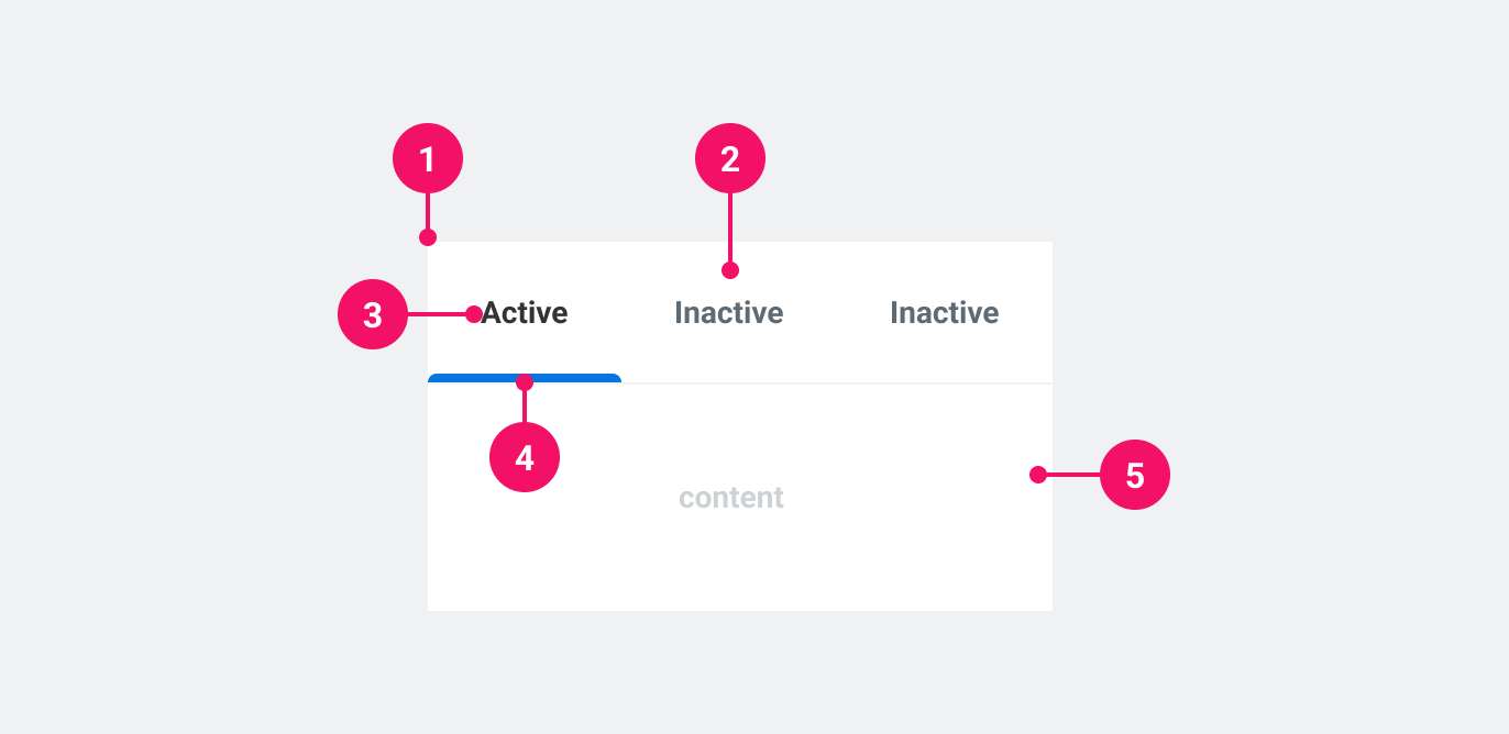
- Tab List: Container that houses all the tabs.
- Tab: Clickable element that updates the content area.
- Tab Label: A concise description of the content inside the content area.
- Active Tab Indicator: Show if the tab is currently active.
- Content area: Container for content that updates according to which tab is active.
UsagePermalink to: Usage
Tabs are a way to group content inside the page, enabling the user to remain in the context of the page, while navigating through content. Use Tabs when there is an abundance of related, groupable content that need to be grouped inside a container of limited physical space.
When to usePermalink to: When to use
- When switching tabs does not trigger a new URL and simply updates the content within the page.
When not to usePermalink to: When not to use
- When switching tabs does triggers a new URL, use Tab Navigation.
AccessibilityPermalink to: Accessibility
Accessible namePermalink to: Accessible name
It is required to give the Tab List an accessible name, which is done using either the aria-label attribute or the aria-labelledby (referencing the ID of another element in the DOM) attribute on the Tab List component. See example here.
Keyboard navigationPermalink to: Keyboard navigation
You can use up/down or left/right arrow keys to navigate to the previous or next tab respectively. Keyboard navigation stays the same independent of the language/locale.
ExamplesPermalink to: Examples
SizesPermalink to: Sizes
Tabs supports two sizes: medium (default) and large.
Medium (default)Permalink to: Medium (default)
Open
import { Tabs } from "@peakon/bedrock/react/tabs";

function Snippet() {
  return (
    <Tabs>
      <Tabs.TabList aria-label="Medium tabs" size="medium">
        <Tabs.Tab name="tab1">Tab 1</Tabs.Tab>
        <Tabs.Tab name="tab2">Tab 2</Tabs.Tab>
        <Tabs.Tab name="tab3">Tab 3</Tabs.Tab>
        <Tabs.Tab name="tab4">Tab 4</Tabs.Tab>
      </Tabs.TabList>
      <Tabs.TabPanel controlledBy="tab1">
        Lorem ipsum dolor sit amet, consectetur adipiscing elit, sed do eiusmod
        tempor incididunt ut labore et dolore magna aliqua. Ut enim ad minim
        veniam, quis nostrud exercitation ullamco laboris nisi ut aliquip ex ea
        commodo consequat. Duis aute irure dolor in reprehenderit in voluptate
        velit esse cillum dolore eu fugiat nulla pariatur. Excepteur sint
        occaecat cupidatat non proident, sunt in culpa qui officia deserunt
        mollit anim id est laborum.
      </Tabs.TabPanel>
      <Tabs.TabPanel controlledBy="tab2">Second tab</Tabs.TabPanel>
      <Tabs.TabPanel controlledBy="tab3">It is the third tab</Tabs.TabPanel>
      <Tabs.TabPanel controlledBy="tab4">FOURTH TAB</Tabs.TabPanel>
    </Tabs>
  );
}LargePermalink to: Large
Open
import { Tabs } from "@peakon/bedrock/react/tabs";

function Snippet() {
  return (
    <Tabs>
      <Tabs.TabList aria-label="Large tabs" size="large">
        <Tabs.Tab name="tab1">Tab 1</Tabs.Tab>
        <Tabs.Tab name="tab2">Tab 2</Tabs.Tab>
        <Tabs.Tab name="tab3">Tab 3</Tabs.Tab>
        <Tabs.Tab name="tab4">Tab 4</Tabs.Tab>
      </Tabs.TabList>
      <Tabs.TabPanel controlledBy="tab1">
        Lorem ipsum dolor sit amet, consectetur adipiscing elit, sed do eiusmod
        tempor incididunt ut labore et dolore magna aliqua. Ut enim ad minim
        veniam, quis nostrud exercitation ullamco laboris nisi ut aliquip ex ea
        commodo consequat. Duis aute irure dolor in reprehenderit in voluptate
        velit esse cillum dolore eu fugiat nulla pariatur. Excepteur sint
        occaecat cupidatat non proident, sunt in culpa qui officia deserunt
        mollit anim id est laborum.
      </Tabs.TabPanel>
      <Tabs.TabPanel controlledBy="tab2">Second tab</Tabs.TabPanel>
      <Tabs.TabPanel controlledBy="tab3">It is the third tab</Tabs.TabPanel>
      <Tabs.TabPanel controlledBy="tab4">FOURTH TAB</Tabs.TabPanel>
    </Tabs>
  );
}DirectionPermalink to: Direction
Tabs defaults to a horizontal orientation, but also supports a vertical orientation.
Horizontal (default)Permalink to: Horizontal (default)
Open
import { Tabs } from "@peakon/bedrock/react/tabs";

function Snippet() {
  return (
    <Tabs>
      <Tabs.TabList aria-label="Horizontal tabs" direction="horizontal">
        <Tabs.Tab name="tab1">Tab 1</Tabs.Tab>
        <Tabs.Tab name="tab2">Tab 2</Tabs.Tab>
        <Tabs.Tab name="tab3">Tab 3</Tabs.Tab>
        <Tabs.Tab name="tab4">Tab 4</Tabs.Tab>
      </Tabs.TabList>
      <Tabs.TabPanel controlledBy="tab1">
        Lorem ipsum dolor sit amet, consectetur adipiscing elit, sed do eiusmod
        tempor incididunt ut labore et dolore magna aliqua. Ut enim ad minim
        veniam, quis nostrud exercitation ullamco laboris nisi ut aliquip ex ea
        commodo consequat. Duis aute irure dolor in reprehenderit in voluptate
        velit esse cillum dolore eu fugiat nulla pariatur. Excepteur sint
        occaecat cupidatat non proident, sunt in culpa qui officia deserunt
        mollit anim id est laborum.
      </Tabs.TabPanel>
      <Tabs.TabPanel controlledBy="tab2">Second tab</Tabs.TabPanel>
      <Tabs.TabPanel controlledBy="tab3">It is the third tab</Tabs.TabPanel>
      <Tabs.TabPanel controlledBy="tab4">FOURTH TAB</Tabs.TabPanel>
    </Tabs>
  );
}VerticalPermalink to: Vertical
Setting direction="vertical" on the Tab List will stack the Tabs vertically and reposition the active indicator accordingly.
In order to preserve the composability of Tabs, there is no internal styling to position the Tab List and Tab Panel in relation to each other, meaning they must be positioned manually.
Each Tab will wrap in order to prevent the longest title from dictating the fixed length of all the tabs. You can take advantage of Tabs composability by using a wrapper element to determine the Tab List width.
Open
import { Tabs } from "@peakon/bedrock/react/tabs";

function Snippet() {
  return (
    <Tabs>
      <div
        style={{
          display: "flex",
          gap: "5px",
        }}
      >
        <div
          style={{
            width: "130px",
            flexShrink: "0",
          }}
        >
          <Tabs.TabList direction="vertical" aria-label="Vertical tabs">
            <Tabs.Tab name="tab1">Tab 1</Tabs.Tab>
            <Tabs.Tab name="tab2">Tab 2</Tabs.Tab>
            <Tabs.Tab name="tab3">Tab 3 is a long tab</Tabs.Tab>
            <Tabs.Tab name="tab4">Tab 4</Tabs.Tab>
          </Tabs.TabList>
        </div>
        <Tabs.TabPanel controlledBy="tab1">
          Lorem ipsum dolor sit amet, consectetur adipiscing elit, sed do
          eiusmod tempor incididunt ut labore et dolore magna aliqua. Ut enim ad
          minim veniam, quis nostrud exercitation ullamco laboris nisi ut
          aliquip ex ea commodo consequat. Duis aute irure dolor in
          reprehenderit in voluptate velit esse cillum dolore eu fugiat nulla
          pariatur. Excepteur sint occaecat cupidatat non proident, sunt in
          culpa qui officia deserunt mollit anim id est laborum.
        </Tabs.TabPanel>
        <Tabs.TabPanel controlledBy="tab2">Second tab</Tabs.TabPanel>
        <Tabs.TabPanel controlledBy="tab3">It is the third tab</Tabs.TabPanel>
        <Tabs.TabPanel controlledBy="tab4">FOURTH TAB</Tabs.TabPanel>
      </div>
    </Tabs>
  );
}ComposabilityPermalink to: Composability
The container component, Tabs, provides the React context(external link) through which all sub-components receive data. This means that Tab List and Tab Panel do not need to be direct children, which provides significant flexibility in how to layout the Tabs. For example, you could split the Tab Panel and Tab List by nesting them within other elements:
Open
import { Tabs } from "@peakon/bedrock/react/tabs";

function Snippet() {
  return (
    <Tabs>
      <div
        style={{
          display: "flex",
          flexDirection: "column",
          gap: "8px",
        }}
      >
        <div
          style={{
            backgroundColor: "white",
            border: "1px solid black",
          }}
        >
          <Tabs.TabList aria-label="Indirect Tabs">
            <Tabs.Tab name="tab1">Tab 1</Tabs.Tab>
            <Tabs.Tab name="tab2">Tab 2</Tabs.Tab>
          </Tabs.TabList>
        </div>
        <div
          style={{
            backgroundColor: "white",
            border: "1px solid black",
            padding: "1rem",
          }}
        >
          <Tabs.TabPanel controlledBy="tab1">
            Lorem ipsum dolor sit amet, consectetur adipiscing elit, sed do
            eiusmod tempor incididunt ut labore et dolore magna aliqua. Ut enim
            ad minim veniam, quis nostrud exercitation ullamco laboris nisi ut
            aliquip ex ea commodo consequat. Duis aute irure dolor in
            reprehenderit in voluptate velit esse cillum dolore eu fugiat nulla
            pariatur. Excepteur sint occaecat cupidatat non proident, sunt in
            culpa qui officia deserunt mollit anim id est laborum.
          </Tabs.TabPanel>
          <Tabs.TabPanel controlledBy="tab2">Second tab</Tabs.TabPanel>
        </div>
      </div>
    </Tabs>
  );
}
Controlled vs UncontrolledPermalink to: Controlled vs Uncontrolled
You can control which tab is active either externally (controlled) or internally (uncontrolled).
Providing an activeTab will switch the Tabs to controlled. You must also pass a function to onTabChange that handles the tab switching behaviour. Within the component, the name of the Tab being navigated to is passed to this function as its argument.
Open
import { useState } from "react";
import { Tabs } from "@peakon/bedrock/react/tabs";

function Snippet() {
  const [activeTab, setActiveTab] = useState("ctrl_01");

  function handleTabChange(newTabName) {
    setActiveTab(newTabName);
  }

  return (
    <Tabs activeTab={activeTab} onTabChange={handleTabChange}>
      <Tabs.TabList aria-label="Controlled Tabs">
        <Tabs.Tab name="ctrl_01">Tab One</Tabs.Tab>
        <Tabs.Tab name="ctrl_02">Tab Two</Tabs.Tab>
        <Tabs.Tab name="ctrl_03">Tab Three</Tabs.Tab>
      </Tabs.TabList>
      <Tabs.TabPanel controlledBy="ctrl_01">
        <p>Content of the first tab.</p>
      </Tabs.TabPanel>
      <Tabs.TabPanel controlledBy="ctrl_02">
        <p>Content of the second tab.</p>
      </Tabs.TabPanel>
      <Tabs.TabPanel controlledBy="ctrl_03">
        <p>Content of the third tab.</p>
      </Tabs.TabPanel>
    </Tabs>
  );
}
If nothing is provided, the Tabs are uncontrolled, and the first tab will automatically be set as active. You can also provide a defaultTab if you wish to set another tab as the default.
Open
import { Tabs } from "@peakon/bedrock/react/tabs";

function Snippet() {
  return (
    <Tabs defaultTab="ctrl_02">
      <Tabs.TabList aria-label="Default Tabs">
        <Tabs.Tab name="ctrl_01">Tab One</Tabs.Tab>
        <Tabs.Tab name="ctrl_02">Tab Two</Tabs.Tab>
        <Tabs.Tab name="ctrl_03">Tab Three</Tabs.Tab>
      </Tabs.TabList>
      <Tabs.TabPanel controlledBy="ctrl_01">
        <p>Content of the first tab.</p>
      </Tabs.TabPanel>
      <Tabs.TabPanel controlledBy="ctrl_02">
        <p>Content of the second tab.</p>
      </Tabs.TabPanel>
      <Tabs.TabPanel controlledBy="ctrl_03">
        <p>Content of the third tab.</p>
      </Tabs.TabPanel>
    </Tabs>
  );
}
When uncontrolled, the component itself will handle the tab switching behaviour.
Naming the Tab ListPermalink to: Naming the Tab List
Using aria-labelPermalink to: Using aria-label
An aria-label is required for screen readers to understand what the Tabs represent.
Open
import { Tabs } from "@peakon/bedrock/react/tabs";

function Snippet() {
  return (
    <Tabs>
      <Tabs.TabList aria-label="Example using the aria-label attribute">
        <Tabs.Tab name="al_01">Tab One</Tabs.Tab>
        <Tabs.Tab name="al_02">Tab Two</Tabs.Tab>
        <Tabs.Tab name="al_03">Tab Three</Tabs.Tab>
      </Tabs.TabList>
      <Tabs.TabPanel controlledBy="al_01">
        <p>Content of the first tab.</p>
      </Tabs.TabPanel>
      <Tabs.TabPanel controlledBy="al_02">
        <p>Content of the second tab.</p>
      </Tabs.TabPanel>
      <Tabs.TabPanel controlledBy="al_03">
        <p>Content of the third tab.</p>
      </Tabs.TabPanel>
    </Tabs>
  );
}
Using aria-labelledbyPermalink to: Using aria-labelledby
If the Tabs are labelled by an external heading, you can use aria-labelledby instead of aria-label.
Open
import { Tabs } from "@peakon/bedrock/react/tabs";

function Snippet() {
  return (
    <div
      style={{
        display: "flex",
        flexDirection: "column",
        gap: "8px",
      }}
    >
      <h1 id="tabListName">This is the name of the Tab List</h1>
      <Tabs>
        <Tabs.TabList aria-labelledby="tabListName">
          <Tabs.Tab name="al_01">Tab One</Tabs.Tab>
          <Tabs.Tab name="al_02">Tab Two</Tabs.Tab>
          <Tabs.Tab name="al_03">Tab Three</Tabs.Tab>
        </Tabs.TabList>
        <Tabs.TabPanel controlledBy="al_01">
          <p>Content of the first tab.</p>
        </Tabs.TabPanel>
        <Tabs.TabPanel controlledBy="al_02">
          <p>Content of the second tab.</p>
        </Tabs.TabPanel>
        <Tabs.TabPanel controlledBy="al_03">
          <p>Content of the third tab.</p>
        </Tabs.TabPanel>
      </Tabs>
    </div>
  );
}
Props TablePermalink to: Props Table
TabsPermalink to: Tabs
Does not extend or return a DOM element.
| Name | Type | Description | Default | Required |
|---|---|---|---|---|
activeTab | string | Defines the current active tab. Used alongside | — | Only alongside onTabChange when creating controlled Tabs. It cannot be used if |
onTabChange | function | For controlling the changing of tabs and any side effects. Used alongside | — | Only alongside |
defaultTab | string | For defining what tab should be active by default when using uncontrolled Tabs. | — | Only for uncontrolled Tabs. It cannot be used if |
children | ReactNode | The contents of the Tabs. This should contain everything intended to be rendered within the Tabs context. | — | Yes |
Tabs.TabListPermalink to: Tabs.TabList
Props extend from HTML Div Element(external link), with the omission of className, style and role
| Name | Type | Description | Default | Required |
|---|---|---|---|---|
aria-labelledby | string | Used to link the Tabs to an external label that describes the Tabs. | — | Yes, if not using |
aria-label | string | Used to provide context to screen readers about the Tabs. | — | Yes, if not using |
children | ReactNode | The contents of the TabList. This should contain the Tabs (see Tabs.Tab) | — | Yes |
direction | horizontal | vertical | Defines the orientation of the Tabs. | horizontal | No |
size | medium | large | Defines the size of the Tabs padding. | medium | No |
Tabs.TabPermalink to: Tabs.Tab
Props extend from HTML Button Element(external link), with the omission of className, style, id, aria-controls, tabIndex and role
| Name | Type | Description | Default | Required |
|---|---|---|---|---|
name | string | A reference for the Tab. Internally, a unique ID is built using this name that will be used to link to a corresponding TabPanel. | — | Yes |
children | ReactNode | The contents of the Tab. This will render as the visible label. | — | Yes |
Tabs.TabPanelPermalink to: Tabs.TabPanel
Props extend from HTML Div Element(external link), with the omission of className, style, id, aria-labelledby and role
| Name | Type | Description | Default | Required |
|---|---|---|---|---|
controlledBy | string | Defines which Tab the TabPanel is controlled by, ie. which Tab will reveal the TabPanel contents when active. It must correspond to the | — | Yes |
children | ReactNode | The contents of the TabPanel. Revealed when the controlling Tab is active. | — | Yes |