Content Banners are dismissable, informative banners.
AnatomyPermalink to: Anatomy
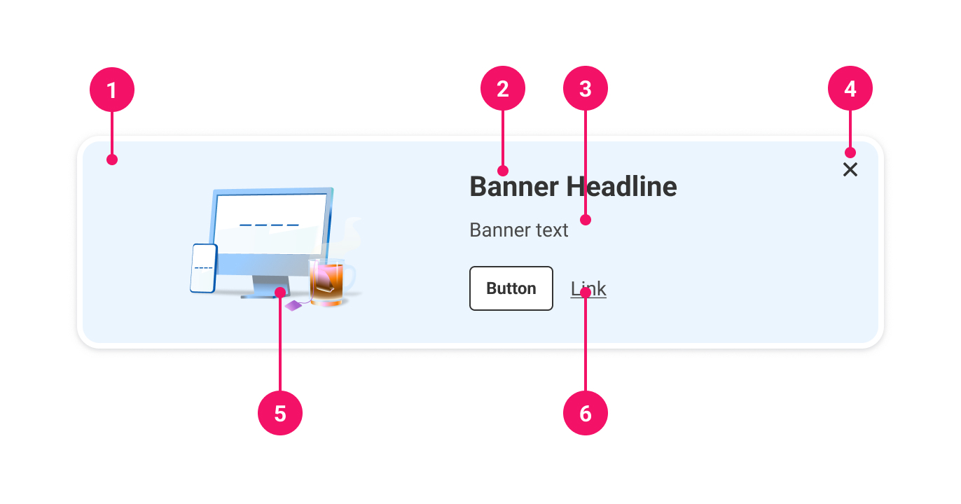
- Container: Houses the Content Banner.
- Heading: Short headline explaining the Content Banner.
- Body (optional): Further information to explain the purpose of the Content Banner.
- Close button: The button that dismisses the Content Banner.
- Illustration (optional): A decorative image.
- Actions (optional): Further relevant actions that the user can take, eg. a link or button.
UsagePermalink to: Usage
Content Banners are dismissable messages that provide useful information, optionally with further actions that can be taken in relation to a page. They are intended to be prominent, usually including information or actions that would benefit the user ahead of proceeding with the page, and so should ideally be placed at the top of the page and span the width of the content.
When to usePermalink to: When to use
- For information that could be useful, but not essential for a user.
- To suggest further actions a user could take in relation to the page content.
When not to usePermalink to: When not to use
- As a branding banner.
- As the edge-to-edge site banner informing the user about tech outage, new survey to take, etc.
- To alert the user about critical information - use the Alert component instead.
ContentBanners are always controlledPermalink to: ContentBanners are always controlled
Content Banners are always controlled components, because dismissing them must be persistent (ie. once a Content Banner is dismissed, it should not return again simply by refreshing or revisiting the page). This persistence needs to be stored in the application state, usually as part of the user's ongoing UX flow.
It is permissible to display the Content Banner again, but should be a conscious product decision, and therefore is triggered by the application state.
AccessibilityPermalink to: Accessibility
Content Banners are always dismissable, so they must have a closeLabel, which will be read to screen readers when focused on the dismiss icon.
Content Banners always have a heading, and must therefore have a headingLevel to determine the level of heading element(external link) it should render.
ExamplesPermalink to: Examples
With imagePermalink to: With image
An image can be used to further illustrate a Content Banner. They must be purely decorative.
Open
import React, { useState } from "react";

import { ContentBanner } from "@peakon/bedrock/react/banner";
import { Button } from "@peakon/bedrock/react/button";
import { Illustration } from "@peakon/bedrock/react/assets/Illustration";

function Snippet() {
  const [show, setShowing] = useState(true);

  return (
    <div>
      {show ? (
        <ContentBanner
          heading="Heading"
          headingLevel={3}
          illustration={<Illustration name="spot-acknowledgement-great-idea" />}
          closeLabel="Close"
          onDismiss={() => setShowing(!show)}
        >
          <ContentBanner.Paragraph>
            Excepteur sint occaecat cupidatat non proident, sunt in culpa qui
            officia deserunt mollit anim id est laborum. Lorem ipsum dolor sit
            amet, consectetur adipiscing elit, sed do eiusmod tempor incididunt
            ut labore et dolore magna aliqua. Ut enim ad minim veniam, quis
            nostrud exercitation ullamco laboris nisi ut aliquip ex ea commodo
            consequat.
          </ContentBanner.Paragraph>
        </ContentBanner>
      ) : (
        <Button variant="primary" onClick={setShowing}>
          Show Content Banner again
        </Button>
      )}
    </div>
  );
}
With action(s)Permalink to: With action(s)
The Content Banner can be used to suggest further actions related to a page. Remember that Content Banners should not convey critical information, so the actions should simply be suggestions.
Open
import React, { useState } from "react";

import { ContentBanner } from "@peakon/bedrock/react/banner";
import { Button } from "@peakon/bedrock/react/button";

function Snippet() {
  const [show, setShowing] = useState(true);

  return (
    <div>
      {show ? (
        <ContentBanner
          heading="Heading"
          headingLevel={3}
          closeLabel="Close"
          onDismiss={() => setShowing(!show)}
        >
          <ContentBanner.Paragraph>
            Excepteur sint occaecat cupidatat non proident, sunt in culpa qui
            officia deserunt mollit anim id est laborum. Lorem ipsum dolor sit
            amet, consectetur adipiscing elit, sed do eiusmod tempor incididunt
            ut labore et dolore magna aliqua. Ut enim ad minim veniam, quis
            nostrud exercitation ullamco laboris nisi ut aliquip ex ea commodo
            consequat.
          </ContentBanner.Paragraph>
          <ContentBanner.Actions>
            <Button variant="secondary" size="small">
              Do something
            </Button>
            <Link href="/" variant="secondary">
              Read more
            </Link>
          </ContentBanner.Actions>
        </ContentBanner>
      ) : (
        <Button variant="primary" onClick={setShowing}>
          Show Content Banner again
        </Button>
      )}
    </div>
  );
}
Props TablePermalink to: Props Table
ContentBannerPermalink to: ContentBanner
Props extend from HTML div Element(external link), with the omission of className and style
| Name | Type | Description | Default | Required |
|---|---|---|---|---|
children | ReactNode | The contents of the ContentBanner (ContentBanner.Paragraph and, optionally, ContentBanner.Actions are recommended). | — | Yes |
illustration | ReactNode | An decorative illustration. | — | No |
closeLabel | string | The label for the close button of the ContentBanner (for assistive technology). | — | Yes |
heading | string | Renders a heading above the content. | — | Yes |
headingLevel | 1 | 2 | 3 | 4 | 5 | 6 | Used to determine the semantic level of the heading element that the heading is rendered within, eg. | — | Yes |
onDismiss | function | Callback function for when the ContentBanner is dismissed, triggered by the close button. | — | Yes |
ContentBanner.ParagraphPermalink to: ContentBanner.Paragraph
Props extend from HTML p element(external link), with the omission of className and style
| Name | Type | Description | Default | Required |
|---|---|---|---|---|
children | ReactNode | Used to add text content to a ContentBanner. It renders the same output as using a Typography.BodyText. | — | Yes |
ContentBanner.ActionsPermalink to: ContentBanner.Actions
Props extend from HTML div element(external link), with the omission of className and style
| Name | Type | Description | Default | Required |
|---|---|---|---|---|
children | ReactNode | The actions for a ContentBanner. | — | Yes |